
User Onboarding Examples by Platform, Pattern, and First-Value Action
Decision-ready user onboarding examples by platform, pattern, and first-value action, plus a reusable flow and measurement plan.
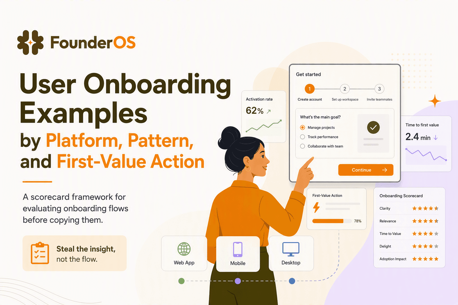
User onboarding examples are only useful when you can map each flow to a platform constraint, a first-value action, and a measurable outcome you can replicate. Teams copy tours that look polished, then wonder why activation does not move: the missing piece is evaluation criteria that connects the pattern (checklist, tooltip, template, survey) to what the user must do to get value in your product.
- Evaluate onboarding by platform, audience, pattern, steps, first-value action, and the outcome you can actually measure in your own analytics.
- Choose patterns based on the job-to-be-done: personalization reduces time-to-value, interactive prompts reduce errors, and templates or sample data remove blank-screen friction.
- Ship onboarding as a system: segmentation rules, exit conditions, event tracking, and follow-ups matter as much as the UI of the tour.
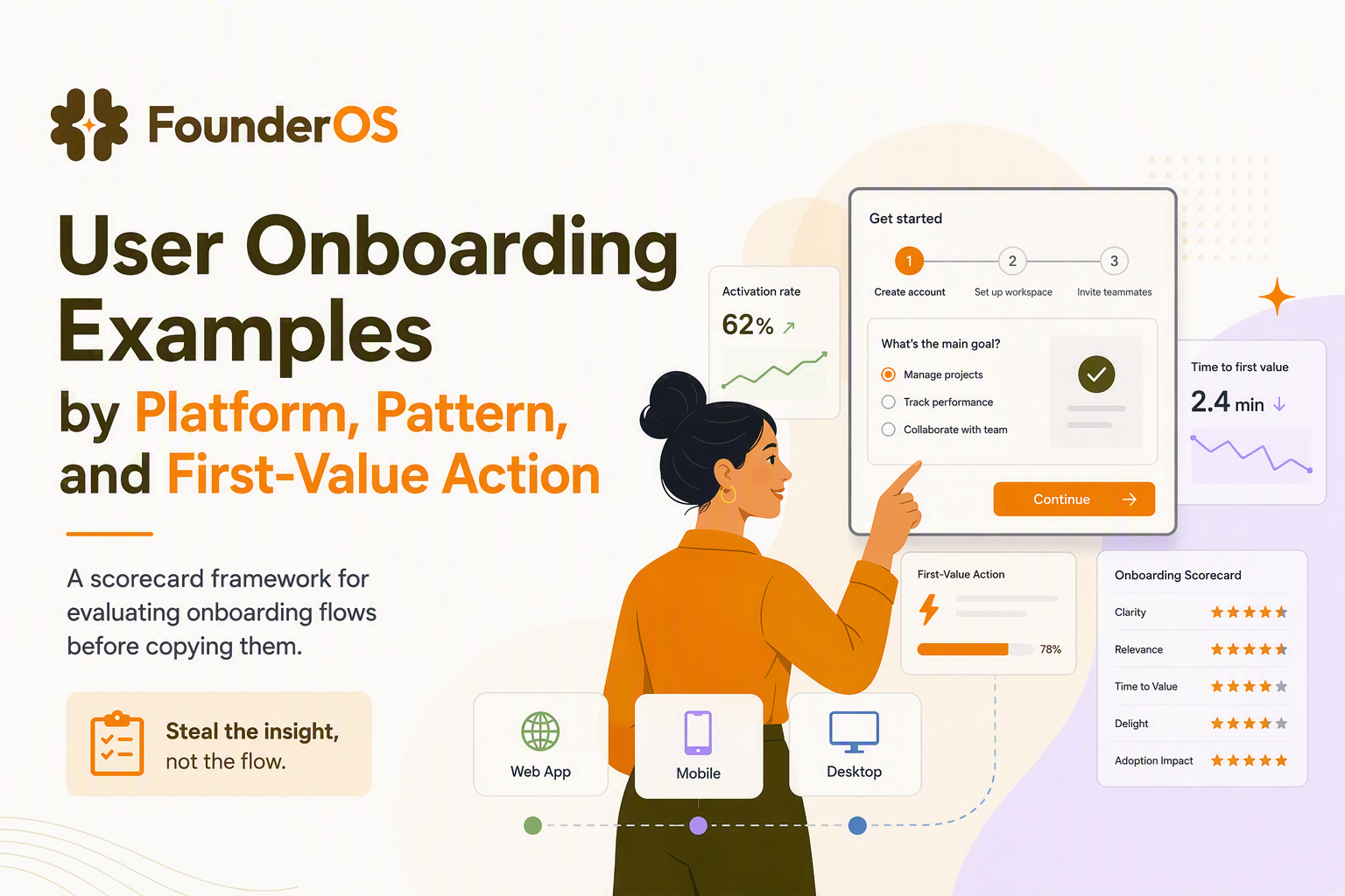
How to Evaluate User Onboarding Examples Before Copying Them
User onboarding examples become decision-ready when you score them with the same lens you use to ship product changes: constraints, intended behavior, and proof. Instead of asking, “Is this onboarding nice?”, ask, “What does this flow make the user do, on which platform, and how will we know it worked?”
A practical evaluation lens you can reuse
Use this 6-part lens to break down any onboarding you see in the wild. It keeps you from copying surface-level UI and forces you to translate it into an implementable flow.
- Platform constraint: Web app, mobile app, desktop app, or browser extension? (This determines real estate, interaction cost, notification rules, and whether tours can anchor to stable UI selectors.)
- Audience and entry state: Self-serve SMB, mid-market, enterprise, or consumer? New user vs invited teammate vs returning user after a long gap?
- Onboarding pattern: Checklist, guided tour, tooltips, modals, templates, empty-state education, interactive walkthrough, or in-app survey.
- Steps and friction: Number of steps, required fields, permissions, and any “hard stops” (for example: must connect data, must invite teammate, must grant access).
- First-value action: The smallest user action that produces an immediate “win” (example: create a first doc, import first rows, run first report, send first message).
- Evidence and measurement: What metric could plausibly move, and what event(s) would confirm it? (Completion rate alone is not enough.)
A quick scoring checklist (copy/paste)
When our team audits onboarding libraries, we use a simple scorecard to decide whether an example is worth recreating. A “yes” on 7 out of 10 usually means it is actionable; below that, it is likely inspiration only.
- Does it clearly drive one first-value action (not five)?
- Can the user skip or defer without getting stuck?
- Is the UI anchored to stable elements (especially on responsive web)?
- Does it adapt based on role, use case, or plan tier?
- Does it teach by doing (click here, create this), not by reading?
- Does it reduce mistakes (validation, examples, guardrails)?
- Would it still work if the user is distracted or on a smaller screen?
- Is there a clear exit condition (what makes the flow stop)?
- Does it create a habit loop (next step after first win)?
- Can you measure impact with events tied to activation or retention?
User Onboarding Examples Organized by Platform and Product Type
User onboarding examples vary more by platform than by industry because interaction costs and UI stability differ across web, mobile, and desktop. If you pick a pattern that fights the platform, you will see low completion, users dismissing prompts, or tours breaking when UI shifts.
Platform comparison table for choosing the right pattern
| Platform / product type | Best-fit onboarding patterns | Typical screens and step count | Skip / defer behavior to support | Common first-value actions | What to watch (failure mode) |
|---|---|---|---|---|---|
| Web SaaS (B2B) | Checklists, anchored tooltips, templates, contextual modals | 3 to 10 micro-steps across dashboard + key feature pages | “Skip for now”, resume later, role-based routing | Create first project, connect integration, invite teammate | UI changes break tooltip anchors; too many steps before any win |
| Web SaaS (PLG, freemium) | Templates, sample data, progressive disclosure tours | 1 to 5 steps, heavy emphasis on empty states | Soft prompts, non-blocking nudges | Generate first artifact (doc, design, board), share link | Over-personalization adds friction; unclear “next best action” |
| Mobile app | Full-screen cards, permission education, short checklists | 2 to 6 screens; short sessions | Defer permissions, “Not now”, reminder later | Enable notifications, complete profile, do first core action | Permission prompts too early cause drop-off |
| Desktop app | First-run wizard, sample project, menu highlights | Wizard 3 to 7 steps + embedded hints | Save state, resume wizard, “don’t show again” | Open sample, import file, run first workflow | Wizards that lock the user out of the app feel punitive |
| Browser extension | Contextual prompts + checklist tied to host site | 1 to 4 steps; frequent context switching | Teach in the moment; short prompts | Pin extension, authorize, use on first target page | Missing context: user not on the right page when prompted |
How to translate an example to your platform
- If your UI changes weekly, prefer checklists + contextual prompts triggered by page or feature use, rather than a brittle 12-step tour.
- If your product has multiple personas, prioritize routing (role, team size, use case) over showing every feature.
- If “first value” requires setup (data connections, integrations), design an onboarding that proves progress with intermediate wins (test connection, import sample data, run first query).
Signup and Personalization Examples That Reduce Time to Value
Signup onboarding works when it asks only the questions needed to route users to a fastest path to first value. The best signup flows feel short because each question changes what the user sees next, rather than collecting data “for later.”
Examples to copy and what they are really doing
- Notion: Uses lightweight use-case selection (personal, team, school) to route users into templates and an initial workspace structure. The implementation takeaway is not the exact questions, but the tight coupling between answers and the first screen the user lands on.
- Grammarly: Often asks about writing goals and contexts to tune suggestions and content surfaces. The key idea is “configure the product’s default behavior” instead of “collect demographics.”
- Figma: Routes by role and intent to set up team spaces and surface the right starting point. The lesson is to treat the first workspace as part of onboarding, not as a blank container.
A decision rule for which questions to ask
Ask only questions that satisfy at least one of these rules. If a question does not meet a rule, it belongs in later progressive profiling.
- Routing: The answer changes the next screen or checklist items (example: marketer vs engineer).
- Default configuration: The answer changes defaults that affect time-to-value (example: writing tone, report template type).
- Eligibility or compliance: The answer is required to use the product safely (example: region for data handling, SSO requirement).
What to measure for signup and personalization
- Activation conversion: % of new signups who reach the first-value action within X time window.
- Time-to-first-value: Median time from account created to first value event.
- Drop-off by field: Where users abandon the form or flow (especially on mobile).
We initially assumed “more personalization questions” would increase activation, but audits across several SaaS products showed the opposite unless each answer changed the next step immediately. The practical fix is to move “nice to know” fields into in-app prompts triggered after the first win.
Interactive Onboarding Examples That Guide Users Without Overwhelming Them
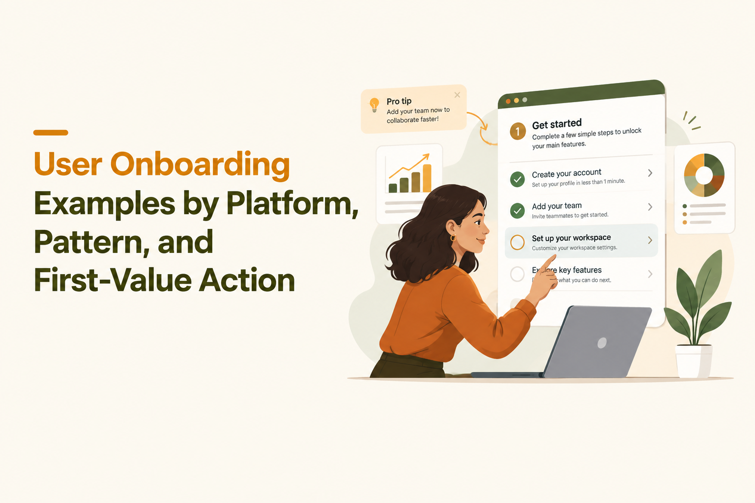
Interactive onboarding succeeds when it teaches one behavior at a time in the user’s real context, with an obvious escape hatch. When people say they want “a product tour,” they often need a smaller set of patterns: checklists for clarity, tooltips for just-in-time instruction, and progressive disclosure for complex workflows.
Pattern map: what to use when
| Pattern | Use it when | Keep it effective by | Common first-value actions |
|---|---|---|---|
| Guided tour (multi-step) | The UI is stable and the user needs orientation | 5 steps max before a “do the thing” step; allow skip | Create first project, run first report |
| Tooltip / anchored hint | The user is already on the right page | Trigger by intent signals (visited page, hovered, clicked) | Configure setting, connect integration |
| Checklist | The product has multiple setup tasks | 3 to 6 items; show progress; deep-link to each task | Invite teammate, add billing, upload data |
| Contextual modal | You must announce a change or unblock a step | One CTA; never stack modals; offer “later” | Try new feature, pick template |
| Micro-survey prompt | You need segmentation data with low friction | 1 question; use it to branch the next in-app step | Route to correct workflow |
Recognizable examples and the underlying structure
- Slack: Uses progressive disclosure and contextual education to encourage key actions like creating a channel, inviting teammates, and sending a first message. The copy is short because the UI itself is the lesson.
- Duolingo: Uses immediate interaction to create momentum, then personalizes the plan after the user has experienced the core loop. The transferable idea is “let the user do the core action first, then ask questions.”
- Trello: Leans on templates and an initial board experience; guidance appears near the exact UI control the user needs next.
Accessibility and UX checks most tours fail
- Keyboard support: Can users tab through prompts and CTAs?
- Focus management: Does focus move to the tooltip/modal and back correctly?
- Contrast and motion: Avoid low-contrast highlights and excessive pulsing that can be distracting.
- Skip and resume: “Skip” should not punish users; “Resume” should be discoverable.
Empty States, Templates, and Sample Data That Create the First Win
Empty-state onboarding is the fastest way to improve first-session success because it turns “nothing here” into a clear next action. This is where many of the most effective user onboarding examples hide: not in flashy tours, but in the first blank screen.
Examples and what to replicate
- Airtable: Uses templates and sample bases to demonstrate what “good” looks like and reduce the cost of starting from scratch. The replicable mechanism is pre-built structure plus a guided first edit.
- Canva: Starts with templates that match an intent (presentation, social post), then offers in-context tips as the user edits. The key is that the first win is visible within seconds: the user sees a design immediately.
- GitHub: Empty repositories and project areas provide clear CTAs and documentation pointers that match the user’s likely next step.
A template and sample-data checklist (implementation-focused)
- Template taxonomy: 5 to 12 templates max; group by job-to-be-done, not by feature.
- Guided first edit: One prompt that asks the user to change a meaningful field (name, goal, first row) to create ownership.
- Built-in success metric: A subtle progress indicator (for example: “1 of 3 steps complete” or a checklist tied to template usage).
- Safe sandbox: Make it clear the sample can be deleted and does not affect real data.
What surprised our team was how often “sample data + one contextual tooltip” outperformed long tours in early-stage SaaS. Users did not need more explanation; they needed a starting artifact they could safely edit.
A Reusable User Onboarding Flow for SaaS Teams
A reusable onboarding flow is a small system with segmentation, triggers, exit conditions, and follow-ups that all aim at one activation event. If you can describe your onboarding as a state machine, you can ship it, measure it, and iterate instead of endlessly browsing user onboarding examples.
Step-by-step flow you can implement
- Define the activation event: One event that represents “the user got value.” Examples: created first dashboard, invited a teammate, published a report, sent first campaign.
- Define 2 to 4 segments: Route by role, use case, or source. Avoid more than four segments until you have enough volume to learn.
- Choose the minimum pattern set: Usually checklist + 2 to 3 contextual tooltips + 1 template or sample artifact.
- Set triggers: Use page view, feature click, and time-based triggers sparingly. Prefer intent-based triggers (user opened feature X but did not complete step Y).
- Write exit conditions: Stop showing onboarding if activation is achieved, or if the user dismisses twice, or if the user is on a paid plan with success already reached.
- Add behavior-based follow-up: If the user stalls, nudge them to the next best action in-app and via email, tied to the exact missed step.
Sample copy blocks (short, reusable)
- Tooltip (do the thing): “Add your first [item] so you can see [result] instantly.” CTA: “Create [item]”.
- Checklist item: “Connect [integration] (2 min)” with subtext “Unlock automatic data sync.”
- Empty state: “Start with a template” and a secondary link “Import your own data.”
Event tracking you need (minimum viable)
- Onboarding shown: tour_started, tooltip_seen, checklist_viewed.
- Onboarding engaged: step_completed, dismissed, skipped, resumed.
- Product progress: the real events, not onboarding UI events (created_project, connected_integration, invited_teammate).
- Activation: activated_event fired once, with segment properties attached.
If you want to implement this without engineering cycles, Founder OS includes a no-code product onboarding tool plus product tracking and user profile tracking and segmentation, so the same system that shows a flow can also measure whether the flow drove your activation event. The key is to keep segmentation and exit conditions in the same place you design steps, so you do not ship “one tour for everyone.”
How to Measure Which Onboarding Example Actually Works
Measurement is the difference between browsing user onboarding examples and improving activation because it separates “users clicked through” from “users achieved value.” A clean measurement plan ties each pattern to a primary metric, a diagnostic metric, and an experiment design.
Map patterns to metrics (what to measure and why)
| Pattern | Primary success metric | Diagnostic metrics | Common interpretation mistake |
|---|---|---|---|
| Guided tour | Activation conversion rate | Step drop-off, time-to-first-value | Optimizing for tour completion instead of product value |
| Checklist | % completing key checklist items | Sequence analysis, item-level completion | Adding too many items and inflating “progress” |
| Templates / sample data | First artifact created and edited | Template selection rate, delete rate | Counting template selection as activation |
| Tooltips | Feature adoption for targeted feature | Dismiss rate, repeat exposure, hover-to-click | Showing tooltips too early, before intent exists |
| Surveys for routing | Segment-specific activation lift | Response rate, branch performance | Collecting data but not changing the next step |
A lightweight experiment plan (so you can ship changes weekly)
- Define a hypothesis: “If we add a template-driven empty state, more new users will complete [activation event] in 7 days.”
- Pick one primary metric: activation conversion, not tour completion.
- Choose guardrails: support tickets, dismiss rate, time-to-complete core task.
- Run a clean comparison: A/B test or phased rollout by cohort, but keep segments consistent.
- Inspect paths, not just rates: Look at where successful users went next and replicate that path.
After running multiple onboarding experiments, the pattern was clear: flows that reduce cognitive load (templates, fewer steps, clearer next action) often beat “feature education” tours even when tour completion looks lower. That is why a measurement plan must prioritize time-to-first-value and activation, then use step drop-off as a diagnostic.
| First-value action | Best onboarding patterns | Minimum events to track | Suggested follow-up if stalled |
|---|---|---|---|
| Create first project | Template + empty state + 1 tooltip | project_created, project_edited | In-app nudge to pick a template and rename it |
| Connect an integration | Checklist + contextual tooltip at integration page | integration_started, integration_connected | Modal explaining value, then deep-link to connect |
| Invite a teammate | Checklist + tooltip in share/invite UI | invite_sent, invite_accepted | Prompt after first win: “Get feedback faster with a teammate” |
| Run first report / workflow | Guided tour capped at 5 steps + sample data | report_run, report_saved | Show saved example and ask user to duplicate it |
FAQ
How many steps should an onboarding tour have?
Keep a tour short enough to reach a first-value action quickly. In practice, many teams cap tours at about 5 steps before the user performs a real product action (create, import, connect, invite) and move deeper guidance into contextual tooltips.
What is the best metric for onboarding success?
The best metric is activation conversion tied to a concrete product event, not tour completion. Use completion, dismiss rate, and step drop-off as diagnostic metrics to explain why activation did or did not move.
When should I use templates instead of a walkthrough?
Use templates or sample data when the main friction is the blank screen or the user does not know what “good” looks like. Use a walkthrough when the user must learn a sequence of actions to complete a workflow and the UI is stable enough to anchor steps reliably.
How do I choose among user onboarding examples for my product?
Score each example by platform fit, persona routing, the first-value action it targets, and whether you can measure impact with events in your analytics. If you cannot name the activation event and the exit condition, the example is probably not ready to copy.
If you are ready to implement the strongest user onboarding examples as real, measurable flows, Founder OS can help you build no-code in-app onboarding, segment users by profile and behavior, and connect onboarding engagement to product tracking so you can see what actually improves activation.
Read Next
View all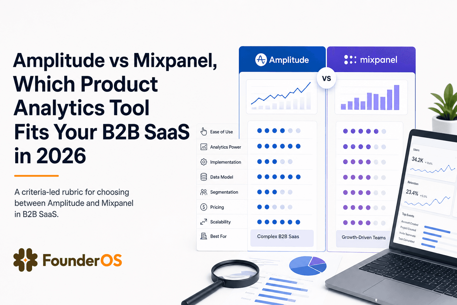
Amplitude vs Mixpanel, Which Product Analytics Tool Fits Your B2B SaaS in 2026
Amplitude vs Mixpanel comparison for B2B SaaS teams in 2026. Use a fast rubric for data model fit, analysis depth, collaboration, and TCO.

Fix Your Customer Onboarding Platform Before It Bleeds Activation and Support Time
A practical blueprint to fix your customer onboarding platform, cut time-to-value, and reduce support load with measurable onboarding flows.
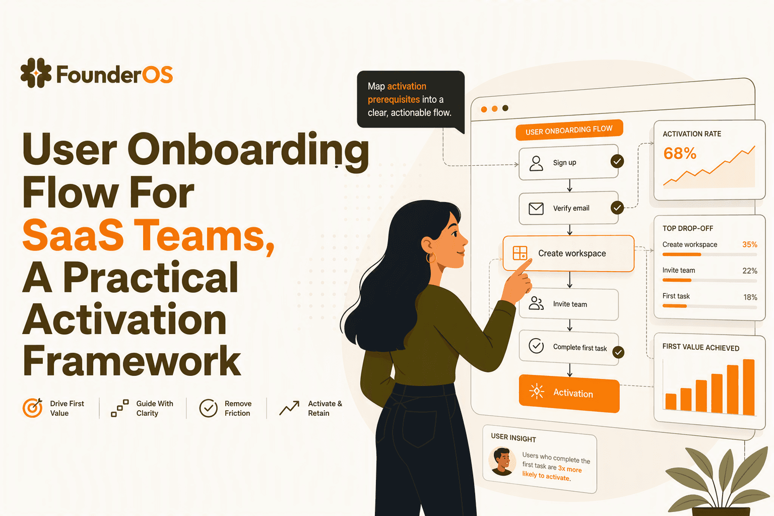
User Onboarding Flow For SaaS Teams, A Practical Activation Framework
Build a user onboarding flow around activation: map intent, choose the right in-app steps, measure time-to-value, and iterate by segment.