
Analytics Software for B2B SaaS, Categories, Examples, and a Buyer Decision Tree
Buying analytics software for a B2B SaaS team gets confusing fast because “analytics” can mean anything from web traffic to product usage to revenue attribution, and each category answers different questions with different data.
- Map your need to a category first (BI, product analytics, web analytics, or data stack) before comparing tools.
- Use a 10-minute decision tree based on what you analyze, your team’s skills, and governance needs to avoid overbuilding.
- Evaluate tools by workflows and outputs (funnels, cohorts, exec scorecards, anomaly alerts), not feature checklists.
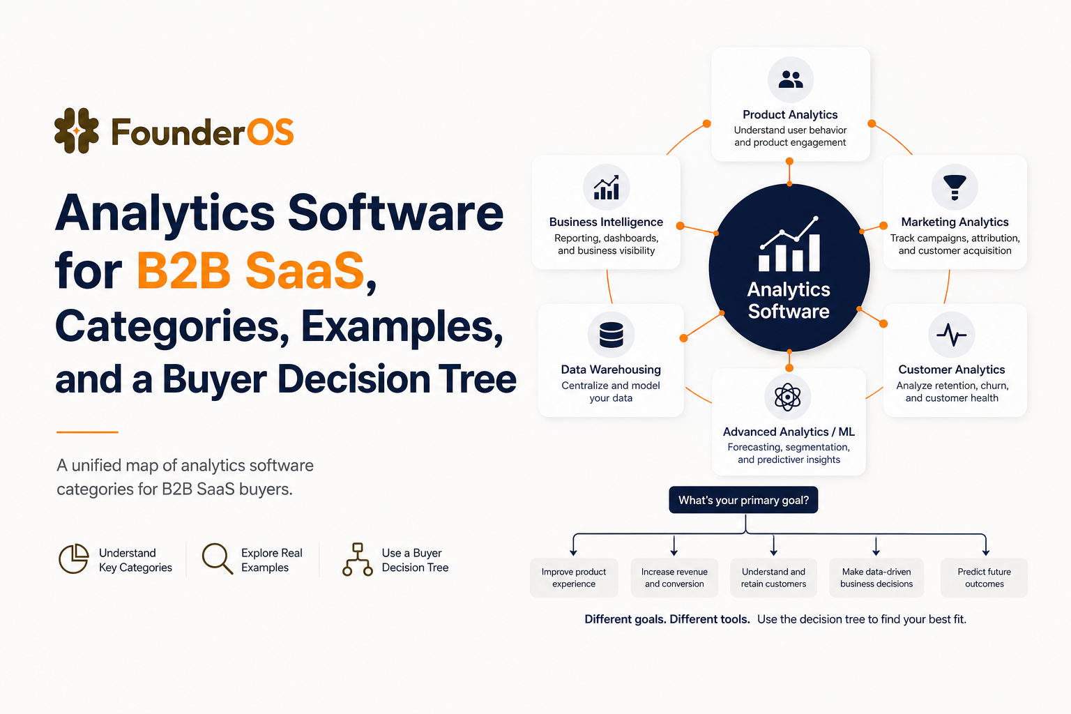
Analytics Software Categories, A Unified Map for Buyers
The fastest way to de-risk an analytics software purchase is to start with category fit. Most buying mistakes happen when teams evaluate tools inside the wrong category, for example trying to do product activation analysis in a BI dashboard, or trying to do finance-grade revenue reporting in a product analytics UI.
Category map and who each one is for
- Web analytics: answers “How do people arrive and what do they do on marketing pages?” Best for acquisition teams and marketing sites.
- Product analytics: answers “What do users do inside the product, and where do they drop off?” Best for product, growth, and onboarding teams.
- BI and reporting: answers “What happened to revenue, pipeline, retention, and unit economics?” Best for exec reporting and finance style metrics.
- Data stack (warehouse + ELT + modeling): answers “How do we centralize data and define metrics once?” Best when you need governance, scale, and multiple downstream tools.
Category to shortlist mapping (tool types, not brands)
Use this as a shortlist by type so you can compare vendors later without mixing apples and oranges:
- Web analytics: privacy-aware web analytics, tag manager, session replay (optional).
- Product analytics: event tracking, funnels, cohorts, segmentation, user profiles, onboarding experimentation.
- BI: semantic layer or metric definitions, scheduled reporting, exec scorecards, ad hoc slicing.
- Data stack: warehouse, ELT, reverse ETL, data quality, access controls.
Common mismatch patterns to avoid
- “We bought BI first” and then realized there is no reliable event stream for activation and feature adoption.
- “We bought product analytics” and then tried to use it as the single source of truth for booked revenue and invoicing.
- “We built a full data stack” without a clear set of product questions, then got stuck in instrumentation and modeling.
The 4 Types of Analytics and Which Analytics Software Actually Supports Each
The classic framework is descriptive, diagnostic, predictive, and prescriptive analytics. It’s useful, but only if you map each type to the software category that can produce the right outputs with the right data.
Four-type framework mapped to questions, outputs, and tool categories
| Analytics type | Typical SaaS question | Output you should expect | Best-fit software category |
|---|---|---|---|
| Descriptive | What happened this week? | Dashboards, trends, weekly scorecards | BI, product analytics, web analytics |
| Diagnostic | Where did conversion drop and why? | Funnels, cohort cuts, session/user drilldowns | Product analytics |
| Predictive | Who is likely to churn? | Propensity scores, risk segments, forecasts | Data stack + BI, sometimes product analytics add-ons |
| Prescriptive | What action should we take next? | Playbooks, triggered journeys, alerts | Product analytics + lifecycle tools, data stack for automation |
What this means for B2B SaaS teams
If your highest-value questions are diagnostic, for example “which step of onboarding kills activation,” you will get faster answers from product focused analytics software than from BI alone. In our experience working with early-stage B2B SaaS teams, the biggest time sink is not building charts, it’s getting trustworthy event definitions and being able to drill from an aggregate drop-off into the actual users affected.
Where the “four types” often breaks in practice
- Predictive without clean inputs: churn models are noisy if your event tracking is incomplete or inconsistent.
- Prescriptive without delivery: recommendations are useless if you cannot route segments to onboarding, email, or sales workflows.
A Decision Tree to Choose Analytics Software in 10 Minutes
This decision tree is designed for buyers who want to narrow down the correct category and minimum viable stack quickly, before they start vendor demos.
Step 1: What are you analyzing?
- Marketing site behavior (landing pages, campaigns): start with web analytics.
- In-app behavior (activation, feature adoption, retention): start with product analytics.
- Business outcomes (MRR, NRR, pipeline, CAC payback): start with BI, but only if the underlying sources are reliable.
Step 2: How will data be captured?
- Mostly automatic capture (page views, clicks, forms) is ideal for speed, but still needs naming conventions.
- Custom events are required for core product actions, for example “created workspace” or “invited teammate.”
- Server-side events matter for billing, security, and reducing ad blocker loss.
Step 3: What is your team’s analysis skill profile?
- No SQL, no data team: prioritize analytics software with a visual funnel builder, cohort slicing, and user-level drilldowns.
- Some SQL, analyst support: a hybrid approach works well, product analytics for exploration plus BI for standardized reporting.
- Dedicated data team: invest in a warehouse-centric model with governed metrics and multiple downstream tools.
Step 4: Activation needs and feedback loops
- If you need to improve activation in weeks, pick tools that can answer “where do users stall” and “who stalled” quickly, then route those users into onboarding or outreach.
- If activation is stable and you’re optimizing unit economics, your priority shifts to revenue attribution and forecasting in BI.
Step 5: Privacy, governance, and access control
- Regulated data: ensure role-based access, data retention controls, and auditability.
- Customer trust: avoid collecting unnecessary PII in events; prefer stable IDs and trait minimization.
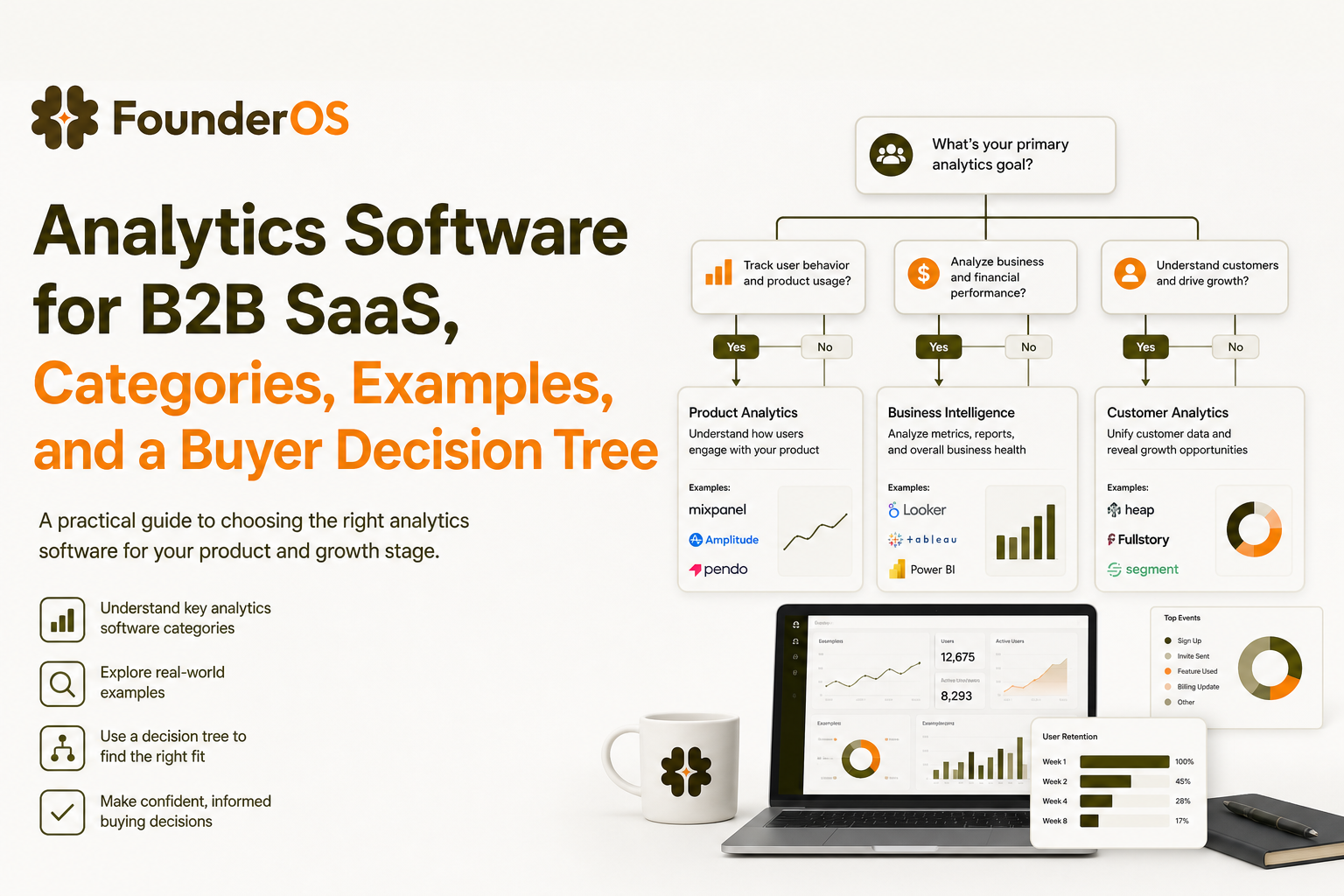
Analytics Software Examples, 8 Real Workflows and the Outputs to Expect
Instead of comparing feature lists, compare whether a tool can reliably produce the outputs you need. Below are eight workflows B2B SaaS teams repeatedly run, the expected artifact, and the best-fit analytics software category.
1) Activation funnel from signup to “first value”
- Input: events like Signed Up, Created Project, Connected Integration, Invited Teammate.
- Output: step-by-step funnel with drop-off rates and time-to-convert distribution.
- Best fit: product analytics with funnel analysis.
2) Feature adoption curve by persona
- Input: feature events plus user traits (role, plan, company size).
- Output: adoption trend lines and “first used” cohorts.
- Best fit: product analytics and user analytics tools with segmentation.
3) Retention cohorts by activation quality
- Input: activation milestones and weekly active usage events.
- Output: cohort retention heatmap (week 1 to week 8+) split by “activated vs not.”
- Best fit: product analytics; BI can standardize the metric later.
4) Drop-off diagnosis with user-level drilldown
- Input: funnel steps plus session context (pages, errors, device, plan).
- Output: list of users who dropped and what they did immediately before drop-off.
- Best fit: product analytics with event stream exploration.
5) Executive weekly scorecard
- Input: MRR, NRR, churn, pipeline, activation rate, WAU/MAU.
- Output: a stable dashboard with definitions, targets, and scheduled delivery.
- Best fit: BI, often backed by a warehouse.
6) Revenue attribution to product behaviors
- Input: billing events, CRM stage changes, product usage signals.
- Output: “behaviors correlated with expansion” and “usage leading indicators.”
- Best fit: data stack + BI; product analytics for exploration.
7) Lead scoring for sales assist motions
- Input: high-intent events (invited teammate, connected integration, hit usage threshold).
- Output: scored accounts and alerts to sales.
- Best fit: product analytics plus routing to CRM or automation.
8) Anomaly detection and alerts
- Input: key metrics and event volumes.
- Output: alerts when activation, signup-to-value time, or a critical event drops unexpectedly.
- Best fit: BI alerting or product analytics alerts, depending on the metric.
What surprised our team was how often “activation dropped” was actually “activation got slower.” When we tested time-to-first-value as a distribution (p50 and p90) instead of a single conversion rate, the bottleneck step became obvious and the fix was usually onboarding clarity, not more traffic.
Buyer Checklist for B2B SaaS, Features That Matter in Product and Growth Analytics
This checklist is focused on product and growth use cases because that’s where analytics software selection impacts time-to-value the most. Use it during trials and demos, and require vendors to show each item with your data or a realistic sample.
Instrumentation and event quality
- Event naming conventions: can you enforce consistent verbs and objects (Created Project, Connected Integration)?
- Identity resolution: can anonymous-to-known user stitching handle email capture, SSO, and multiple devices?
- Schema governance: can you prevent event spam and deprecated events from polluting reports?
- Latency: do events appear in dashboards fast enough for debugging and experimentation?
Core analysis workflows
- Funnels: flexible step definitions, cohort comparisons, and breakdowns by segment.
- Segmentation: dynamic segments based on behavior sequences, recency, frequency, and traits.
- Cohorts and retention: retention by cohort, rolling windows, and “returning usage” definitions.
- User and session drilldown: click from aggregate charts into individual user histories.
Growth operations and activation loops
- Onboarding measurement: can you link onboarding steps to activation outcomes?
- Lead scoring signals: can you define account-level intent from user actions?
- Routing and integrations: can segments flow to lifecycle tools or CRM without manual exports?
Security, privacy, and governance
- Role-based access and workspace separation for teams.
- Data retention and deletion workflows for compliance requests.
- PII controls: ability to avoid or mask sensitive fields.
For deeper evaluation criteria and trade-offs across categories, see our guide to product analytics tools and how to buy them without overpaying for dashboards you cannot operationalize.
Shortlist for SaaS Teams and When Founder OS Is the Best Fit
Most B2B SaaS teams end up with a small stack: web analytics for acquisition, product analytics for in-app behavior, and BI for executive reporting. The question is which layer you buy first and how quickly you can get to a usable feedback loop.
Scenario shortlist and recommended stack patterns
- Early-stage, improving activation: product analytics first, then BI later when metrics stabilize.
- PLG with sales assist: product analytics plus lead scoring signals routed to CRM, then BI for pipeline and revenue.
- Mid-market with governance needs: warehouse-centric stack plus BI, with product analytics for exploration and debugging.
- Marketing-led with light product motion: web analytics plus BI, add product analytics when in-app conversion becomes a bottleneck.
When Founder OS is a strong fit
Founder OS tends to fit best when you want product-focused analytics software that can be installed quickly and used by a lean team to answer activation and retention questions without waiting on an engineering sprint. It is built around capturing user behavior from install, tying events to user profiles, and making it easy to segment cohorts and diagnose drop-offs in funnels, then connect those insights to onboarding improvements.
After running multiple onboarding audits, the pattern was clear: teams move faster when the same place that shows the drop-off also lets them define the “stalled users” segment they need to re-engage. If you are comparing options, you can also reference our best analytics software shortlist for a category-based view.
Pricing and Pilots, How to Compare Free Tiers, Trials, and Time-to-Value
Pricing for analytics software is often driven by event volume, seats, and data retention. The trap is optimizing for the cheapest monthly number instead of the fastest path to a trustworthy decision.
How to read pricing signals (and what to ask)
- Event-based pricing: ask how “events” are counted, whether auto-captured events can be filtered, and what happens when you exceed limits.
- Seat-based pricing: confirm who needs a paid seat (viewers vs editors) and whether exec dashboards cost extra.
- Retention and exports: check data retention windows, export limits, and whether raw event export is included.
- Implementation costs: quantify engineering time for instrumentation, identity stitching, and governance.
A 14-day pilot plan with success criteria
- Day 1 to 2: Instrument the “first value” path with 8 to 15 events max. Define one activation metric and one time-to-value metric.
- Day 3 to 5: Build two funnels: signup to activation, and activation to key feature adoption. Validate event quality by spot-checking user histories.
- Day 6 to 9: Create three segments: newly activated, stalled before activation, and power users. Ensure segments update automatically.
- Day 10 to 14: Run one intervention: change onboarding copy, add a guided step, or route stalled users to outreach. Measure lift using the same funnel and cohorts.
Pitfalls that invalidate pilots
- Too many events too soon: you end up debugging naming instead of learning.
- No baseline window: you cannot tell whether changes improved outcomes.
- Unclear ownership: pilots fail when no one owns the activation metric and the follow-up action.
| Need | Best starting category | What “good” looks like in a trial |
|---|---|---|
| Improve activation and onboarding | Product analytics | 2 funnels + 3 dynamic segments + user drilldowns working in week 1 |
| Standardize exec metrics | BI | Metric definitions, scheduled reporting, access controls |
| Governance across many tools | Data stack | Warehouse as source of truth + documented models + data quality checks |
| Understand marketing site performance | Web analytics | Channel attribution, landing conversion rates, privacy compliant tracking |
FAQ about analytics software for B2B SaaS
If you want to pilot analytics software focused on activation, funnels, and real-time segmentation without a heavy setup, Founder OS is worth testing. Install it once, validate your first-value funnel, and use the pilot plan above to decide quickly whether it fits your GTM and product workflow.
Written by Ivy Tran
Founder of FounderOS, sharing practical insights on SaaS growth, product analytics, and user activation.
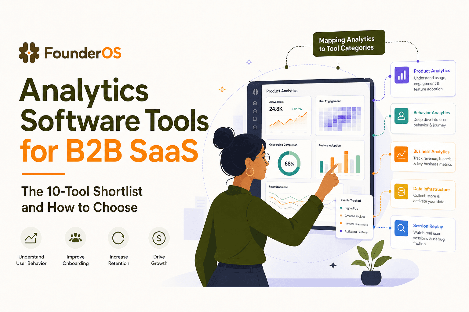
Analytics Software Tools for B2B SaaS - The 10-Tool Shortlist and How to Choose
A BOFU-ready shortlist of analytics software tools for B2B SaaS: 10 picks across categories plus a buyer rubric and rollout plan.

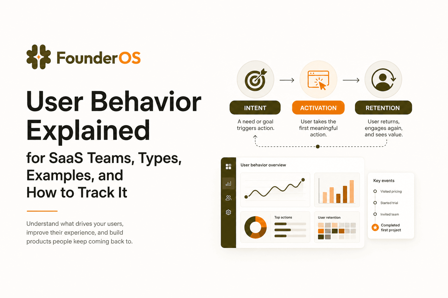
User Behavior Explained for SaaS Teams, Types, Examples, and How to Track It
Learn what user behavior means in SaaS, the key types, and a practical event tracking playbook to turn user behavior into product decisions.
Best Analytics Software for B2B SaaS, A Category-Based Shortlist and Buyer Checklist
Find the best analytics software for B2B SaaS with a 1-minute chooser, category shortlists, GA4 parity checklist, and a 14-day rollout plan.