
Product Walkthrough Tools for B2B SaaS, the Shortlist, Scorecard, and True Cost Comparison
Compare product walkthrough tools for B2B SaaS with a shortlist, success scorecard, and true cost scenarios for 2k, 10k, and 50k users.

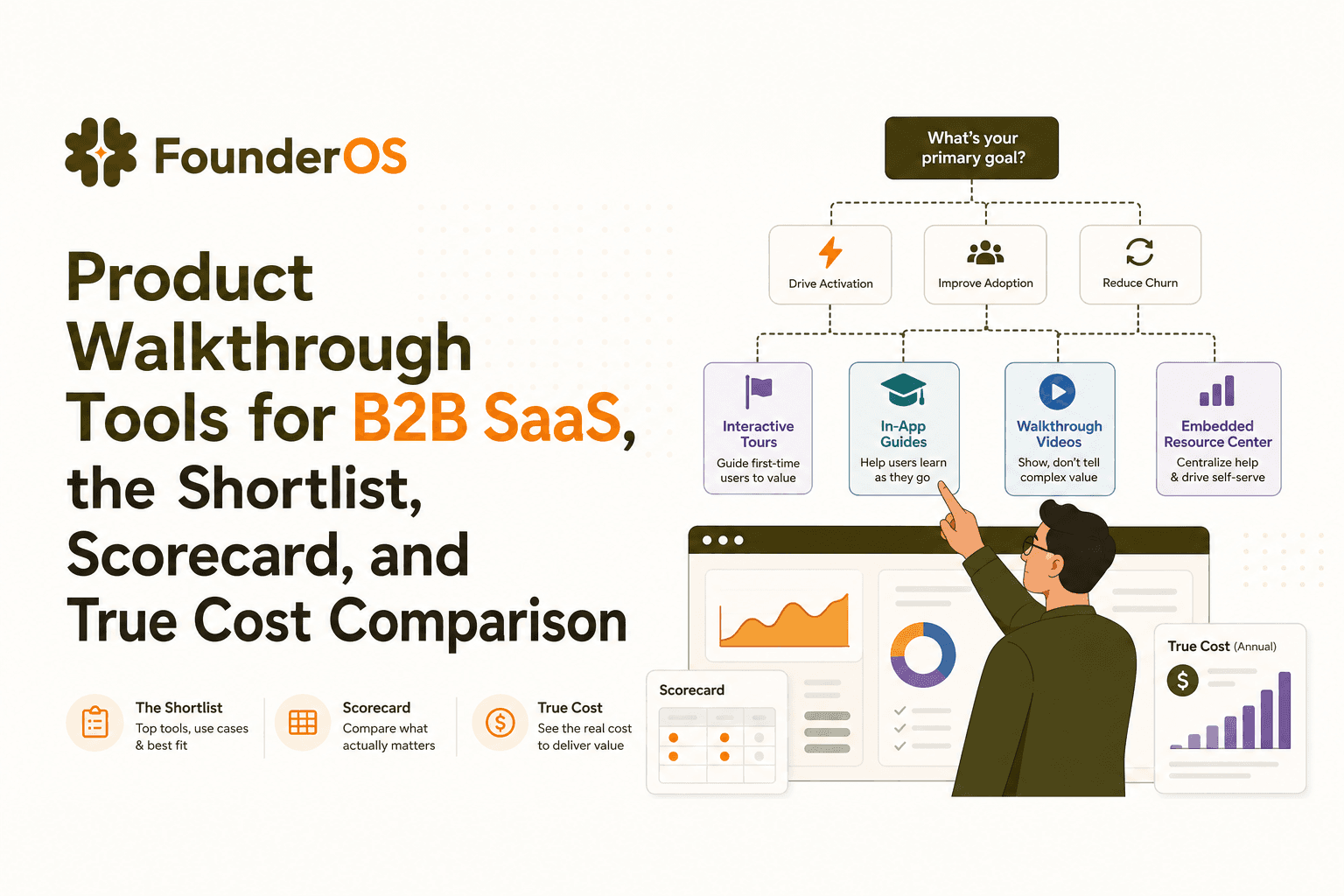
Buying product walkthrough tools is easy; buying the right category (and pricing model) for your SaaS is what prevents broken tours, surprise bills, and “completed the tour but didn’t activate” outcomes.
- Use a 60-second decision tree to pick the right category: in-app onboarding, presales interactive demos, or enterprise DAP.
- Shortlist tools by use case, then validate with a production scorecard (segmentation, triggers, SPA resilience, analytics).
- Normalize pricing into 2k, 10k, and 50k user scenarios to uncover hidden costs like localization, seats, and add-ons.
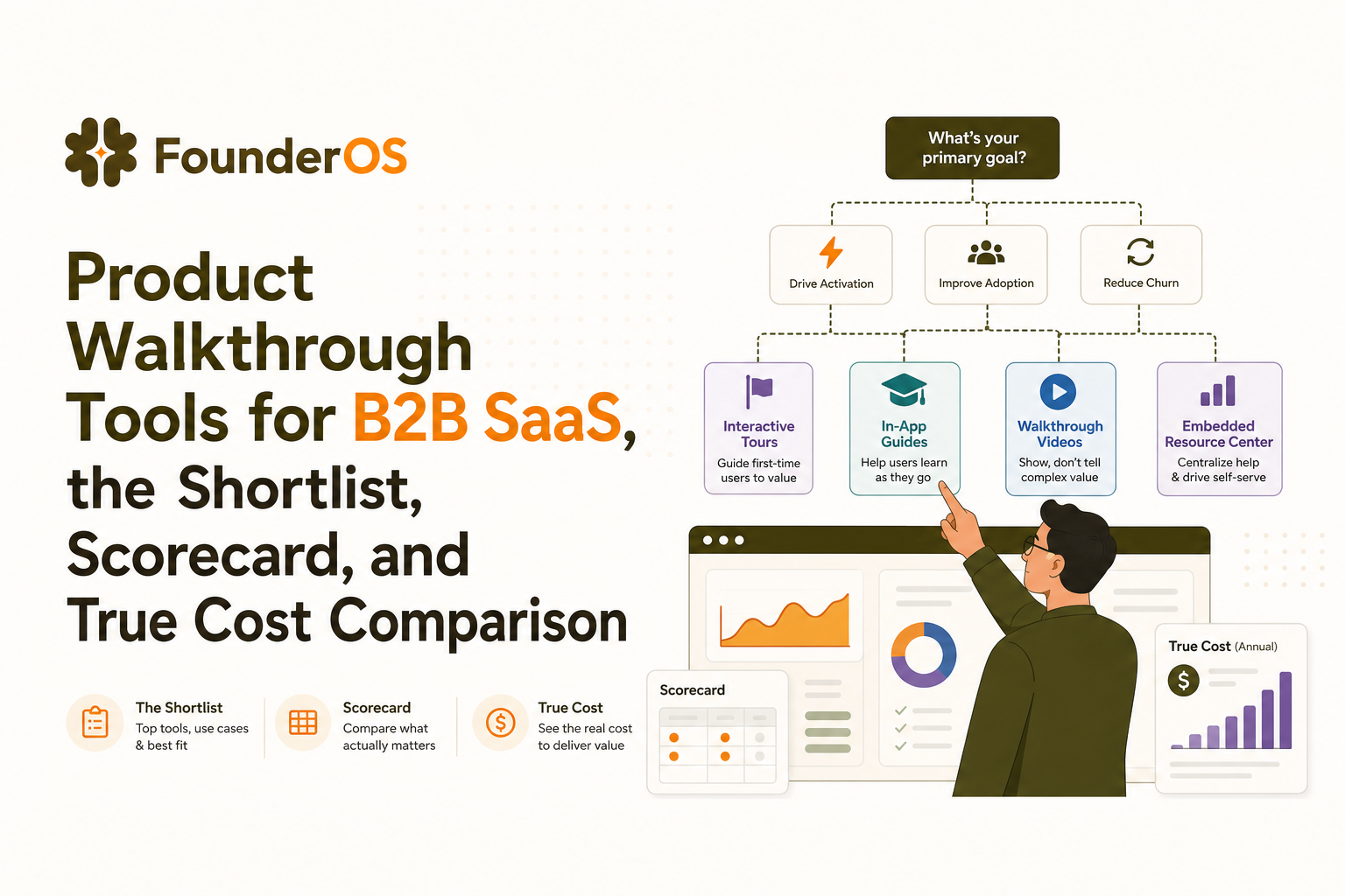
First confirm you are buying the right category of product walkthrough tools
Before you compare vendors, separate the three categories that often get lumped together. If you buy the wrong category, you will either under-serve onboarding or overpay for governance you do not need.
A 60-second decision tree
- If the walkthrough must run inside your app after signup (tooltips, modals, checklists, surveys): you want in-app onboarding product walkthrough tools.
- If the walkthrough must run before signup (sales-led demos, clickable sandboxes, website-embedded flows): you want a presales interactive demo platform.
- If you need enterprise governance (role-based controls, compliance, multi-workspace, deep change management, training overlays across many apps): you want an enterprise DAP (digital adoption platform).
Quick fit checks that prevent category mistakes
- Primary success metric: activation and time-to-value (in-app) vs meeting-to-trial conversion (presales) vs training completion and policy adherence (DAP).
- Where it must work: single SaaS app (in-app) vs many internal tools (DAP).
- Who owns it: product growth (in-app) vs sales engineering (presales) vs enablement and IT (DAP).
Best product walkthrough tools for in-app onboarding, a shortlist by use case
This shortlist focuses on in-app onboarding because it is the most common “activation lever” for B2B SaaS. The ranking below is by fit for typical production needs, not by brand awareness.
1) Userpilot: best for fast iteration with strong UI patterns
- Best for: SaaS teams that want to ship tours, checklists, and in-app messaging quickly and iterate weekly.
- Key strengths: broad pattern library, solid segmentation and targeting, good reporting for non-analysts.
- Deal-breakers to check: how it handles complex single-page apps (SPAs) and whether advanced analytics or localization are gated behind higher tiers.
2) Pendo: best for analytics-first onboarding and larger orgs
- Best for: teams that want product analytics plus in-app guides in one place, especially at larger scale.
- Key strengths: strong analytics heritage, robust guide capabilities, enterprise-friendly controls.
- Deal-breakers to check: pricing complexity at scale and whether you will pay for features your team will not operationalize.
3) Appcues: best for polished onboarding experiences and messaging
- Best for: teams that care about refined UI, in-app announcements, and lifecycle messaging tied to onboarding milestones.
- Key strengths: good builder UX, strong messaging patterns, integrations for lifecycle workflows.
- Deal-breakers to check: depth of branching logic and how resilient flows are when your UI changes.
4) Chameleon: best for highly customized UI and micro-interactions
- Best for: product teams that want walkthroughs to look native and match design systems closely.
- Key strengths: customization control, UI polish, strong patterns for tooltips and microsurveys.
- Deal-breakers to check: implementation effort for advanced customizations and the maintenance burden if your UI changes frequently.
5) Whatfix: best for enterprise DAP-style needs inside complex environments
- Best for: larger organizations where onboarding overlaps with training, governance, and multiple app contexts.
- Key strengths: enterprise DAP depth, governance, multi-app enablement patterns.
- Deal-breakers to check: whether the DAP overhead is justified if your real goal is simply SaaS activation.
How to pick from the shortlist in 10 minutes
- Write your “aha” path in 3 to 7 steps (the minimum actions that correlate with activation).
- Decide the trigger type per step: URL, element visible, event fired, or attribute-based.
- Choose your owner model: product alone vs product plus engineering for selector hardening.
A feature scorecard that actually predicts success in production
Most evaluations over-index on the builder UI. In production, success is driven by targeting accuracy, resilience to UI changes, and whether you can connect walkthrough completion to activation outcomes.
Production scorecard (use this in trials)
- Segmentation depth: can you target by attributes (plan, role), lifecycle stage, and behavior? If you are comparing categories, this is where in-app product walkthrough tools usually win over presales tools.
- Triggers and conditions: URL triggers are table stakes; require event-based and element-based triggers, plus AND/OR logic. For deeper thinking on this, see behavior triggers.
- Branching and personalization: can the flow fork based on role, prior actions, or completion state?
- Localization and variations: languages, right-to-left support if relevant, and versioning per segment.
- A-B testing: step-level experiments and holdouts, not just message-level.
- Analytics that matter: completion and drop-off by step, plus ability to tie to activation metrics (activation event, retention cohort, support ticket rate).
- SPA resilience: stable element targeting when DOM changes, support for dynamic components, and clear diagnostics when a step cannot find its anchor.
Two trial tasks that reveal the truth fast
- Make one flow that branches for two personas (for example, Admin vs Member) and verify the wrong persona never sees the wrong step.
- Simulate a UI change by renaming a class or moving an element; measure how quickly you can detect and fix the broken step.
When we tested onboarding flows across an SPA with frequent UI releases, the tools that offered clearer “step failed to anchor” diagnostics reduced QA time noticeably because we could fix selectors before users hit the broken step.
Pricing that is comparable, normalize MAU vs MTU vs seats into real scenarios
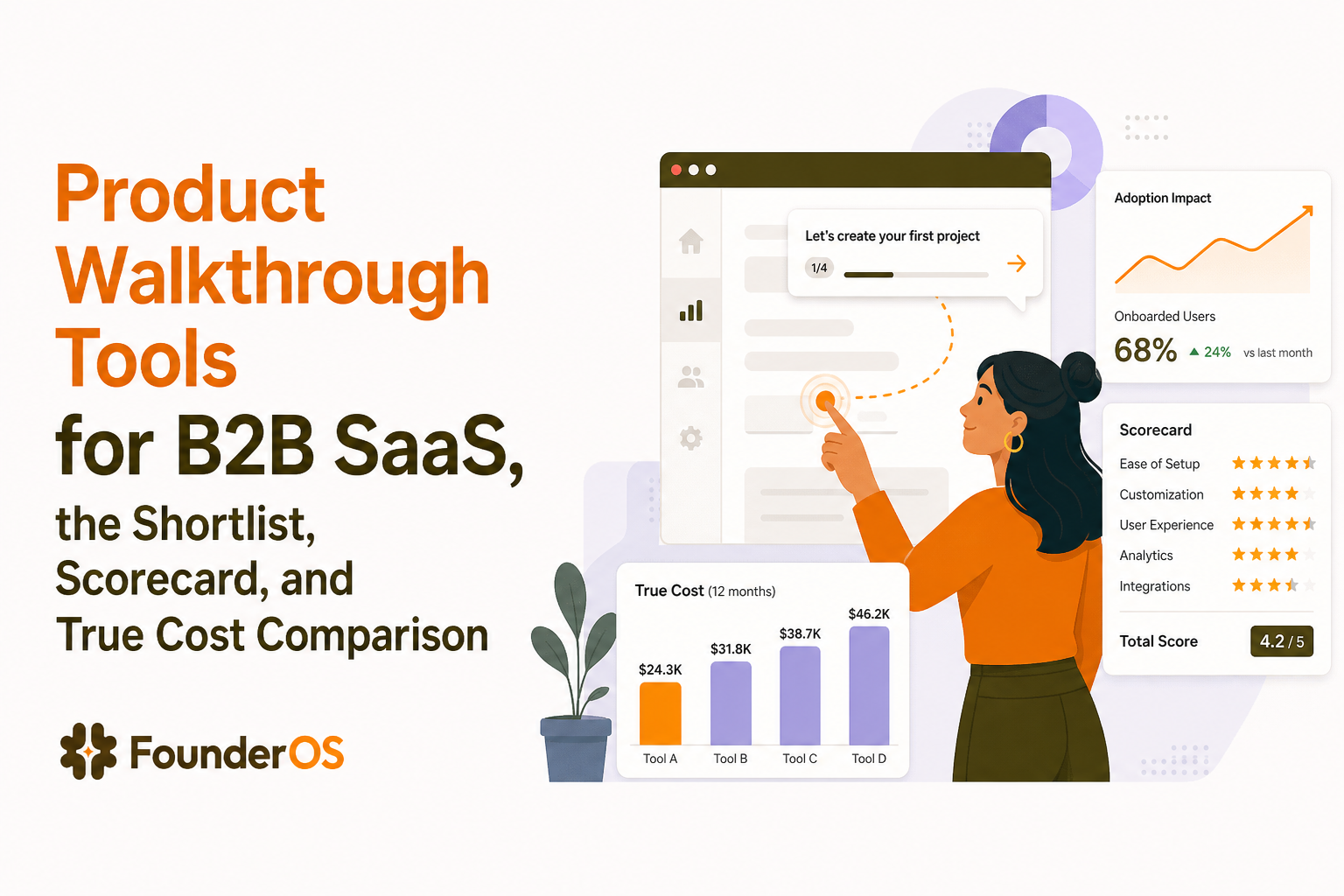
Pricing for product walkthrough tools is rarely apples-to-apples because vendors mix monthly active users (MAU), monthly tracked users (MTU), seats, and feature add-ons. Normalize into scenarios so you can forecast real cost and avoid surprise upgrades.
Step 1: define your counted unit and your “eligible audience”
- Eligible audience: who should see onboarding flows (all users vs new users vs only trial users).
- Counted unit: MAU/MTU definitions vary; ask whether inactive users count, whether internal users count, and whether anonymous visitors count.
Step 2: model three scenarios (2k, 10k, 50k users)
Use these templates in your spreadsheet. Replace “users” with the vendor’s unit (MAU, MTU, or active accounts) and add seats.
- Scenario A (2k): early growth SaaS. Needs segmentation, basic analytics, 3 to 5 seats, 1 to 2 languages.
- Scenario B (10k): scaling SaaS. Needs advanced targeting, branching, QA workflow, 5 to 10 seats, 2 to 5 languages.
- Scenario C (50k): high-scale SaaS. Needs performance guarantees, robust SPA resilience, governance, and analytics you can trust for decisions.
Step 3: uncover hidden costs with five questions
- Is localization included or billed per language?
- Do A-B tests require a higher tier?
- Are advanced segments or event-based triggers paywalled?
- How are seats priced for contractors or agencies?
- Are analytics retention windows limited unless you upgrade?
We initially assumed the “starter” tiers would cover event-triggered flows, but in our experience the upgrade pressure often appears when you need behavioral targeting and experimentation, not when you need more UI patterns.
Implementation checklist to prevent tours breaking after UI changes
Broken steps are the silent killer of onboarding credibility. Treat walkthroughs like UI code: version them, test them, and assign ownership.
Selector and anchoring hardening
- Prefer stable attributes: use data attributes (for example,
data-testidor dedicated onboarding IDs) instead of brittle CSS chains. - Define fallback anchors: if the primary element is missing, either skip the step or anchor to a parent container with a clear message.
- Set “element visible” waits: for SPAs, ensure steps wait for render and state, not just URL.
QA and release process
- Add a pre-release checklist: run through top 3 onboarding flows in staging on every UI release.
- Use a changelog trigger: if a PR touches navigation, settings, or core objects, it triggers walkthrough QA.
- Monitor breakage signals: sudden drop in step-2 completion, spike in “cannot find element” logs, or increased support tickets.
Ownership model that scales
- Single accountable owner: one person owns onboarding quality, even if multiple people build flows.
- RACI for edits: define who can publish, who can edit, and who reviews.
- Monthly audit: remove outdated tours, merge duplicates, and align to the current “aha” path.
After running onboarding audits across multiple releases, the pattern was clear: teams that added stable data attributes up front spent far less time firefighting broken walkthroughs later.
Founder OS as the all-in-one option for walkthroughs plus tracking and segmentation
If you want product walkthrough tools that connect directly to activation measurement without stitching multiple systems together, Founder OS is designed as a combined onboarding and analytics workflow.
A concrete workflow you can run in one place
- Define the activation event you care about (for example, “created first project” or “invited teammate”) and track it.
- Segment users by attributes and behavior so new users, returning users, and power users do not see the same flow.
- Build the walkthrough using the Chrome extension against your live product, then set triggers and conditions so the right segment sees it at the right moment.
- Publish instantly without a deployment cycle, then measure completion and drop-off by step and correlate to activation changes.
Migration steps if you already have tours elsewhere
- Export your current “aha path” as a step list and map each step to a stable UI anchor.
- Recreate one critical flow first (the flow most tied to activation), then validate targeting and SPA behavior.
- Run a 2-week comparison using holdouts to ensure you are improving activation, not just increasing tour completion.
If you are still deciding which approach fits your org, it can help to compare against a broader buyer framework like guided walkthrough software and then narrow to the minimum stack you will actually maintain.
| Decision factor | In-app onboarding tools | Presales interactive demos | Enterprise DAP |
|---|---|---|---|
| Primary job | Activate users inside the product | Convert prospects before signup | Train and govern usage across apps |
| Typical owner | Product growth | Sales engineering | Enablement / IT |
| Must-have capabilities | Segmentation, triggers, branching, SPA resilience | Shareable demo links, guided clicks, lead capture | Governance, multi-app overlays, compliance controls |
| Pricing risk | MAU/MTU growth, add-ons for experiments/localization | Seat-based and content production overhead | High baseline cost and long implementation |
FAQ about product walkthrough tools
How do I know if I need in-app onboarding or an enterprise DAP?
If you are guiding users inside one SaaS product toward activation, start with in-app onboarding. If you must govern training across many internal apps with strict controls, a DAP is the better category.
What features matter most when evaluating product walkthrough tools for a single-page app?
Prioritize element anchoring resilience, “wait until visible” logic, clear failure diagnostics, and a QA workflow. These reduce breakage when the DOM changes.
Should I optimize for tour completion rate?
Use completion as a health metric, but optimize for downstream outcomes: activation events, time-to-value, and retention. A high completion rate can still produce low activation if the flow is not aligned to the “aha” path.
How can I compare pricing fairly across vendors?
Normalize into scenarios (2k, 10k, 50k users), define what counts as an active user, and list required add-ons like localization, A-B testing, and additional seats. Then ask vendors to quote those exact scenarios.
If you want to ship onboarding flows quickly and measure their impact on activation without stitching multiple systems together, start with Founder OS and build one production-ready walkthrough from your highest-leverage activation path.

Written by James Walker
Product Marketing Manager | Helping SaaS teams improve activation, onboarding, and user engagement.
Read Next
View all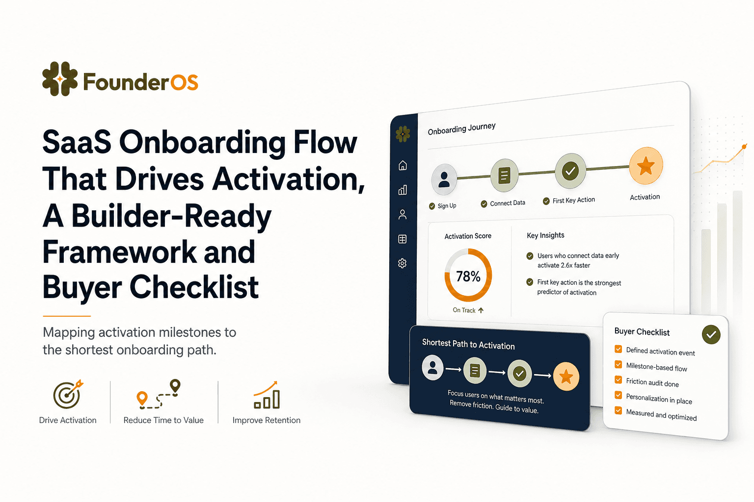
SaaS Onboarding Flow That Drives Activation, A Builder-Ready Framework and Buyer Checklist
Build a saas onboarding flow that drives activation with segments, triggers, tracking, and a buyer checklist for no-code flow builders.

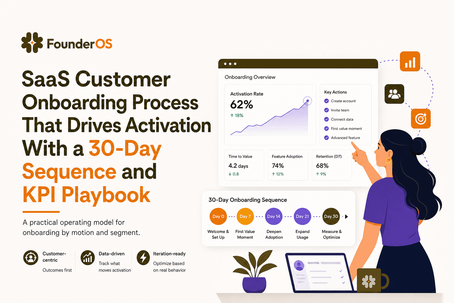
SaaS Customer Onboarding Process That Drives Activation With a 30-Day Sequence and KPI Playbook
Build a saas customer onboarding process with a 30-day sequence, triggers, RACI ownership, and KPI formulas to reach activation faster.

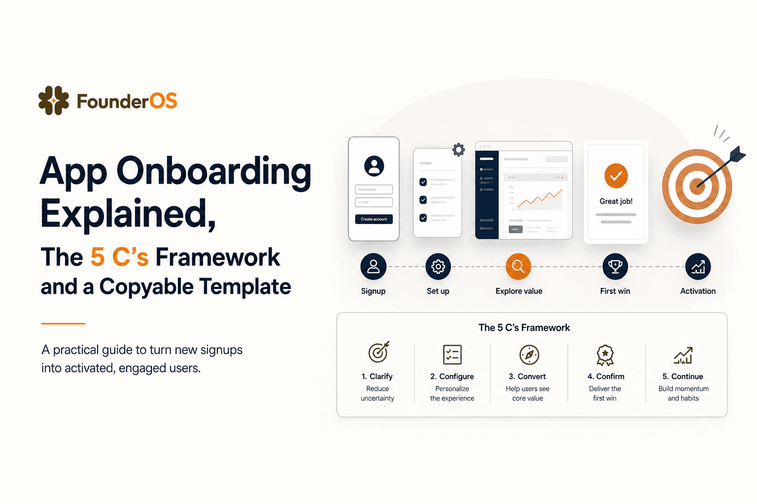
App Onboarding Explained, The 5 C’s Framework and a Copyable Template
Learn app onboarding with the 5 C’s framework, a copyable flow template, and a measurement plan to improve activation and time-to-value.