
Onboarding Design for B2B SaaS, How to Turn First-Time Users Into Activated Users
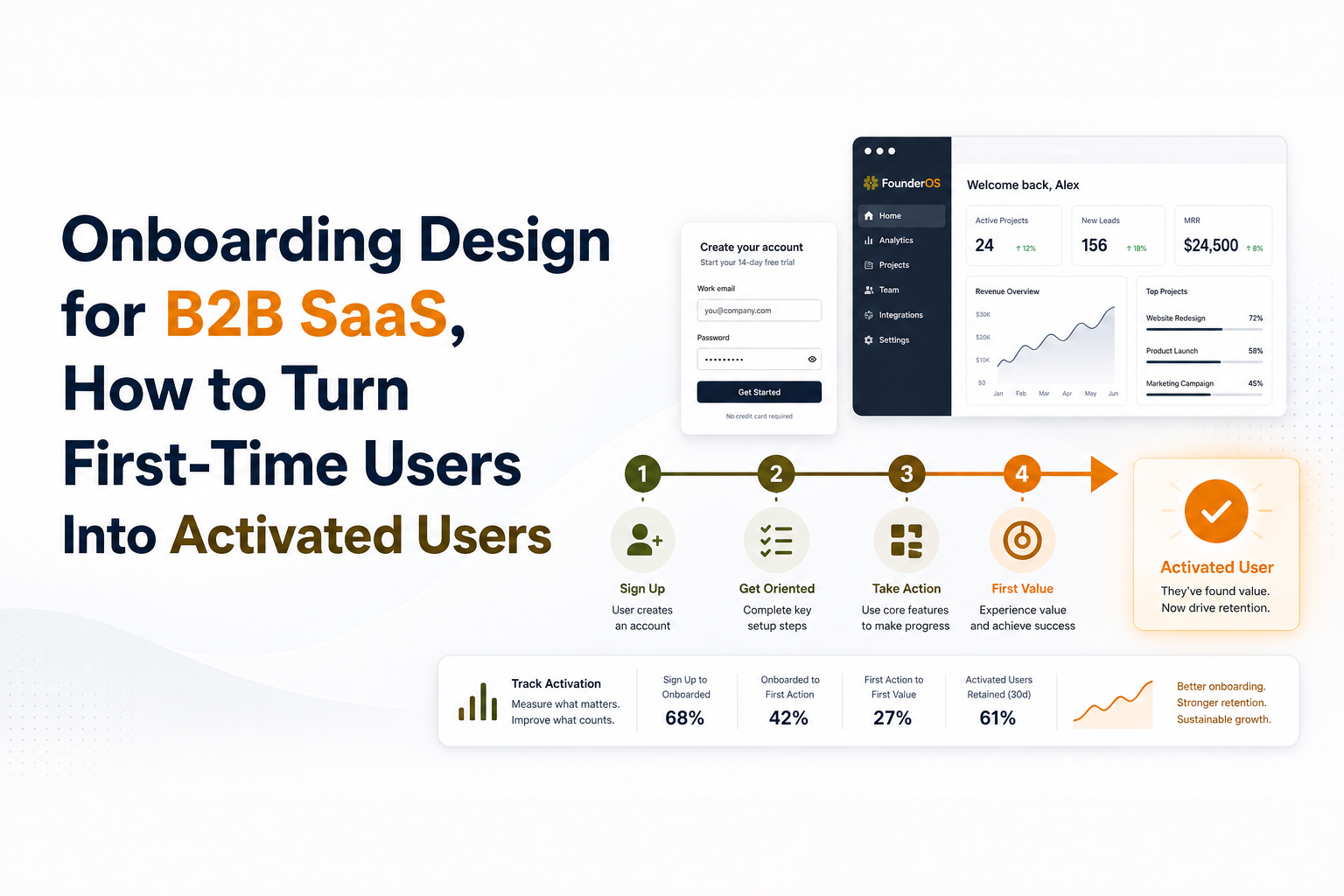
Onboarding design is the practice of shaping a B2B SaaS user’s first-run experience around time-to-value and activation, not just a polished welcome UI. Done well, it helps new signups reach a meaningful outcome quickly, so they keep using the product and adopt key features instead of stalling after “account created.”
- Design onboarding backward from the user’s activation moment (the first meaningful outcome), then build only the steps needed to reach it.
- Strong onboarding design combines flows, prompts, checklists, segmentation, and friction reduction into one measurable system.
- Measure onboarding with activation rate, step drop-off, completion rate, and time-to-value, then iterate with small experiments.
What onboarding design means in B2B SaaS
Onboarding design in B2B SaaS is successful when it reliably moves a new user from “signed up” to “activated” through a measured sequence of product experiences. Unlike generic UX onboarding advice that focuses on tours, tooltips, or “where things are,” B2B onboarding design is about orchestrating the smallest set of actions that prove value for a specific job-to-be-done.
A practical definition you can use internally
Working definition: onboarding design is the set of in-product steps, guidance, and friction-reduction choices that minimize time-to-first-value for each target user segment, and that can be evaluated with event data.
That definition matters because it forces two constraints:
- Outcome-first: you must name the “value moment” (activation) before you build screens.
- Measurable: you must be able to observe the journey via events, not vibes.
How B2B differs from consumer onboarding
B2B onboarding often has more stakeholders, more setup, and a higher “cost of wrong choices.” A few common patterns change what good onboarding design looks like:
- Setup is real work: importing data, connecting integrations, inviting teammates, configuring roles.
- Value can be delayed: the user might not see results until data flows in or a workflow is created.
- Multiple personas exist: admins, end users, and decision-makers want different outcomes.
So a welcome modal and a product tour rarely solve the real problem. The real problem is getting the right persona to complete the critical setup actions that unlock value.
Start with the activation moment, not the welcome screen
Onboarding design gets easier when you define a single activation moment per use case and design backward from it. The welcome screen is just packaging; activation is the point where the user can say, “This works for me.”
Step 1: Write an activation statement
Use this template to make activation concrete:
- Persona: [who]
- Job: [what they came to do]
- Activation moment: “User has successfully [done X] and sees [value Y] within [time window].”
Example (B2B analytics tool): “A product manager has tracked their first key event and viewed a basic funnel within 30 minutes.”
Step 2: Map the minimum viable path (MVPath)
List the minimum steps needed to reach activation, and label each as one of:
- Must-do: required to unlock value (example: connect data source).
- Helpful: improves experience but not required (example: set timezone).
- Later: can be postponed until after activation (example: invite full team).
In our experience working with early-stage B2B SaaS teams, the biggest onboarding wins come from deleting or delaying “helpful” steps that were quietly acting like gatekeepers.
Step 3: Turn steps into observable events
If you cannot measure it, you cannot improve it. Convert each MVPath step into an event name you can track consistently:
- Action event: “integration_connected”
- Progress event: “first_project_created”
- Value event: “report_viewed” or “workflow_ran_successfully”
This event map becomes the backbone of both your onboarding design and your measurement plan.
The core elements of effective onboarding design
Effective onboarding design combines five building blocks that each solve a different failure mode: confusion, overwhelm, misalignment, inaction, and hidden friction. Treat these as a system, not a bag of UI tricks.
1) Onboarding flows that match the user’s job
A flow is the guided sequence that gets a user through the MVPath. Use one of these flow patterns based on your product:
- Linear setup flow: best when steps must occur in order (connect data, then configure).
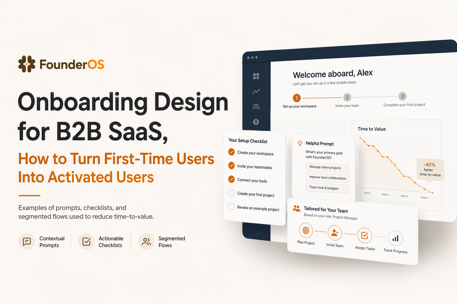
- Choose-your-goal flow: best when multiple use cases exist (pick “Track activation” vs “Reduce churn”).
- Progressive onboarding: best when value can be shown early while setup continues in background.
When you need a deeper framework, start with onboarding flows as a set of repeatable patterns you can apply across features.
2) Prompts that trigger at the moment of need
Prompts include tooltips, banners, empty states, and inline nudges. The rule is simple: prompts should appear when the user is most likely to act, not when you are most eager to teach.
- Empty state prompt: “Create your first project to see your dashboard.”
- Contextual tooltip: shown only after a user clicks into a relevant page
- Just-in-time banner: “Connect Stripe to unlock revenue reporting” on the billing page
If you rely heavily on tooltips, align them to an action and a success event, not a click-through rate. For patterns, see tooltip onboarding.
3) A checklist that encodes the MVPath
A checklist works when it is short, role-specific, and tied to value, not administrative busywork. A good checklist has:
- 3 to 6 items maximum for the initial activation path
- One clear verb per item (Connect, Create, Invite, Publish)
- Immediate feedback when an item is completed
- A visible reward (unlock a template, show a dashboard, reveal a report)
What surprised our team after running several onboarding audits was how often checklists failed because they were “complete the setup” lists, not “reach value” lists. If you want a more adaptive approach, use an onboarding checklist that changes based on what the user already did.
4) Segmentation so different users get different paths
Segmentation is what keeps onboarding design from turning into a one-size-fits-none tour. Start simple with two segmentation layers:
- Declared intent: role, company size, primary goal chosen at signup
- Observed behavior: which pages/features they touched in the first session
Practical rule: create a different MVPath only when the activation moment differs. If two segments share the same activation moment, they probably can share most of the same onboarding design.
5) Friction reduction at the “commitment points”
Friction kills onboarding when it shows up before the user trusts you. Identify your commitment points and make them easier:
- Form friction: reduce required fields; allow “skip” where possible.
- Data friction: offer sample data or a sandbox mode.
- Complexity friction: provide templates instead of blank slates.
- Permission friction: clarify why permissions are needed, right at the prompt.
For broader context on structuring in-product guidance, you can compare these pieces to common app onboarding frameworks, then adapt them to your activation definition.
How to measure whether your onboarding design is working
Onboarding design is working when more users reach activation faster with fewer drop-offs at the critical steps. You do not need a data team to start measuring, but you do need a small set of consistent definitions.
The four metrics that matter most
- Activation rate: % of new users who reach your activation event within a time window (example: 7 days).
- Time-to-value (TTV): time from signup to activation event (median is usually more useful than average).
- Step completion rate: % who complete each MVPath step.
- Drop-off rate: % who stop progressing between two steps (example: created workspace but never connected data).
A simple measurement setup (no advanced stats required)
Use this measurement checklist to keep onboarding analytics clean:
- Name one activation event per use case and keep it stable for at least a few weeks.
- Build one funnel: signup → step 1 → step 2 → activation event.
- Define the time window (commonly 1 day, 7 days, or 14 days depending on setup complexity).
- Segment the funnel by role, acquisition channel, and “first session did X” behaviors.
- Track cohorts over time so you can see whether changes improved outcomes.
How to interpret results without overreacting
Two interpretation rules prevent common mistakes:
- Optimize the biggest drop-off that sits before activation, not the first drop-off you notice.
- Watch TTV alongside activation rate, because a change can increase activation while making activation slower (or vice versa).
After running multiple onboarding experiments, the pattern was clear: changes that reduced cognitive load (fewer choices, clearer next step) often moved both activation rate and TTV in the right direction, even when the UI changes looked “small.”
A simple onboarding design process teams can use this week
A repeatable onboarding design process turns guesswork into a weekly improvement loop you can run with product, design, and growth together. The goal is not to “redesign onboarding,” but to run small, measurable iterations that reduce drop-off and shorten time-to-value.
Step 1: Choose one onboarding journey to fix
Pick one persona and one activation moment. If you try to fix everything at once, you will ship more UI than impact.
- Good scope: “New admins connecting their first integration.”
- Too broad: “All onboarding.”
Step 2: Create a one-page MVPath spec
Document the MVPath in a format that is easy to review:
- Activation event: [event name]
- Steps: 3 to 7 steps maximum
- Friction risks: what could block each step (permissions, missing data, unclear copy)
- Instrumentation: the event name for each step
This one-page spec prevents teams from confusing “help content” with “activation progress.”
Step 3: Run a 30-minute “first-run” test
Before you ship anything, do a fast reality check:
- Create a brand-new account.
- Attempt to reach activation with no prior knowledge.
- Write down every moment you pause to think, search, or ask “what now?”
In our experience, this quick exercise surfaces at least one unnecessary decision point that can be replaced with a default, a template, or a single recommended path.
Step 4: Design one change as an experiment
Keep changes small enough to evaluate clearly. Use this experiment template:
- Hypothesis: If we [change], then [metric] will improve because [reason].
- Primary metric: activation rate or TTV
- Guardrail metric: errors, support tickets, or downstream usage (to avoid “gaming” activation)
- Duration: run long enough to see stable directionality, not just one day of noise
Step 5: Ship, measure, and keep what works
When results are in, decide using simple criteria:
- Keep: activation rate up and TTV down (or clearly improved), with no guardrail regression.
- Iterate: one metric improved but the other worsened.
- Revert: activation down, or guardrails show real harm.
Over time, these small loops create onboarding design that is resilient across new features and new segments, which is the real goal.
| Onboarding component | What it helps | What to measure | Common mistake |
|---|---|---|---|
| Activation definition | Aligns team on “value” | Activation rate, TTV | Choosing a vanity event (e.g., “completed tour”) |
| MVPath flow | Reduces overwhelm | Step completion, drop-off | Including “nice-to-have” setup before value |
| Prompts (tooltips, empty states) | Solves confusion in context | Action event rate after prompt | Measuring only click-through |
| Checklist | Maintains momentum across sessions | Checklist completion, activation | Too many items, not tied to value |
| Segmentation | Keeps guidance relevant | Activation by segment | Creating segments with no different activation moment |
FAQ about onboarding design
If you want to apply this onboarding design framework with fewer handoffs, Founder OS combines product tracking, user profiles, segmentation, and an onboarding tool so you can ship changes and measure activation and time-to-value in the same place. You can start small by instrumenting one activation journey, building a funnel, and iterating week by week.
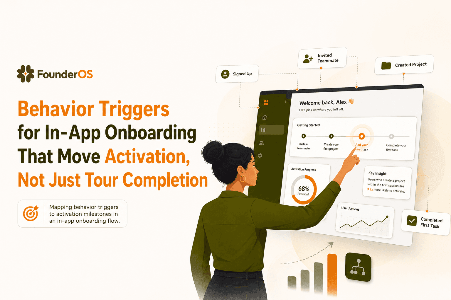
Behavior Triggers for In-App Onboarding That Move Activation, Not Just Tour Completion
Learn behavior triggers for in-app onboarding that drive activation milestones, not just tour completion. Includes trigger taxonomy, tests, and checklists.

High Churn Explained, What Counts as High and What to Check First
High churn explained by type, thresholds, and a fast triage checklist to diagnose churn drivers before fixing anything.
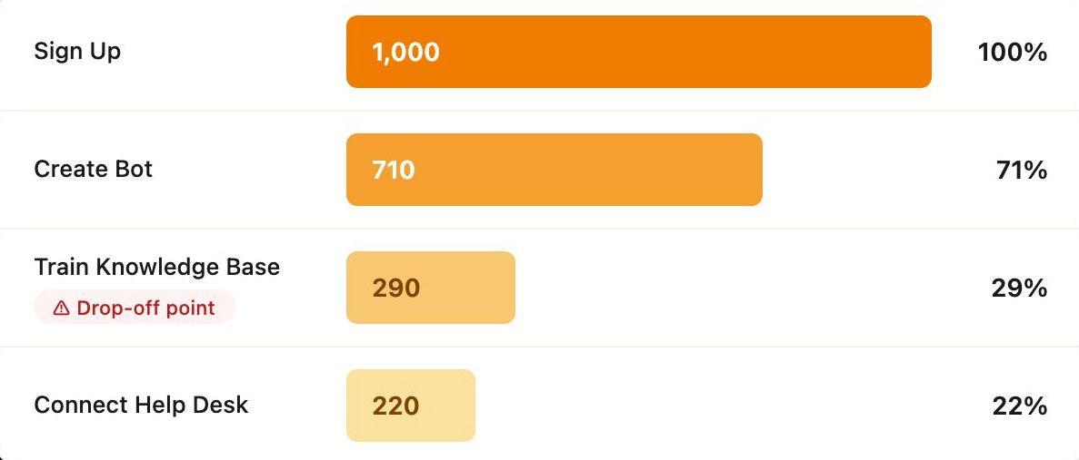
How CX Genie Increased Setup Completion by 61% in 60 Days
Learn how CX Genie improved SaaS user activation by increasing setup completion by 61% in just 60 days with onboarding optimization and activation strategies.