
High Churn Explained, What Counts as High and What to Check First
High churn is a retention warning sign that your product, pricing, onboarding, or billing flow is leaking customers faster than your growth can replace them. The hard part is that teams often label churn as “high” using the wrong metric or the wrong denominator, then fix the wrong thing.
- Separate logo churn, revenue churn, and user or activity churn before you decide you have high churn.
- Use cohort-based comparisons and consistent denominators, otherwise benchmarks and “20% churn” claims become misleading.
- Triage churn in order: measurement and tracking, involuntary vs voluntary, cohort and segmentation, then root-cause patterns.
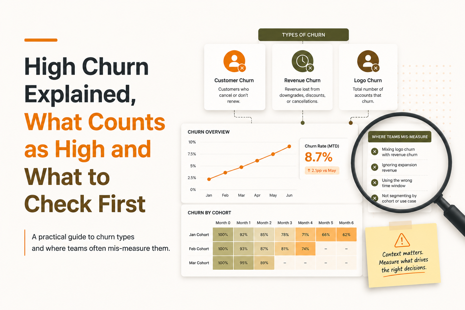
High churn meaning, why it happens, and why it’s so often misdiagnosed
High churn means customer loss is large enough, relative to your customer base and your unit economics, that it materially drags down growth and lifetime value. In practice, churn gets misdiagnosed because teams mix churn types (customers vs revenue vs users), measure across inconsistent time windows, or compare to benchmarks that use different denominators.
Why “high” is a context label, not a universal number
Churn only becomes “high churn” when it breaks your model. For an SMB self-serve product, higher logo churn can be survivable if expansion and acquisition are strong. For enterprise, even a small number of logo losses can be catastrophic if contracts are large and sales cycles are long.
The three most common measurement mistakes
- Mixing periods: quoting monthly churn next to annual benchmarks.
- Mixing populations: using all-time customers in the denominator instead of “customers active at the start of the period”.
- Mixing behaviors with payments: treating “inactive users” as churn without separating product usage decline from account cancellation.
Churn types you must separate before calling it high churn
Churn diagnosis starts by naming the churn metric you are using, because each churn type points to different root causes and different fixes. A team can have low customer churn but high revenue churn (downgrades), or low revenue churn but high user churn (seat reduction masked by annual contracts).
1) Customer (logo) churn
Customer churn rate measures the share of customers that cancel in a period.
Formula: Customer churn % = (Customers lost during period) / (Customers at start of period) × 100
Use it when: you care about account retention (common in B2B SaaS) and cancellations are the primary loss event.
2) Revenue churn (MRR churn) and net revenue retention
Revenue churn captures contraction and cancellations in dollars, not accounts. Most teams track both gross revenue churn and net revenue retention (NRR).
- Gross revenue churn %: (MRR lost from cancellations + downgrades) / (MRR at start of period) × 100
- Net revenue retention %: (Starting MRR + expansions − churn − downgrades) / (Starting MRR) × 100
Interpretation tip: If logo churn is stable but revenue churn is rising, you likely have downgrades, seat shrink, discounting, or plan mismatch, not necessarily product failure.
3) User or activity churn (behavioral churn)
User churn measures the share of users who stop being active, even if the account still pays.
Formula (example): User churn % = (Users active last period who are inactive this period) / (Users active last period) × 100
In our experience working with B2B SaaS teams, “high churn” alarms often start here, because usage drops before cancellation. That is useful, but only if “active” is defined as a meaningful value event (not just logging in).
What counts as high churn, practical thresholds and the 20% question
High churn thresholds depend on business model, contract terms, and whether you’re talking about logo churn or revenue churn, so the safest approach is to use ranges plus a reality check on what the number implies annually. A monthly churn number that looks “only” 5% compounds quickly across a year.
A practical context table (use as a starting point, not a promise)
The table below is meant to help you ask better questions, not to declare winners and losers. Always compare your metric definition and period to the benchmark you’re referencing.
- SMB self-serve SaaS (monthly plans): logo churn often reads higher; watch behavioral churn and time-to-value.
- Mid-market SaaS (monthly or annual): downgrades can drive revenue churn even when logo churn looks fine.
- Enterprise SaaS (annual, multi-year): logo churn is typically low, but when it happens the impact is large; expansions and renewals dominate.
How to interpret “20% churn” without fooling yourself
“20% churn” is incomplete unless it specifies the period. If you lose 20% of customers per month, the remaining base after 12 months is 0.8^12, which is about 6.9% retained, meaning roughly 93% churned over the year. If you lose 20% per year, that’s a very different business situation and usually points to renewal and customer success issues more than onboarding.

Benchmarking correctly, make apples-to-apples comparisons
Correct churn benchmarking requires aligned cohorts, consistent denominators, and clear contract assumptions, otherwise you will compare numbers that look similar but measure different realities. This is where many “high churn” narratives go wrong: the benchmark might be net revenue retention while you’re looking at logo churn, or the benchmark might be annual while you’re measuring monthly.
Benchmarking checklist (quick but strict)
- Match the churn type: logo churn vs gross revenue churn vs NRR vs user churn.
- Match the period: monthly with monthly, annual with annual. If you must convert, state assumptions explicitly.
- Use the same denominator: “start of period” base is standard for churn; avoid averaging unless you explain why.
- Align contract structure: monthly self-serve behaves differently from annual invoiced contracts with true-ups.
- Compare by cohort, not blended averages: acquisition mix changes over time; blended churn hides that.
Monthly to annual conversion (safe framing)
If churn is a constant monthly rate r, annual retention is approximately (1 − r)^12. This is a simplification, but it is directionally better than multiplying by 12, and it makes compounding visible.
What surprised our team during churn audits
What surprised our team was how often “churn is up” was actually “acquisition mix changed”, meaning a new channel brought lower-fit customers who churned faster. A simple customer cohort analysis by signup month usually surfaces that within an hour.
High churn triage, a prioritized checklist to find the real driver fast
A reliable high churn triage flow checks measurement first, then separates involuntary from voluntary churn, then segments by cohort and behavior before you jump to solutions. This order matters because every step narrows the problem space and prevents you from fixing symptoms.
Step 1: Verify tracking and definitions (before analysis)
- Define “active”: pick 1 to 3 value events (for example: created project, invited teammate, shipped first report) instead of “logged in”.
- Confirm the churn event: cancellation date vs end-of-paid-term vs last activity date are different.
- Audit the denominator: customers at start of period, excluding new customers added mid-period if you want classic churn.
If you are still building your instrumentation, start with a KPI-first analytics events tracking plan so churn analysis is tied to real product value, not vanity actions.
Step 2: Split involuntary vs voluntary churn
- Involuntary churn signals: failed payments, card expiry, invoice friction, dunning gaps.
- Voluntary churn signals: explicit cancellation reasons, declining usage leading up to cancel, downgrade then cancel.
When we tested this split on a subscription business, we found a meaningful share of “churn” was payment failure rather than dissatisfaction, which completely changed the fix list from product work to billing and dunning.
Step 3: Cohort the churn, then read the curve
Build cohorts by signup month (or contract start month) and look at retention over time, because churn patterns usually cluster around specific lifecycle moments: week 1 onboarding, day-30 evaluation, renewal month, or post-implementation.
- Early cliff: activation failure and unclear time-to-value.
- Slow decay: weak habit formation, low feature adoption, or commoditized value.
- Renewal spike: ROI narrative, stakeholder change, procurement friction.
To make this visual and comparable, teams often chart a cohort retention curve rather than staring at a single blended churn percentage.
Step 4: Segment to find the driver (not the average)
High churn is rarely uniform. Segment by one dimension at a time and look for the biggest deltas:
- Acquisition source: paid search vs integrations vs referrals.
- Company size or use case: SMB vs mid-market; single-player vs team workflows.
- First value path: which “aha moment” event they hit first, if any.
- Plan and pricing: churn by tier often reveals mismatch.
Step 5: Tie churn back to a drop-off moment you can fix
Once you know which segment churns, map the last successful steps before churn and where users stall: onboarding steps completed, core feature first-use, teammate invite, integration connected, report exported. This is where retention analysis becomes actionable: you can point to a specific moment that predicts cancellations, not just a percentage that scares people.
| Triage question | If “yes”, likely driver | What to check next |
|---|---|---|
| Is churn mostly payment failures? | Involuntary churn | Dunning coverage, retry logic, card updater, invoicing friction |
| Do cohorts show an early retention cliff? | Activation and onboarding issues | Time-to-first-value, onboarding completion rate, first “aha” event rate |
| Is revenue churn worse than logo churn? | Downgrades and contraction | Seat usage, feature gating, plan fit, pricing and packaging |
| Is churn concentrated in one channel? | Low-fit acquisition mix | Channel messaging, landing page promise vs product reality, sales qualification |
| Do cancellations spike at renewal milestones? | Value proof and stakeholder alignment | ROI reporting, champion enablement, renewal comms, success plans |
FAQ
If you want a simple next step, run the triage checklist above on one recent churn window and document where the first drop-off happens. If you need lightweight tooling to instrument key events, build conversion funnels, segment cohorts, and spot where high churn starts in the journey, Founder OS can help you get there quickly with product tracking and onboarding flows without turning this into a data team project.
Interactive Product Tour Explained, A Practical Framework for SaaS Teams
Learn what an interactive product tour is, when to use it vs demos, and how to plan, build, and measure tours that drive activation.
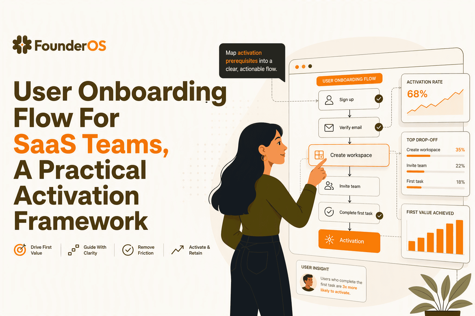
User Onboarding Flow For SaaS Teams, A Practical Activation Framework
Build a user onboarding flow around activation: map intent, choose the right in-app steps, measure time-to-value, and iterate by segment.
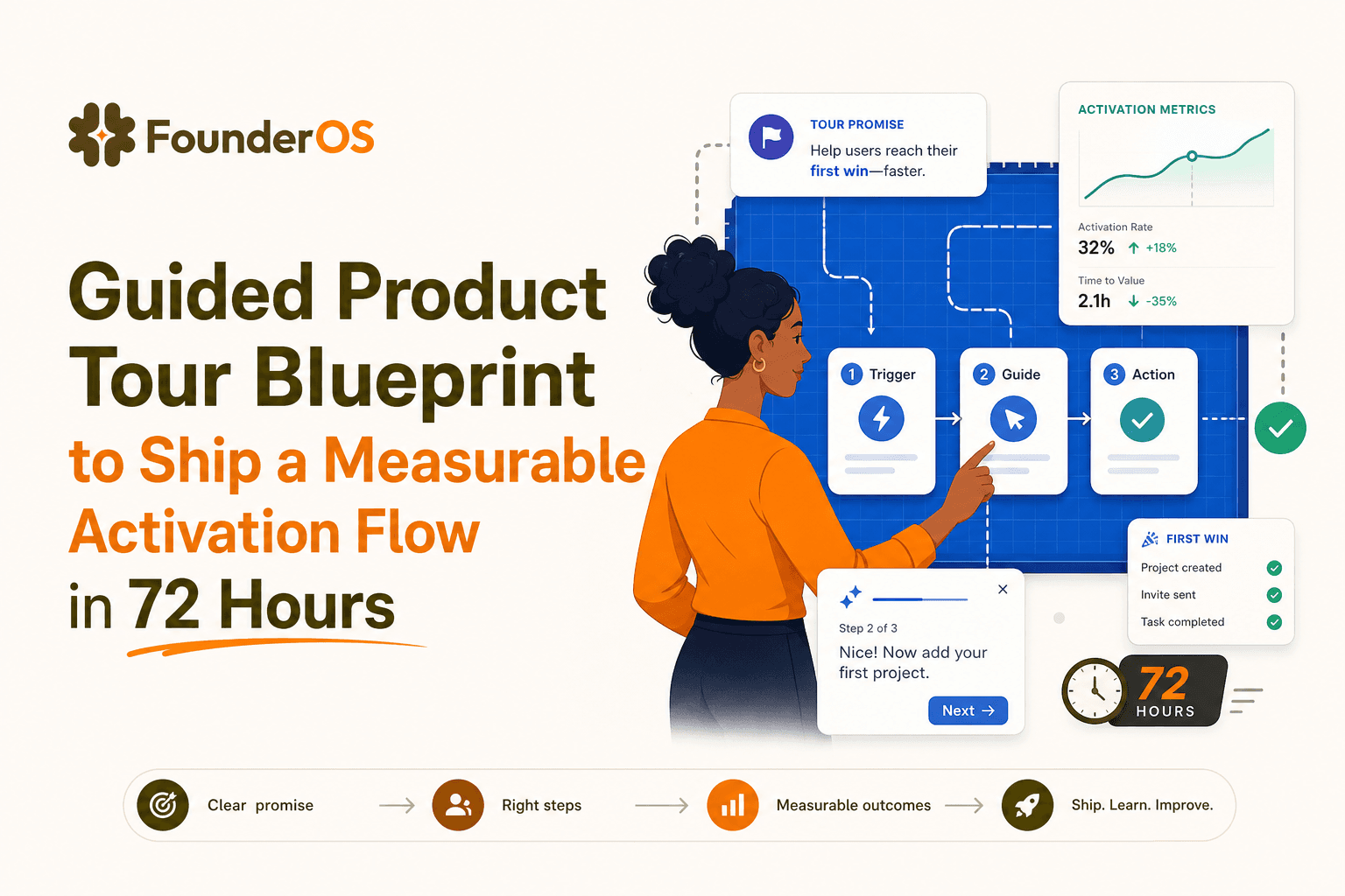
Guided Product Tour Blueprint to Ship a Measurable Activation Flow in 72 Hours
A guided product tour blueprint to ship in 72 hours: define the promise, map steps to events, segment entry rules, and measure activation.