
Interactive Product Tour Explained, A Practical Framework for SaaS Teams
Learn what an interactive product tour is, when to use it vs demos, and how to plan, build, and measure tours that drive activation.
An interactive product tour is an in-app, click-through guidance flow that leads users to a specific outcome (not just a sequence of screens), and it is one of the fastest ways to reduce time-to-value for new SaaS users when it is tied to a clear “aha” action. The problem is that many teams ship tours that get completed but do not change activation, because the tour is designed around UI coverage instead of user intent and measurable behaviors.
- Design an interactive product tour around one user goal and one measurable “aha” behavior, not around feature coverage.
- Choose the right format (tour vs walkthrough vs demo vs video) using a simple decision matrix based on audience, context, and desired action.
- Measure success with a ladder of metrics: step interaction quality, drop-off by step, activation events, and downstream adoption.
What an Interactive Product Tour Is and Why SaaS Teams Use It
Interactive product tours work best when they guide a user to complete a real task inside the product, using prompts that react to what the user does. Unlike a passive video or a static help article, a tour can require interaction (click, type, choose, confirm) and can branch based on user state, which makes it useful for onboarding and feature discovery.
A practical definition you can design against
Use this definition to keep the scope tight: an interactive product tour is a short, in-context flow that (1) appears at the right moment, (2) highlights the next best action, (3) validates completion of that action, and (4) ends only after the user reaches a pre-defined value milestone. “Short” is deliberate: if the flow cannot fit in 3 to 7 steps, it is usually multiple jobs-to-be-done bundled together.
Why teams ship tours, and why many of them underperform
SaaS teams use tours to compress the time between signup and value, especially when the product has a non-obvious first setup step (connecting data, inviting teammates, creating the first project). The underperformance pattern is consistent: teams optimize for “tour completion” because it is visible, but completion is not the same as activation.
The activation-first lens (a simple causal chain)
To connect tours to growth outcomes without guesswork, map your tour to this chain:
- Prompt: the user sees guidance at a moment of intent (first visit to a screen, after an empty-state click).
- Action: the user performs the key step (create, connect, invite, configure).
- Confirmation: the product shows evidence of progress (a created object, a populated dashboard, a “connected” state).
- Repeatable use: the user returns and repeats a core action within your chosen window (often days, not minutes).
In our experience auditing onboarding flows for early-stage B2B SaaS, the biggest lift comes from improving the confirmation part of the chain: users are more likely to continue when the tour forces a visible outcome (not just a click on a menu).
Interactive Product Tour vs Walkthrough vs Demo Choose the Right Format
The right format depends on whether the user can take the real action inside the environment and whether you need the product UI to respond to their input. An interactive demo is best when the user is not yet in a live account; an in-app tour is best when the user is already inside the product and you can observe state and behavior.
Decision framework: choose by context, audience, and “reversibility”
Use these three questions to decide quickly:
- Where is the user? Outside the app (marketing, sales) or inside the app (signed in)?
- Do you need real data and permissions? If yes, favor in-app guidance. If no, a demo environment may be enough.
- Is the action reversible? If the action is risky (billing, permissions, deletions), use a lighter walkthrough or video first, then guide the real action with guardrails.
Format fit by outcome
- Interactive demo: best for pre-signup evaluation and sales enablement, focused on understanding value propositions.
- In-app guided tour: best for first-time setup and early activation, focused on completing “aha” tasks.
- Product walkthrough (non-interactive or lightly interactive): best for orientation and navigation, focused on reducing confusion.
- Video: best for conceptual understanding, focused on “what is possible,” not “do it now.”
Two common mismatches to avoid
- Using a video when the user needs to configure something: videos explain, but they do not verify completion. Tours can.
- Using an in-app tour for a product that needs a lot of data first: if value requires imports or integrations, start with a demo or checklist that sets expectations, then launch a tour once prerequisites are met.
If you are specifically designing a measurable in-app flow, the guided product tour format is usually the most reliable starting point because it can enforce a sequence of real actions instead of passive reading.
The Core Elements of a High-Converting Interactive Product Tour
A high-converting interactive product tour is built from a small set of elements that tie guidance to intent, personalize the next step, and instrument the flow so you can improve it. You do not need every UI pattern, but you do need a consistent structure and measurement.
Element 1: a single “tour job” and a stop condition
Define your tour job in one sentence: “Help [persona] do [task] so they get [value].” Then define a stop condition that is observable: an event fired, an object created, a state changed. If you cannot define a stop condition, you do not have a tour yet; you have documentation.
Element 2: interaction design patterns that match the step type
Match the UI pattern to what the user needs to do:
- Modal: use for setting context or confirming a milestone. Keep to 1 to 2 per flow.
- Tooltip: use for precision instructions on a specific element.
- Speech bubble: use for multi-step guidance anchored to the UI, especially when the user must click and then look elsewhere.
- Survey prompt: use to capture intent (“What are you here to do?”) and route users to the right flow.
We initially assumed longer flows would teach more, but after running onboarding reviews across multiple apps, the pattern was clear: adding steps past the first successful task increases drop-off faster than it increases understanding.
Element 3: segmentation and timing (the relevance engine)
Relevance comes from who sees the tour and when. A practical targeting checklist:
- User state: first session vs returning, role (admin vs member), plan type, integration connected or not.
- Behavioral intent: visited a page twice, clicked “Create” but did not finish, hovered on a setting, opened an empty state.
- Context: URL, feature flag state, device type (mobile tours often need fewer steps).
For deeper targeting mechanics, this guide to behavior triggers is a helpful companion because it focuses on intent signals rather than “show on first login.”
Element 4: analytics that support iteration (not vanity)
Instrument the tour like a mini product: track impressions, step views, step interactions, exits, completion, and the activation event the tour is meant to influence. If you already have event naming standards, align tour events to them; if you do not, start with a small schema and expand later. A KPI-first approach to analytics events tracking prevents the common failure mode where tours ship without a measurable hypothesis.
Interactive Product Tour Examples Across SaaS Use Cases
Interactive product tour examples are most useful when they show the flow structure and the interaction pattern, because the same UI components can produce very different outcomes depending on sequencing. The templates below are organized by goal so you can reuse the structure.
Example 1: New user activation, “Create the first thing”
- Trigger: user lands on an empty dashboard for the first time.
- Step pattern: modal (set expectation) → tooltip (point to primary CTA) → anchored bubbles for the form → confirmation step that points to the resulting object.
- Stop condition: “Created [object]” event plus object detail page viewed.
Design note: treat the form as a sequence of micro-commitments. If there are optional fields, hide them behind “Advanced” and do not let the tour drag the user through them.
Example 2: Lead capture or trial conversion, “Show value before asking for setup”
- Trigger: user clicks a feature page from marketing or a “Try it” button in-app.
- Step pattern: 2-step preview (what they will get) → interactive step that creates a sample dataset or template → lightweight prompt to continue (invite teammate, connect integration).
- Stop condition: user reaches a value screen with populated content (not a blank state).
Copy note: avoid “Let’s take a tour.” Use outcome language like “Create your first report” or “Send your first invite.”
Example 3: Feature launch, “What changed and what should I do?”
- Trigger: user visits the updated screen after release, or a feature flag turns on.
- Step pattern: modal announcement (one sentence) → 2 to 4 tooltips that highlight only net-new actions → optional “Show me later” button.
- Stop condition: user completes one new action (toggle, setting, new workflow run).
Design note: launches often fail because they explain every change. Instead, guide the first successful use and link out to deeper docs for the rest.
Example 4: Sales enablement in a live account, “Prove collaboration value”
- Trigger: account has one user and has created at least one object.
- Step pattern: tooltip pointing to “Invite” → bubble explaining permission roles → confirmation step showing activity feed populated by the invited user.
- Stop condition: invite sent and second user completes first action.
If your team needs a structured way to document a flow before building it, start from a product walkthrough step map, then convert the critical path into an interactive tour.
How to Build an Interactive Product Tour From Planning to Launch
A reliable build process for an interactive product tour starts with a measurable hypothesis, then narrows to one audience and one critical path before you ever write tooltip copy. The steps below prevent the common “tour as UI highlight reel” problem.
Step 1: define the “aha” moment as an observable event
Write down one activation behavior that indicates value. Examples: “connected data source,” “invited teammate,” “created first project,” “published first report.” If the action is multi-step, pick the smallest meaningful milestone you can verify.
Step 2: choose one audience segment and one entry point
Do not start with “all new users.” Start with a segment that shares the same goal and constraints. A useful segmentation checklist:
- Role: admin vs non-admin
- Use case: reporting vs collaboration vs automation
- Readiness: has data connected, has teammates, has completed setup step 1
Entry points should be behavioral and contextual: first visit to a page, clicking an empty state, or failing an action. Avoid launching tours on login unless the first screen is always relevant.
Step 3: map the critical path and remove branches
Draft the critical path as 5 to 9 bullets. Then prune anything that is “nice to know.” If you have branches (different ways to do the task), pick one default path and handle alternatives with optional links or a second tour. This keeps cognitive load low and makes measurement clearer.
Step 4: write step copy that tells users what to do and what they will get
Good step copy has two parts: instruction and outcome. A simple copy formula:
- Instruction: “Click Create project.”
- Outcome: “This gives you a place to track your first workflow.”
Keep each step to one sentence if possible. Use product terms the UI already uses so the user can visually match your words to the screen.
Step 5: add guardrails, then publish and iterate
Add “skip,” “remind me later,” and escape hatches for advanced users. Before you publish, test three scenarios: brand new user, returning user who already completed the task, and a user without permissions. After launch, review step drop-off and the activation event weekly, and treat the tour as a living flow.
How to Measure Whether Your Product Tour Actually Works
Product tour measurement should connect the tour to a user behavior that matters, using a ladder of metrics that starts with step-level friction and ends with activation or adoption. If you only look at completion rate, you will miss the difference between “users clicked Next” and “users achieved value.”
The measurement ladder (from local to business impact)
- Exposure: how many eligible users saw the tour (impressions among the target segment).
- Engagement quality: click-through on required steps, time per step, and exits.
- Flow health: drop-off by step, especially before the first required action.
- Activation impact: lift in the “aha” event completion compared to a holdout or to a pre-launch baseline.
- Downstream adoption: repeat usage of the core feature after the first success (for example, within 7 to 14 days).
Three practical measurement setups (pick one)
- Before/after baseline: compare activation event rate in the same segment for a fixed window pre-launch vs post-launch. Good for quick iteration, weaker on causality.
- Holdout group: exclude a small slice of eligible users from seeing the tour and compare activation. Stronger evidence, requires targeting controls.
- Step-gated analysis: compare users who reached the first required action step vs users who exited before it. Good for isolating where friction starts.
What to look for in your data review
- Early exits: high exits on step 1 usually means bad timing or an unclear promise.
- Mid-flow confusion: drop-off at a step anchored to a UI element often indicates the element is not visible (responsive layouts, permission states, scrolling).
- No activation lift: if activation does not move, the tour might be teaching navigation instead of driving the value action, or the activation event is mis-specified.
What surprised our team was how often “perfect completion” still failed to move activation, because the tour ended before the user saw a meaningful result state. Once we changed the stop condition to require a visible outcome screen, the post-tour adoption analysis became much more informative.
Common Interactive Product Tour Mistakes and How to Avoid Them
Most interactive product tour mistakes come from prioritizing coverage and aesthetics over relevance and verification, and you can catch them with a pre-launch checklist. The goal is not to make tours shorter at all costs; the goal is to make each step necessary and measurable.
Mistake 1: turning the tour into a feature parade
Symptom: steps bounce across navigation items and explain what each menu does. Fix: reframe the tour as one job-to-be-done and move secondary education to an optional resource link or a later tour.
Mistake 2: showing the same flow to everyone
Symptom: experienced users get interrupted, or users without permissions hit dead ends. Fix: segment by role and state, and add eligibility checks (for example, only show the “Invite teammates” tour if the account has one user and the viewer is an admin).
Mistake 3: relying on “Next” clicks instead of verified actions
Symptom: completion looks high, but activation does not change. Fix: require at least one “do” step where the user must click the real UI element, and end only after the activation event fires.
Mistake 4: poor timing and weak entry triggers
Symptom: users dismiss the tour immediately. Fix: trigger on intent signals such as empty-state interactions, repeated visits, or failed attempts. If the product has multiple use cases, ask a one-question in-app survey first to route users.
Mistake 5: shipping without an iteration cadence
Symptom: tours go stale after UI changes, or they keep pointing to deprecated flows. Fix: review tour analytics on a schedule (weekly early on, then monthly), and add a UI change checklist to your release process so tours get updated alongside product changes.
| Planning decision | Good default | Red flag | What to change |
|---|---|---|---|
| Tour goal | One task tied to an activation event | “Show all key features” | Pick one persona goal and one stop condition |
| Length | 3 to 7 steps with 1 to 2 required actions | 10+ steps, mostly reading | Split into multiple tours by job |
| Targeting | Role + state + intent trigger | “On first login for everyone” | Add eligibility rules and behavioral triggers |
| Success metrics | Activation lift and step drop-off | Completion rate only | Instrument activation and adopt a holdout when possible |
FAQ about interactive product tours
How long should an interactive product tour be?
Most effective tours stay within 3 to 7 steps, with at least one verified action step, because longer flows increase cognitive load and make it harder to connect the tour to a single measurable outcome.
What is the difference between a product walkthrough and an interactive product tour?
A product walkthrough often focuses on orientation and explaining screens, while an interactive product tour is designed to make the user complete a task inside the product and can enforce that completion through required interactions and stop conditions.
What should I measure besides completion rate?
Track step-level drop-off, interactions on required steps, and the activation event your tour is meant to influence. If possible, compare against a holdout group to estimate lift rather than relying only on before/after changes.
When should I use an interactive demo instead of an in-app tour?
Use an interactive demo when the user is not yet in a live account or when value can be shown without real data and permissions. Use an in-app tour when the user needs to complete real setup or creation actions and you want to verify completion.
If you are ready to build an interactive product tour that is tied to activation events and segmented by user behavior, Founder OS combines a no-code onboarding tool with user segmentation and product tracking so you can ship guidance quickly and measure what changes after launch.
Read Next
View all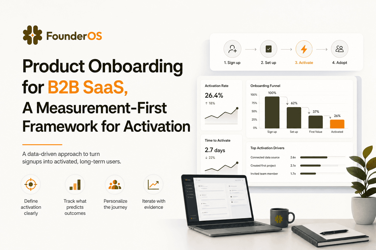
Product Onboarding for B2B SaaS, A Measurement-First Framework for Activation
Learn product onboarding as a measurable system: activation metrics, event tracking, funnels, and a 1-week framework to improve time-to-value.
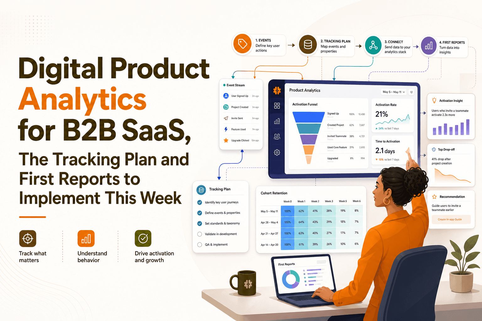
Digital Product Analytics for B2B SaaS, The Tracking Plan and First Reports to Implement This Week
Implement digital product analytics in a B2B SaaS: a minimal event schema, week-1 funnel and retention reports, and a 7-day rollout plan.
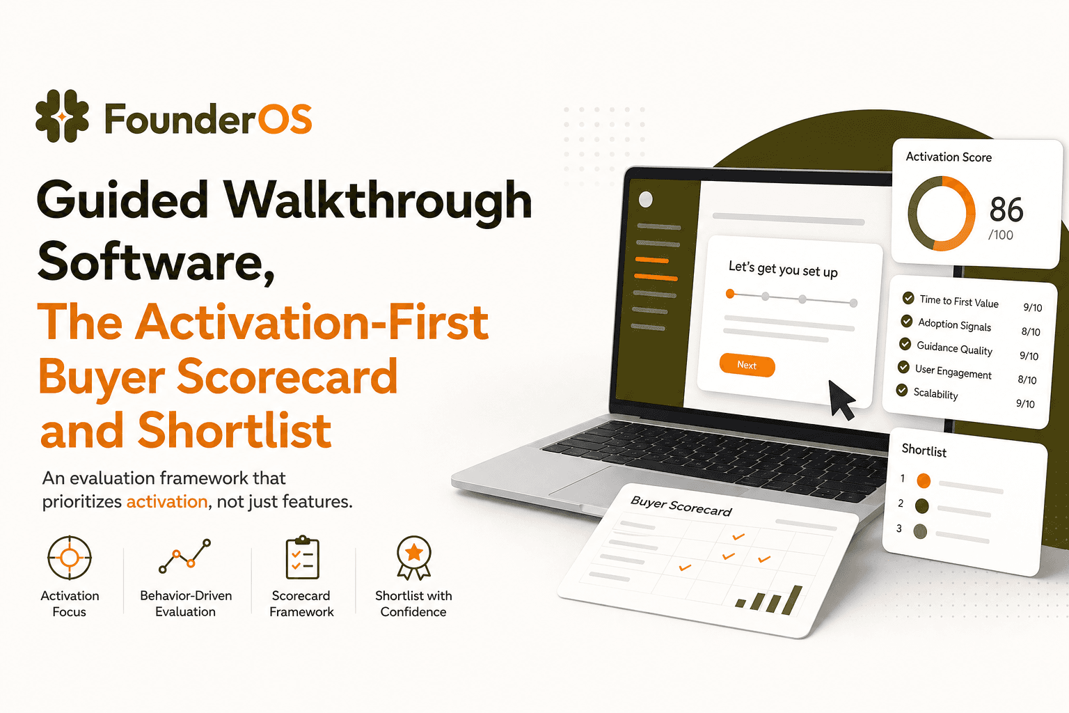
Guided Walkthrough Software, The Activation-First Buyer Scorecard and Shortlist
Compare guided walkthrough software with an activation-first scorecard, tool categories, analytics proof, and a 7-day pilot plan.