
Product Walkthrough Template for SaaS Teams - A Step Map, Copy Blocks, and KPI Plan
Product walkthrough execution gets easier when you treat it like a measurable activation flow, not a one-off tour, so this guide gives you a copy-and-paste step map, launch checklist, and KPI schema you can instrument in a single sprint.
- Start with a single 60-second path to the first user action, not a feature dump.
- Build every step with an exit, a failure state, and a trackable event so you can iterate on drop-off.
- Report weekly on step completion and downstream activation events, then change one variable at a time.
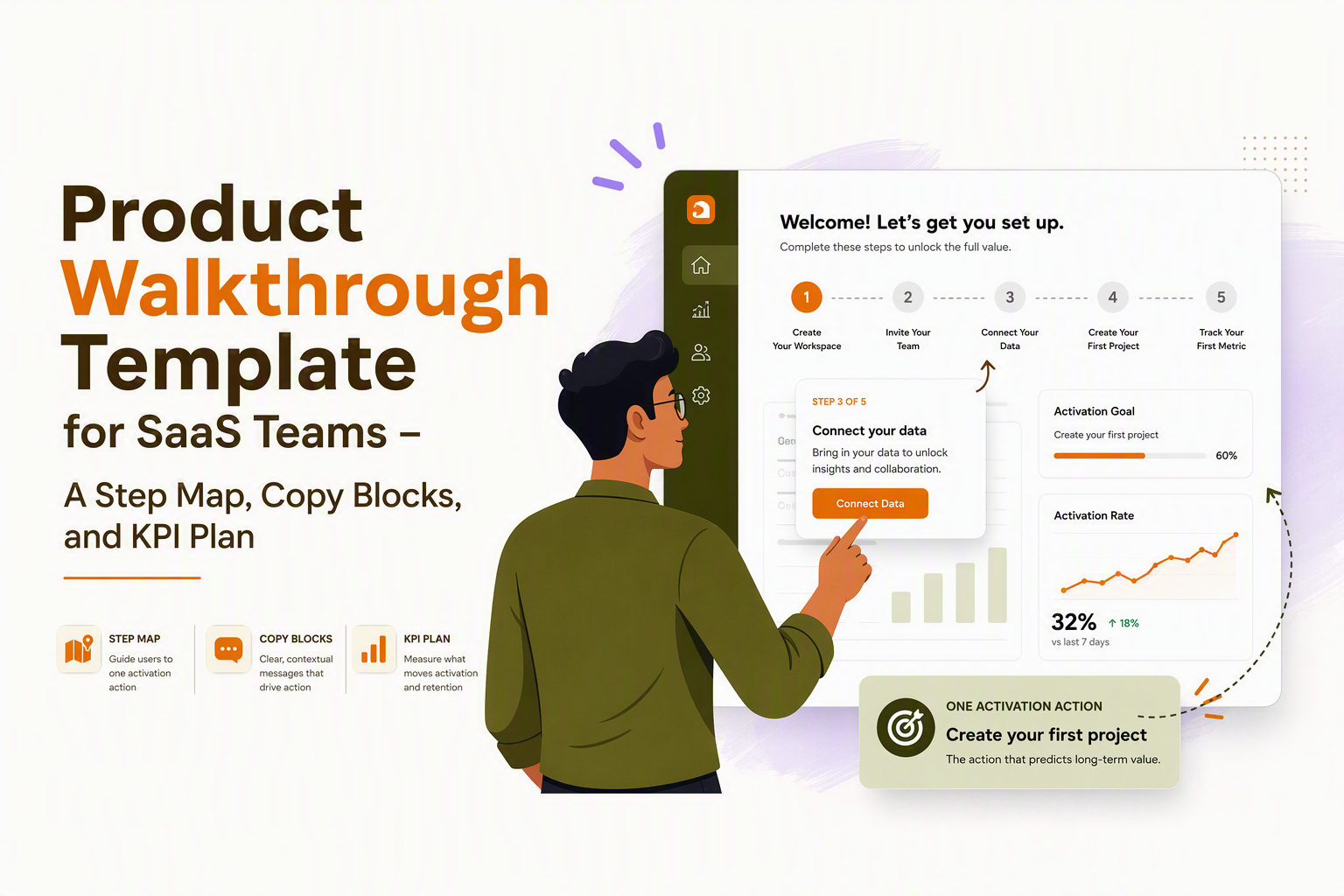
Product walkthrough, tour, or interactive demo, a terminology map that removes team confusion
Product walkthrough alignment improves conversion because each format has a different “where it runs, what it’s for, and what it outputs” profile, and mixing them causes teams to optimize the wrong metric.
A practical map you can paste into your onboarding doc
| Format | Where it runs | Primary goal | What “done” looks like | Best metric to watch |
|---|---|---|---|---|
| In-app product walkthrough | Inside your live product UI | Get a new user to perform the next critical action | User completes an activation task in the product | Step drop-off + downstream activation event |
| Guided product tour | Often in-app, sometimes hybrid | Show the “happy path” to an outcome with guidance | User reaches a key screen or config milestone | Tour completion rate plus time-to-value |
| Interactive demo | Outside the product (marketing site, sales follow-up) | Let prospects try value without a full setup | Prospect experiences value simulation and books/starts trial | Demo-to-trial and demo-to-meeting conversion |
| Video walkthrough | Outside the product (help center, email, LMS) | Explain concepts fast, reduce support load | User understands a feature and self-serves | Deflection rate, watch time, post-video task success |
Three concrete examples that prevent “wrong tool” debates
- In-app product walkthrough: After signup, guide a user to connect their first data source, then confirm “connection_success” as the output. If the UI changes weekly, this needs step-level QA and resilient selectors.
- Interactive demo: On the pricing page, let a prospect click through a simulated dashboard with prefilled data, then route to “start trial.” No in-app triggers, but you still need a clear “next action.”
- Video walkthrough: For an advanced feature, ship a 2 to 4 minute explainer and pair it with a single in-app tooltip that deep-links to the right screen. Video teaches, the product walkthrough converts.
If your team keeps asking “Is this onboarding or marketing?”, label your asset by runtime (in-app vs out-of-app) and output (behavior in-product vs intent signal). That one decision removes most confusion.
Start here, the first 60 seconds of a product walkthrough that gets users moving
The first 60 seconds of a product walkthrough should drive one observable user action, because users evaluate value by momentum, not by how many screens you can point at.
The first-step playbook, one screen, one verb, one promise
Use this sequence as your default opener:
- Context (1 sentence): name the job-to-be-done and the immediate win.
- Permission (1 choice): “Show me” vs “Not now” so you avoid hostage tours.
- One action (1 verb): click, create, connect, invite, import, publish.
- Proof (1 confirmation): a visible state change that tells the user they progressed.
Copy blocks you can reuse (and adapt per persona)
- Modal opener (activation-focused): “Let’s get your first [Outcome] in under 2 minutes. We’ll start by [Action].”
- Tooltip (anchored to the CTA): “Start here: [Verb] your first [Object] to unlock [Benefit].”
- Soft exit (always include): “Skip for now, I’ll explore” (and don’t punish the user for skipping).
What to avoid in PLG-style onboarding
- Feature recital steps: “This is the dashboard…” is not a step, it is a lecture. Replace with “Create your first dashboard view.”
- Multi-path branching in minute one: branching belongs after the first success moment, otherwise you raise cognitive load.
- Untracked microsteps: if you cannot measure where users stop, you cannot improve the flow.
What surprised our team was how often a “shorter” tour performed worse because it removed the only step that created visible progress; the fix was not fewer steps, but a clearer first action and a better confirmation state.
The 7-step product walkthrough build template, step map, copy blocks, and QA checklist
A reliable product walkthrough uses a fixed step map with exits, failure states, and instrumentation, so iteration becomes a weekly routine instead of a redesign project.
The 7-step map (copy and paste)
- Trigger: define exactly when it appears (first visit, first time on /dashboard, after event X).
- Step 1, Orientation: “Here’s the outcome we’ll get today” plus two choices (continue or skip).
- Step 2, First action: point to the primary CTA the user must click or fill.
- Step 3, Confirmation: show the user the UI state that proves success (created item, connected integration, published change).
- Step 4, Next best action: one step that compounds value (invite teammate, set a default, add a tag).
- Step 5, Personalization or segmentation hook: ask one question or infer one attribute to route the next flow.
- Step 6, Hand-off: deep-link to a relevant screen or checklist, then end the tour.
- Exit behavior: always allow close, and store where they exited so you can resume later.
Per-step “copy blocks” template
| Step type | UI format | Copy formula | Required CTA |
|---|---|---|---|
| Orientation | Modal | “Get to [Outcome] by doing [Action]. Takes ~[time].” | Continue + Not now |
| Action | Tooltip / speech bubble | “Click [Button] to [Verb] your first [Object].” | CTA click (or highlight the click target) |
| Confirmation | Tooltip | “Nice, you’ve [Done thing]. Next, [Next action].” | Next |
| Routing question | Survey | “Which best describes you? [Role A] [Role B] [Role C]” | Select one |
| Hand-off | Modal | “You’re set. Go to [Screen] to finish [Milestone].” | Deep-link button |
Failure states and exits (the part most teams skip)
- UI element missing: if the selector is not found, end the tour and log “step_error_missing_element” with step_id.
- Permission denied: show alternate copy: “You need Admin access to do this. Invite an Admin or request access.”
- User closes: log “walkthrough_closed” with step_id and offer a resume entry point on next relevant screen.
Launch and QA checklist (15 minutes, every release)
- Targeting QA: verify correct audience, URL, and segment rules, plus that excluded users do not see it.
- Device QA: test at least one common laptop resolution; tooltips that overlap CTAs kill completion.
- Happy path: complete the flow without reading copy, only following highlights and CTAs.
- Failure path: remove permissions or skip required setup, confirm the flow exits cleanly.
- Tracking QA: confirm events fire for start, each step view, each step complete, and exit reason.
After running multiple onboarding audits, the pattern was clear: teams do not lose users on “too many steps,” they lose users on steps that cannot be completed due to permissions, empty states, or missing setup, so failure handling is part of conversion work.
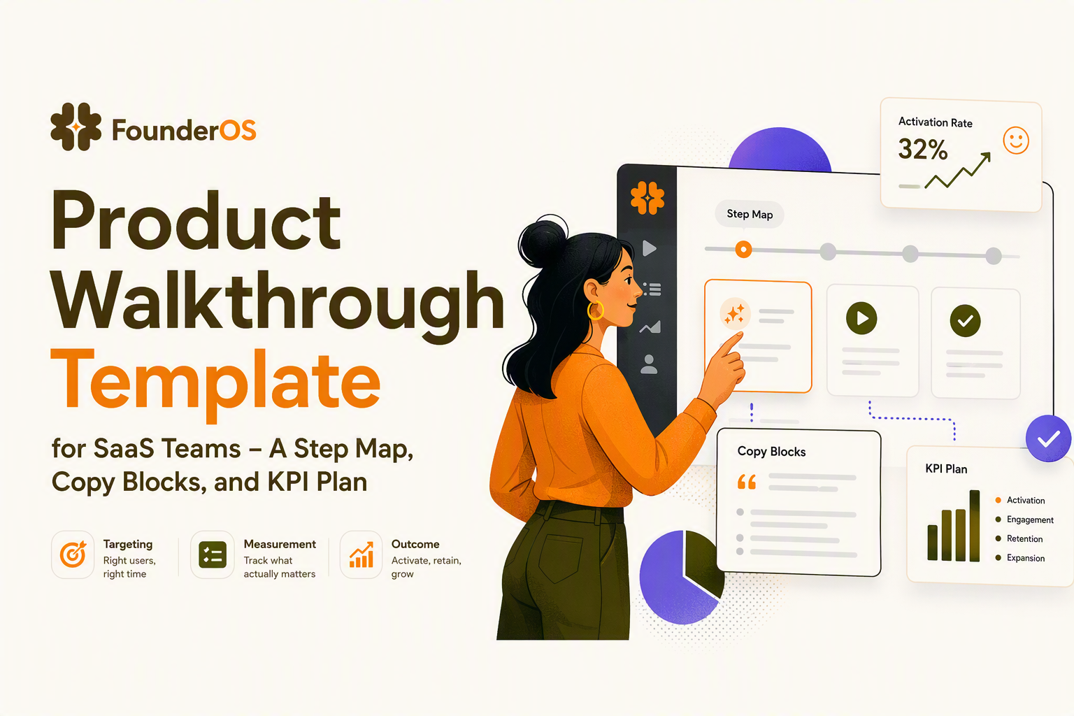
Segmentation and targeting, when to trigger which walkthrough for which user
Segmentation makes a product walkthrough feel relevant because the same steps rarely fit admins, end users, and evaluators, so the trigger should reflect role, lifecycle, and behavior.
A simple decision tree you can implement this week
- Is the user new? If yes, show the “first value” walkthrough on the first visit to the primary workspace screen.
- Do they have the required permissions? If no, route to an “invite admin” or “request access” flow.
- Have they completed the activation event? If no, keep the walkthrough available but do not auto-trigger repeatedly.
- Did they attempt the action and fail? If yes, trigger a rescue step only after the failure event.
Targeting matrix (persona, lifecycle, behavior)
| Segment type | How to detect | Walkthrough goal | Trigger example |
|---|---|---|---|
| Role or job | Signup question, SSO attributes, CRM field | Route to the right “first outcome” | On first /dashboard visit show Admin vs Member flow |
| Lifecycle stage | Account age, plan, trial day, first session | Reduce time-to-value | Trial day 0: connect data; day 3: invite teammate |
| Behavioral | Event history and thresholds | Unblock a stuck user | Triggered after “integration_error” twice |
| Feature intent | Visited pricing or settings pages, clicked disabled buttons | Guide discovery and adoption | After clicking an advanced tab, show a 3-step guide |
Behavior-based triggers that do not spam users
- Use cooldowns: do not auto-trigger the same product walkthrough more than once per user per 7 days unless they explicitly request it.
- Trigger on intent, not time: a click on a disabled control is a better trigger than “session 2.”
- Offer an “on-demand” launcher: let users restart the walkthrough from a help menu or empty state.
In our experience working with self-serve SaaS teams, the biggest targeting mistake is treating “new user” as one bucket; adding a single role question and routing to two different first actions usually improves step completion more than rewriting every tooltip.
If you want deeper patterns, the highest leverage concepts are in behavior triggers and how they map to actual user intent.
Walkthrough measurement stack, event schema, KPIs, and a weekly reporting cadence
Walkthrough measurement works when you track step-level events plus one downstream activation event, because tour completion alone can increase while activation stays flat.
Event schema (minimum viable, but iteration-ready)
Define a stable naming convention and keep it consistent across flows:
- walkthrough_started (properties: walkthrough_id, variant_id, trigger_type, user_role)
- walkthrough_step_viewed (properties: walkthrough_id, step_id, step_type, screen_url)
- walkthrough_step_completed (properties: walkthrough_id, step_id)
- walkthrough_exited (properties: walkthrough_id, step_id, exit_reason: closed, error, success, timeout)
- activation_event (your product-specific event, properties: plan, role, acquisition_source)
Keep step_id stable even if copy changes, otherwise your trendlines break. If a step’s purpose changes, create a new step_id.
KPI definitions that prevent vanity reporting
- Start rate: walkthrough_started divided by eligible impressions (who could have seen it). Low start rate is usually bad timing or weak opener copy.
- Step drop-off: for each step, 1 minus (step_completed / step_viewed). The highest drop-off step is your next iteration target.
- Time-to-first-action: time from walkthrough_started to first critical product event. This is often a better signal than completion.
- Activation lift (directional): activation_event rate for users who started or completed vs an eligible group that did not. If you cannot run an A/B test, at least compare cohorts by eligibility window and segment.
Weekly reporting cadence (30 minutes, same agenda)
- Review start rate and list the top 2 triggers by volume.
- Review step drop-off and pick one step to change this week.
- Check downstream impact against your activation_event trend, by segment.
- Decide one iteration (copy, timing, audience, or UI target) and ship it.
What to change based on the signal
- Low start rate, decent completion: fix trigger timing, add “Not now” copy, or move the opener to an empty state where intent is higher.
- High drop-off on an action step: you likely have a permission problem, missing prerequisites, or the highlighted element is off-screen on common resolutions.
- High completion, no activation movement: the walkthrough is teaching navigation, not driving the critical action. Replace steps with action-driven ones, or change the “hand-off” deep link to the next required screen.
When teams ask for a reference, we point them to event-based product analytics principles similar to what Mixpanel documents for consistent event naming and property hygiene, because the reporting only stays trustworthy if your schema stays stable over time.
For related implementation detail, see onboarding flows and how to tie each micro-step to an activation milestone.
Choosing the right delivery format, a lightweight rubric for in-app vs shareable vs video
The right product walkthrough format depends on UI churn, data requirements, and how quickly you need a user to complete an in-product action.
A weighted rubric you can score in 5 minutes
Score each format 1 to 5, multiply by weight, and choose the highest total.
| Criterion | Weight | In-app walkthrough | Shareable interactive demo | Video walkthrough |
|---|---|---|---|---|
| Needs real user data and permissions | 3 | 5 | 1 | 1 |
| Goal is immediate activation action | 3 | 5 | 3 | 2 |
| UI changes frequently (maintenance risk) | 2 | 2 | 3 | 5 |
| Needs to work outside the app | 2 | 1 | 5 | 5 |
| Best for support deflection and education | 1 | 3 | 2 | 5 |
Maintenance cost rules of thumb
- High UI churn: prefer fewer, more robust in-app steps, and shift explanation to video or help docs.
- Complex prerequisites: make the first in-app product walkthrough step a prerequisite check, or route to a setup checklist instead of forcing a broken step.
- Sales-assisted motion: use a shareable interactive demo to qualify, then an in-app walkthrough to activate after signup.
If you are building your first measurable in-app flow, the fastest path is a short in-app product walkthrough tied to a single activation event, plus a fallback video for edge cases. For a more detailed build sequence, guided product tour planning can help you scope the right first milestone.
| Iteration lever | What you change | When to use it | What to watch after |
|---|---|---|---|
| Opener copy | Promise, time estimate, CTA label | Low start rate | Start rate, step 1 drop-off |
| Trigger timing | URL, delay, behavior trigger | Users start but bounce early | Step 2 drop-off, time-to-first-action |
| Step target | UI element selector, placement | Users are confused or misclick | Error exits, step completion |
| Audience rules | Role, plan, prerequisites | Permissions or empty-state failures | Exit_reason distribution |
| Outcome definition | Activation event and hand-off | High completion, no activation impact | Activation_event rate, retention proxy events |
FAQ
If you want to implement this template end-to-end this week, Founder OS lets you build no-code in-app flows, target by user profiles and segments, and instrument walkthrough events alongside product tracking so you can connect step drop-off to activation outcomes in one place.
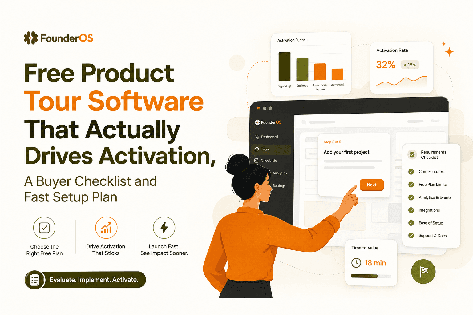
Free Product Tour Software That Actually Drives Activation, A Buyer Checklist and Fast Setup Plan
Choose free product tour software that boosts activation. Use this checklist to avoid free-plan traps and launch a measurable tour in 60 minutes.
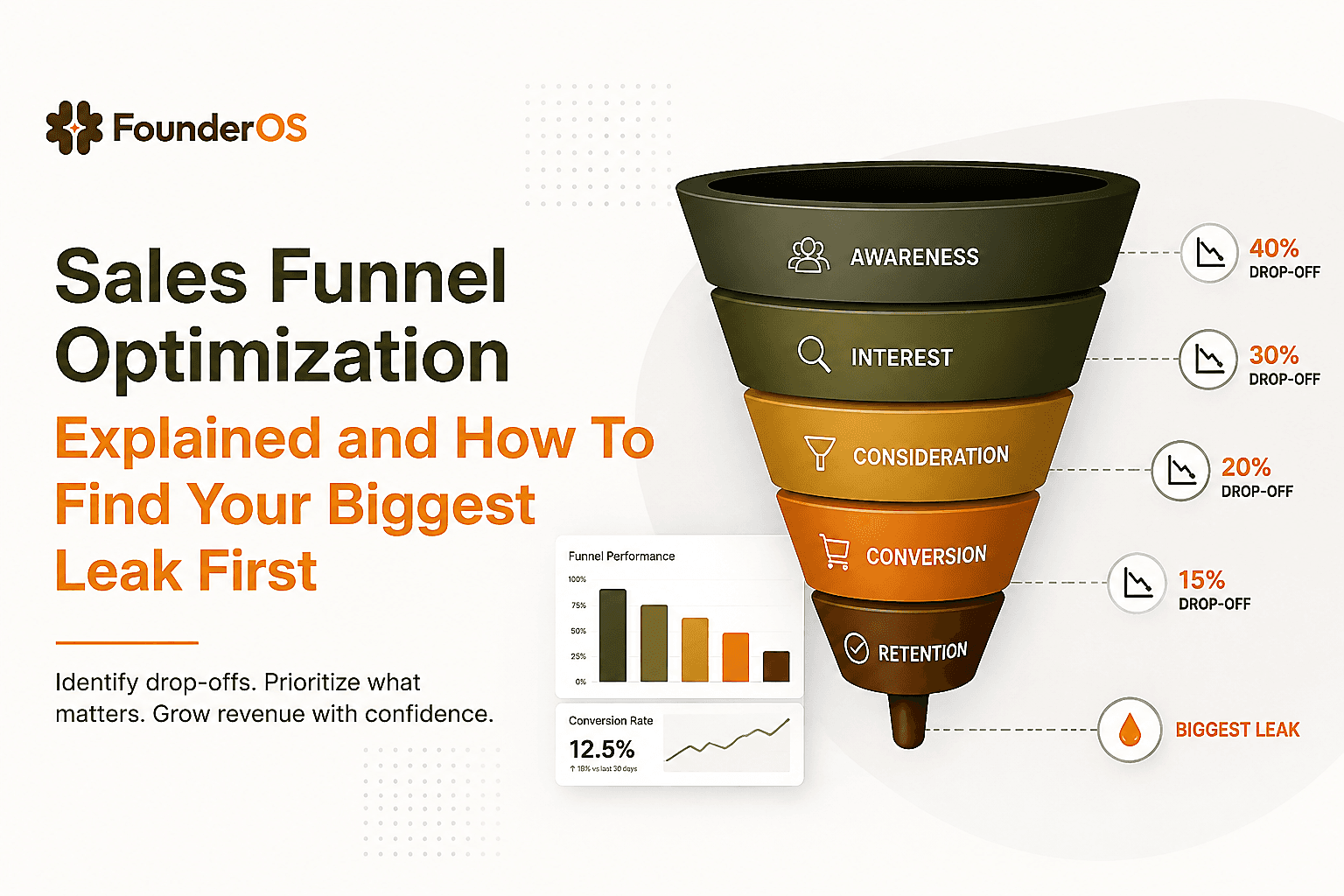
Sales Funnel Optimization Explained and How To Find Your Biggest Leak First
Learn sales funnel optimization with simple diagnostics, formulas, and a reusable worksheet to fix the biggest leak before buying more traffic.
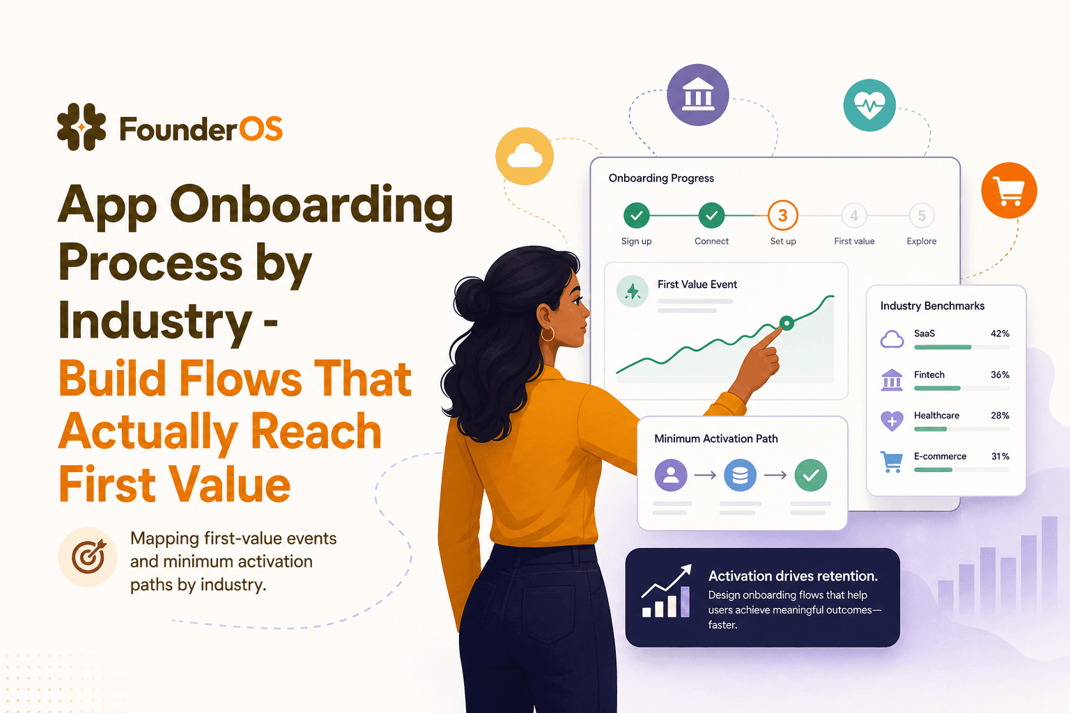
App Onboarding Process by Industry - Build Flows That Actually Reach First Value
A practical SOP to build an app onboarding process by industry, map first-value events, segment roles, and deploy adaptive in-app flows.