
Interactive Walkthroughs Explained, A Step-By-Step Guide for SaaS Teams
An interactive walkthrough is an in-product, step-by-step guidance flow that reacts to what a user clicks or completes, so they learn by doing instead of reading a static tour.
- An interactive walkthrough is best when you can tie guidance to a real user action (create, connect, invite, publish), not just a screen-by-screen explanation.
- The fastest way to design one is to map a single “first value” goal, then build 5 to 8 steps with triggers, segmentation, and one success metric.
- Most completion and activation issues come from poor targeting, too many steps, and measuring clicks instead of outcomes.
What an interactive walkthrough is and how it differs from product tours
An interactive walkthrough guides users through a task inside the product with prompts that wait for the right action before moving on.
Plain-English definition
Think of it as “training wheels” that appear in the interface at the moment of need. A walkthrough typically uses UI patterns like tooltips, speech bubbles, modals, or checklists to guide the user, but the key is interactivity: the next step is unlocked only after the user completes the action (or meets a condition).
How it differs from a product tour
A “product tour” often means a linear, screen-by-screen explanation of features. That can be useful for orientation, but it is usually passive. An interactive walkthrough is designed around a job-to-be-done and a measurable outcome.
- Product tour: “Here’s where things are.” Good for first-time orientation and announcements.
- Interactive walkthrough: “Do this now, in the right order.” Good for helping users reach their first value moment.
SaaS in-app walkthroughs vs website tours vs mobile app coaching
In practice, you will see three common environments:
- B2B SaaS web apps: The most common place for an interactive walkthrough because users have multi-step workflows (setup, integrations, roles, permissions) and need contextual guidance.
- Marketing websites: “Walkthroughs” here are usually interactive demos or guided click-throughs that simulate the product, but they are not tied to real account state.
- Mobile apps: Coaching works best when steps are short and gesture-friendly, but you need to be careful with overlays that block navigation.
If you want a deeper comparison of vendors and requirements, the evaluation criteria in guided walkthrough software scorecards can help you avoid buying a tool that only does superficial tours.
Where interactive walkthroughs work best across SaaS, apps, and websites
Interactive walkthroughs work best when a user must complete 1 to 3 critical actions to experience value and those actions are easy to observe in the UI.
A simple “fit check” before you build
Use this checklist to decide whether an interactive walkthrough is the right intervention:
- Observable action: Can the product detect success (e.g., “integration connected”, “project created”, “report shared”)?
- Sequenced steps: Does the user need to do steps in order (connect data, configure, invite, publish)?
- High confusion cost: Does confusion create support tickets, churn risk, or stalled trials?
- Repeatable path: Do most successful users follow a similar early path?
Common high-impact use cases with concrete examples
- First-time setup: Guide a new account through adding a workspace name, connecting a data source, and creating the first object. Example: “Connect Stripe” then “Create your first dashboard widget”.
- Activation milestones: Take users from “signed up” to “shared with a teammate” because collaboration is the value driver. Example: “Invite 1 teammate” then “Assign a role”.
- Feature discovery at the right time: Instead of blasting a modal at everyone, trigger guidance when a user visits a page repeatedly without using the key feature.
- Change management: For UI changes, a short walkthrough can prevent confusion and reduce tickets, especially if you target only users who used the old path.
Pattern selection by moment, not by preference
Pick UI patterns based on what you need the user to do next:
- Tooltip: Micro-hints on a specific control. Best for “click this” or “fill this”. See examples of when tooltip onboarding helps, and when it becomes noise.
- Speech bubble: Step-by-step guidance with context, anchored to the UI element.
- Modal: Big moment, but easy to overuse. Best for announcements or a single high-level instruction.
- Checklist: Helps users self-navigate and reduces drop-off, especially when tasks can be done in any order.
In our experience working with B2B SaaS trials, walkthroughs tied to “create something real” outperform “tour the interface” flows because users can see progress immediately and understand why each click matters.
How to build an interactive walkthrough step by step without engineering help
A reliable interactive walkthrough is built by starting from one measurable user goal, then designing 5 to 8 conditional steps that end in a verifiable success event.
Step 1: Choose one “first value” goal and one success metric
Write the goal as an outcome, not a feature. Examples:
- “User imports their first dataset.”
- “User creates and shares one report.”
- “User invites a teammate and assigns a role.”
Then pick a success metric you can track without ambiguity. Good metrics are event-based: “integration_connected”, “report_shared”, “teammate_invited”. Avoid vanity metrics like “walkthrough started”. If you need an analytics reference for event definitions and instrumentation, Mixpanel’s event tracking guides are a solid baseline: Mixpanel JavaScript SDK tracking.
Step 2: Map the shortest happy path (then cut it again)
Draft the minimum steps that a successful user must complete. A practical constraint that keeps quality high is: 5 to 8 steps for the first flow. If it takes more than 8, you likely need to split into two walkthroughs: “setup” and “first use”.
Step 3: Write each step as “trigger, prompt, proof”
For every step, define:
- Trigger: When should it show (page, element visible, user segment)?
- Prompt: One sentence that tells the user what to do and why.
- Proof: What counts as completion (click, form submit, saved object, API response reflected in UI)?
Example step spec (copyable):
- Trigger: User lands on /settings/integrations AND “integration_connected” is false.
- Prompt: “Connect your Stripe account to pull transactions automatically.”
- Proof: “integration_connected” event OR UI shows “Connected” state.
Step 4: Add segmentation and guardrails
Most teams skip this and pay for it with low completion. Add at least two guardrails:
- Role targeting: Only admins see setup flows; members see usage flows.
- State targeting: Never show “Connect X” if X is already connected.
We initially assumed “show it to all new users” was safest, but our team found it creates negative signal fast, especially when non-admins are asked to do admin-only tasks they cannot complete.
Step 5: Launch small, measure, and iterate on drop-off steps
Do a two-phase launch:
- Phase A: Internal or a small cohort to catch UI selector issues, confusing copy, and dead ends.
- Phase B: 100% of the intended segment, with step completion and drop-off tracked.
When you review performance, look for the first major drop-off step. Fix that step before adding more steps. If you are also building a broader guided product tour, keep it separate from activation walkthroughs so each has a single job.
Common walkthrough mistakes that hurt completion and activation
Walkthrough completion drops when the flow asks for too much, shows at the wrong time, or measures clicks instead of real progress.
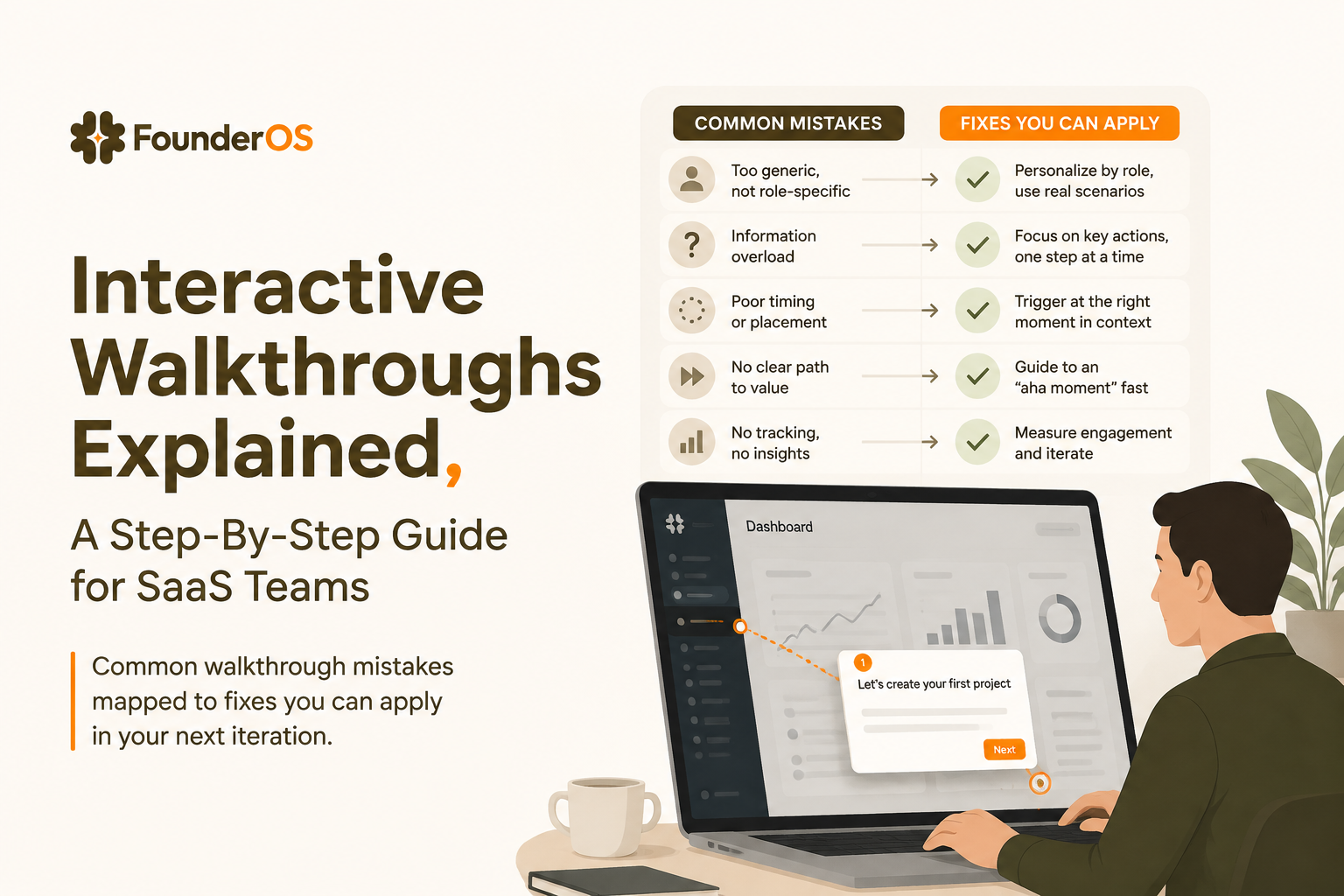
Mistake 1: Designing for “coverage” instead of “first value”
If the walkthrough tries to touch every menu item, users learn nothing and quit. Fix it by choosing one outcome, one path, and one finish line. If you must cover more, ship a second interactive walkthrough that triggers later, after the first value is achieved.
Mistake 2: No escape hatch (or too many escape hatches)
Users should be able to dismiss or pause, but not accidentally lose the path. Add a “Resume” entry point such as a checklist, and keep “Skip” available without shaming language. A good default is: allow skipping individual steps, but keep the overall flow resumable.
Mistake 3: Blocking the UI and forcing clicks
Overlays that cover controls, scroll unexpectedly, or trap users behind modals create friction. Prefer anchored prompts, and only use full-screen modals for one-time announcements.
Mistake 4: Targeting everyone with the same steps
Segmentation is not an advanced feature, it is basic hygiene. At minimum, segment by role (admin vs member), lifecycle state (new vs returning), and product state (has data vs no data). For more detailed guidance on setting this up without engineers, see no code onboarding implementation patterns.
Mistake 5: Measuring “completion” and calling it success
Completion is diagnostic, not the goal. A walkthrough can have high completion and still not improve activation if the steps do not lead to meaningful outcomes. Pair walkthrough analytics (step drop-off) with product analytics (did the user reach the activation event within a time window?).
What to look for in a no-code walkthrough tool
A good no-code walkthrough tool must let you build fast while still supporting targeting, reliable triggers, and outcome measurement.
Evaluation criteria you can use as a shortlist checklist
- Builder speed: Can a non-engineer create and publish changes without a release cycle?
- Targeting and conditions: URL rules, user attributes, and behavioral conditions with AND/OR logic.
- Step reliability: Robust element anchoring and handling for dynamic UI states.
- Analytics: Step completion, drop-off per step, and the ability to tie flows to activation events.
- Localization and versioning: Translate content and keep versions aligned with UI changes.
- Safety and control: Permissions, approvals, and the ability to pause or roll back flows quickly.
Tooling tradeoffs the SERP often skips
Two tradeoffs matter in practice:
- Flexibility vs maintainability: Highly customized tours can break more often when UI changes. A simpler pattern library is easier to keep accurate.
- In-app guidance vs interactive demos: Demos help acquisition, but they cannot react to real user state inside the live product. If the goal is activation, prioritize true in-app walkthroughs.
After running multiple onboarding audits, the pattern was clear: teams underestimate how often UI changes break selectors, so reliability and quick editing matter as much as fancy templates. If you are comparing categories, a practical overview of product walkthrough tools can help you separate “nice tours” from systems that support measurement and iteration.
| Requirement | Why it matters | Quick test before you commit |
|---|---|---|
| Conditional targeting (role, state, behavior) | Prevents irrelevant prompts and dead-end steps | Create a flow that shows only to admins who have not completed a setup event |
| Step completion proof (not just “next” clicks) | Makes the walkthrough truly interactive | Require a form submit or “saved” state before advancing |
| Analytics tied to product outcomes | Connects guidance to activation, not vanity metrics | Compare activation-event rate for users who did vs did not see the flow |
| Fast publishing and rollback | Lets non-engineers iterate safely | Publish an edit, then revert it in under 5 minutes |
| Localization and version control | Prevents inconsistent experiences across languages and UI versions | Duplicate a flow, translate it, and preview both versions |
FAQ about interactive walkthroughs
If you want to turn this framework into live flows without engineering help, Founder OS includes a no-code product onboarding tool with targeting, segmentation, and measurement so you can ship an interactive walkthrough, track completion, and see how it affects activation.
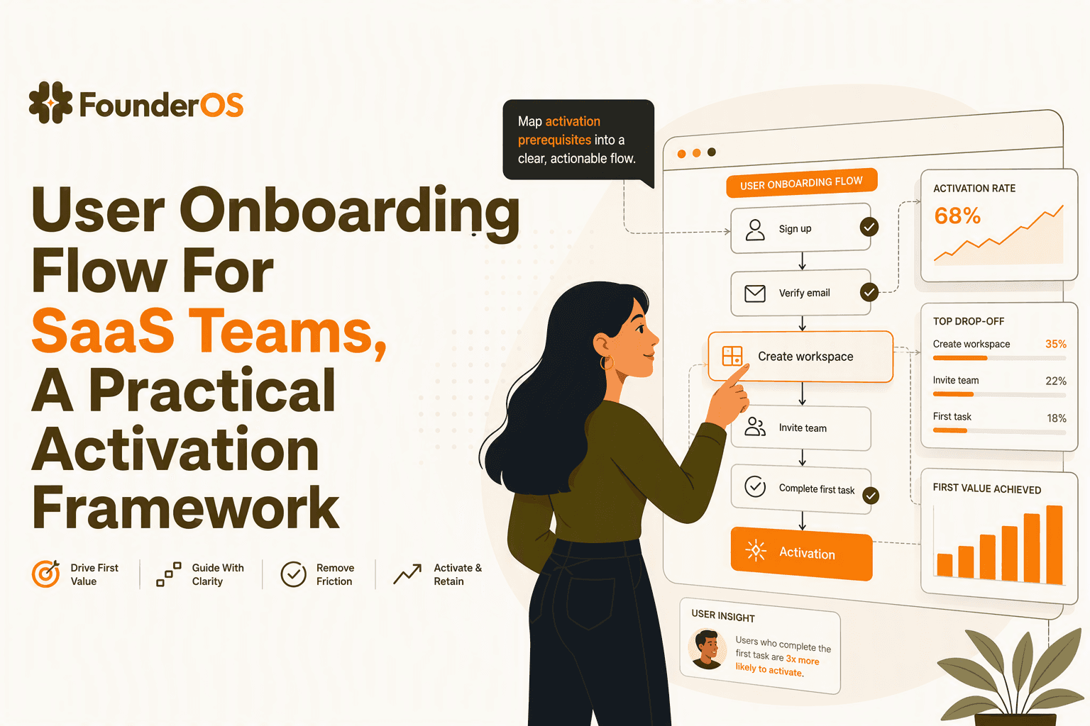
User Onboarding Flow For SaaS Teams, A Practical Activation Framework
Build a user onboarding flow around activation: map intent, choose the right in-app steps, measure time-to-value, and iterate by segment.
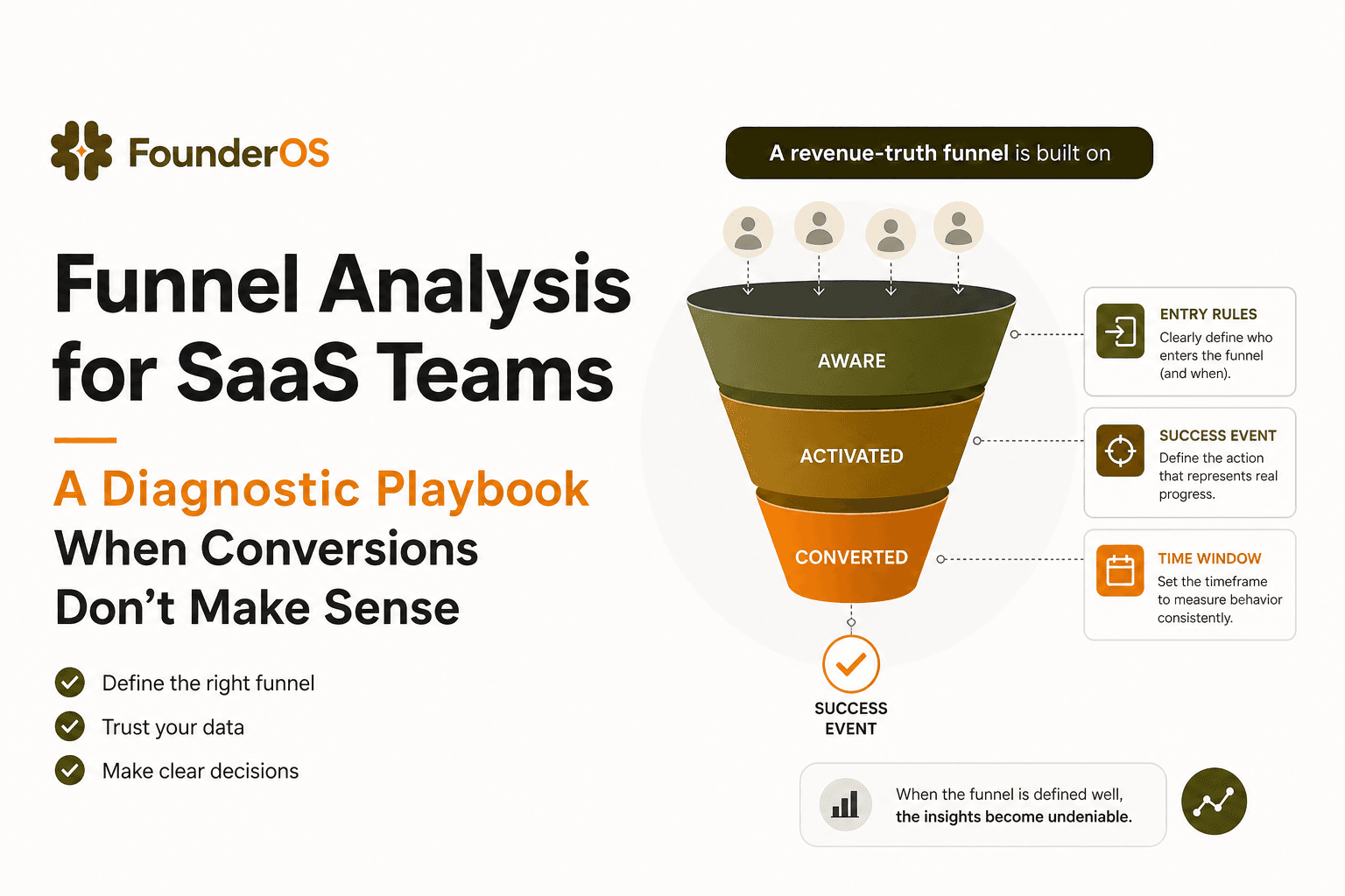
Funnel Analysis for SaaS Teams - A Diagnostic Playbook When Conversions Don’t Make Sense
A practical funnel analysis playbook to diagnose tracking and measurement errors, then turn drop-offs into experiments you can attribute to revenue.
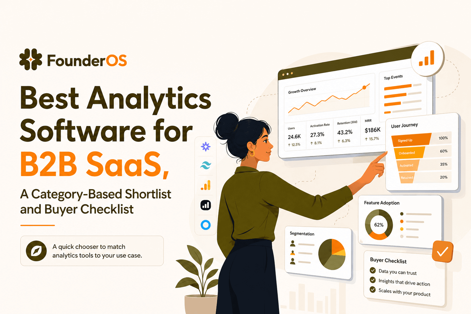
Best Analytics Software for B2B SaaS, A Category-Based Shortlist and Buyer Checklist
Find the best analytics software for B2B SaaS with a 1-minute chooser, category shortlists, GA4 parity checklist, and a 14-day rollout plan.