
Customer Cohort Analysis, A Simple Guide To Retention, Churn, And Growth Patterns
Customer cohort analysis is a practical method for measuring retention and churn by grouping customers who started at the same time (or did the same key action) and tracking what they do over weeks or months, so you can see patterns that averages hide.
- Cohorts replace misleading averages with time-based comparisons, so you can spot whether retention is improving or just shifting between segments.
- Start with an acquisition cohort (signup or first purchase month), then add behavioral cohorts only after you can explain the main retention curve.
- You can build a reliable cohort table in Excel or Google Sheets from raw orders using 3 helper columns and a simple retention matrix.
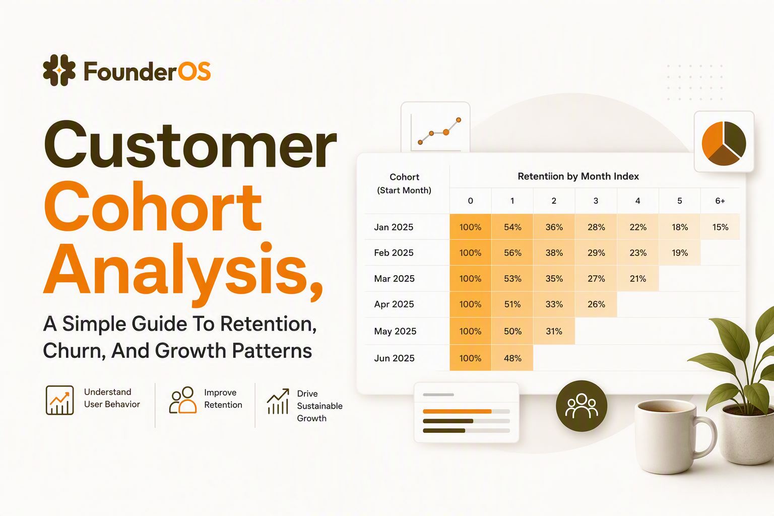
What Customer Cohort Analysis Is And Why Average Metrics Hide The Truth
Customer cohort analysis reveals whether retention and churn are getting better or worse for newer customers by comparing groups that share the same start point across the same “age” timeline.
Why averages can point you in the wrong direction
Aggregate metrics mix different customer “ages” together. That matters because a product with strong month-1 activation but weak month-3 value can still show a healthy overall average if enough new customers keep arriving.
- Example (SaaS): Your overall monthly active users grows 15% month over month, but users acquired 60+ days ago are quietly shrinking.
- Example (ecommerce): Repeat purchase rate looks flat, but customers acquired during holiday promos behave very differently from customers acquired in non-promo months.
- Example (finance): Average balance rises, but that can be driven by new high-deposit customers while older cohorts withdraw.
The cohort lens that makes retention comparable
A cohort table aligns customers by time since start (week 0, week 1, month 2, etc.), not by calendar date. This makes the comparison fair: month-2 retention is month-2 retention, regardless of when the cohort began.
In our experience working with early-stage B2B SaaS teams, the fastest “aha” moment comes from seeing two adjacent acquisition cohorts with different month-1 retention, even when overall signups and MRR are trending up.
A simple 3-step framework to use cohorts for growth decisions
- Pick one start event: signup date, first order date, or first funded account date.
- Pick one return event: “active day,” “any purchase,” “paid invoice,” or “deposit.”
- Compare cohort age: look at week-1, week-4, and month-3 retention side by side across cohorts to see if changes improved outcomes.
The Main Cohort Types And How To Choose The Right One
The right cohort type depends on the decision you want to make: acquisition cohorts explain retention over time, behavioral cohorts explain why it happens, and predictive cohorts help you prioritize action.
1) Acquisition cohorts (start date based) for the “is retention improving?” question
Acquisition cohorts group customers by when they started, typically by week or month. This is the default for customer cohort analysis because it answers the most common question: did the latest changes improve retention for new customers?
- Use when: you shipped onboarding changes, changed pricing, launched a new channel, or ran a major promo.
- Start event examples: Signup date (SaaS), first purchase date (Shopify), account-open date (fintech).
- Good first report: monthly cohorts with month-1 and month-3 retention.
2) Behavioral cohorts (action based) for the “what causes retention?” question
Behavioral cohorts group customers by whether they completed a meaningful action in an early window, then compare retention later. Think: “users who invited a teammate in the first 7 days” versus “users who did not.”
- Use when: you have a clear hypothesis about a habit-forming action (activation) and want to validate it.
- Criteria for a good behavior: it is common enough (so the cohort is not tiny), it is plausibly causal, and it happens early.
- SaaS example: Created 3 projects within 48 hours.
- Ecommerce example: Bought from a second category within 30 days.
3) Predictive cohorts (score based) for prioritizing outreach
Predictive cohorts group customers by a risk or value score, then validate whether that score actually separates future retention or churn.
- Use when: you need an operational list (who to message, who to save) rather than a retrospective report.
- Starter approach: a rule-based score using recency and frequency, then validate it with cohorts.
- Sanity check: a “high risk” cohort should show noticeably lower retention at the next time interval.
How to choose quickly (a checklist)
- If you are new to cohorts, start with acquisition cohorts until you can explain the retention shape.
- If you can name your activation moment, add behavioral cohorts tied to that action.
- If you need a weekly workflow for CS or lifecycle marketing, test predictive cohorts and verify them with retention outcomes.
How To Read A Cohort Table Without Getting Lost In The Numbers
A cohort table becomes easy to interpret once you map rows to start groups, columns to cohort age, and each cell to a retention or revenue metric.
The 3 parts of a cohort table
- Rows: cohorts (for example, customers whose first purchase happened in Jan 2026).
- Columns: time since start (Month 0, Month 1, Month 2, etc.).
- Cells: the metric you care about (retained customers, retention %, revenue retained, average orders per customer).
Three patterns to look for (and what they usually mean)
- Steep early drop, then flat: onboarding or first-value problem. Fix activation first.
- Similar month-1, worse month-3: customers get initial value but do not build a habit. Look at feature adoption and reminders.
- One cohort is a clear outlier: channel mix change, promo-driven buyers, or a product incident during that period.
We initially assumed “retention is retention,” but cohort reads showed our team that month-1 and month-3 are often driven by different levers, so mixing them into one headline number caused us to prioritize the wrong fixes.
How to read the table in 60 seconds (a repeatable method)
- Step 1: Compare the newest two cohorts at the same age (for example, Month 1 vs Month 1). Do not compare Jan Month 3 to Mar Month 1.
- Step 2: Scan down a column to see if retention is trending up for newer cohorts at that age.
- Step 3: Scan across one row to understand the “shape” of churn over time for that cohort.
If you want to go deeper into the shape and interpretation, a cohort retention curve is the same idea visualized as a line chart instead of a grid.
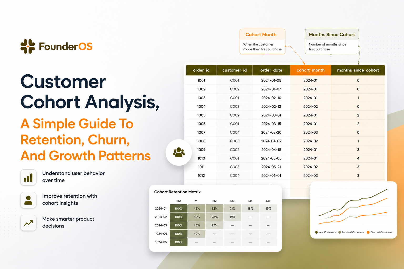
Build A Simple Excel Or Sheets Cohort Template From Raw Orders
A reliable cohort template in Excel or Google Sheets can be built from raw orders using three helper columns and a pivot-style retention matrix.
What raw data you need (minimum viable dataset)
- customer_id
- order_date (or event date)
- order_id (optional, helpful for counting orders)
- revenue (optional, if you want revenue retention)
Step 1: Create a “cohort month” per customer
In a separate table (or using a MINIFS), compute each customer’s first order date, then turn it into a cohort month.
- First order date:
=MINIFS(Orders!B:B, Orders!A:A, A2)where A2 is the customer_id - Cohort month:
=DATE(YEAR(first_order_date), MONTH(first_order_date), 1)
Step 2: Add “order month” and “month index” on every order row
- Order month:
=DATE(YEAR(order_date), MONTH(order_date), 1) - Month index:
=DATEDIF(cohort_month, order_month, "M")
Month index is the cohort age. A customer’s first month is index 0, the next calendar month after that is index 1, and so on.
Step 3: Build the retention matrix (customers retained)
Create a pivot table (or use a COUNTUNIQUEIFS approach) that counts distinct customers by cohort_month (rows) and month_index (columns).
- Values: distinct count of customer_id
- Rows: cohort_month
- Columns: month_index
Step 4: Convert counts to retention percentages
Next to the matrix, divide each cell by the Month 0 value of that row.
- Retention % formula (conceptually):
=retained_customers_at_month_n / customers_in_month_0
Now you have customer cohort analysis in its simplest usable form: “of customers acquired in a given month, what percentage returned in month n?”
Optional: revenue retention instead of customer retention
To switch from customer counts to revenue, sum revenue in each cell, then divide by revenue in Month 0 or Month 1 depending on how you define baseline. This is useful for subscription expansions, repeat orders, and wallet-share models. If you need more interpretation guidance, this retention analysis guide lays out common retention definitions and what they imply.
Common Mistakes And Where Cohort Analysis Helps In SaaS Ecommerce And Finance
Customer cohort analysis is most useful when you avoid small-sample noise, keep cohorts interpretable, and tie the pattern you see to a concrete next action.
Mistake 1: Making cohorts too small to trust
If a cohort has 8 customers, one churn can swing retention by 12.5 percentage points. A simple rule: if you cannot explain the change without naming individual customers, treat it as a signal to watch, not a conclusion.
- Fix: widen from weekly to monthly cohorts, or pool channels until the base cohort size is stable.
- Operational check: add a “cohort size” column and hide cohorts below your minimum threshold.
Mistake 2: Over-segmenting before you understand the baseline
Segmenting by plan, channel, persona, geography, and device all at once often produces dozens of charts and zero decisions.
- Fix: run one baseline acquisition cohort table first, then add one segmentation dimension at a time.
- Good next dimension: acquisition channel, because it usually maps to intent and expectations.
For a practical framework on choosing segments that lead to actions, use this user segmentation approach.
Mistake 3: Mixing “activity” definitions across time
If “active” means “logged in” one month and “used a core feature” the next, your retention table becomes incomparable.
- Fix: define one return event and keep it stable for the analysis period. Document it next to the cohort table.
Where cohorts help most (by business model)
- B2B SaaS: Connect cohorts to activation and onboarding experiments. Use event-based tracking so “returned” can mean “hit key feature,” not just “opened the app.” If you are building that foundation, start with a clean analytics events tracking plan.
- Shopify / ecommerce: Use cohorts to evaluate promo quality. Compare non-discount cohorts versus discount-driven cohorts at 60 and 90 days for repeat purchase behavior.
- Finance: Use cohorts to separate acquisition spikes from durable engagement. Track return events like “deposit,” “trade,” or “bill paid,” not just app opens.
After running a few cohort audits, the pattern was clear: teams move faster when the cohort table is tied to a simple tracking plan and refreshed consistently, rather than rebuilt as a one-off spreadsheet project. A lightweight digital product analytics setup makes that repeatability much easier.
| Cohort type | Best for | Example definition | Common mistake |
|---|---|---|---|
| Acquisition | Tracking retention improvements over time | Customers by first purchase month | Comparing different ages (Month 3 vs Month 1) |
| Behavioral | Testing what actions drive long-term retention | Users who completed activation in first 7 days | Picking a rare behavior that creates tiny cohorts |
| Predictive | Prioritizing outreach and saving at-risk customers | High-risk score vs low-risk score cohorts | Not validating the score against future retention |
FAQ
If you are tired of rebuilding the same spreadsheets every month, Founder OS can help you centralize product tracking, user profiles, and segmentation so cohort views stay current as your product changes, and you can connect insights to GTM reports and onboarding flows without stitching data together by hand.

Google Analytics Tracking Events in GA4, A Practical Setup Guide With GTM and gtag.js
Set up google analytics tracking events in GA4 with GTM or gtag.js, validate in DebugView, and turn events into conversions and funnels.

Product Onboarding Best Practices That Improve Activation, A KPI-Driven Playbook
A KPI-driven guide to product onboarding best practices: define first value, instrument events, segment flows, and ship a 30-60-90 plan to lift activation.

Embedded Analytics Solutions Compared, Which Platform Fits Your SaaS App Best?
Compare embedded analytics solutions for SaaS apps: security, multi-tenancy, white-label depth, integration flow, pricing and TCO, plus a shortlist checklist.