
Customer Engagement Metrics That Actually Matter, A Goal-First Framework For SaaS Teams
Customer engagement metrics only help you grow when they are chosen from a clear goal, measured in the right model, and tied to specific actions your team can take in the same week.
- Pick 1 primary engagement KPI per goal and 2 supporting metrics, so dashboards drive decisions instead of debate.
- Separate behavioral, survey, and outcome metrics into distinct measurement models to prevent misreads and false “wins.”
- Benchmark with internal baselines first, then add alert thresholds and a workflow that turns movement into experiments and follow-ups.
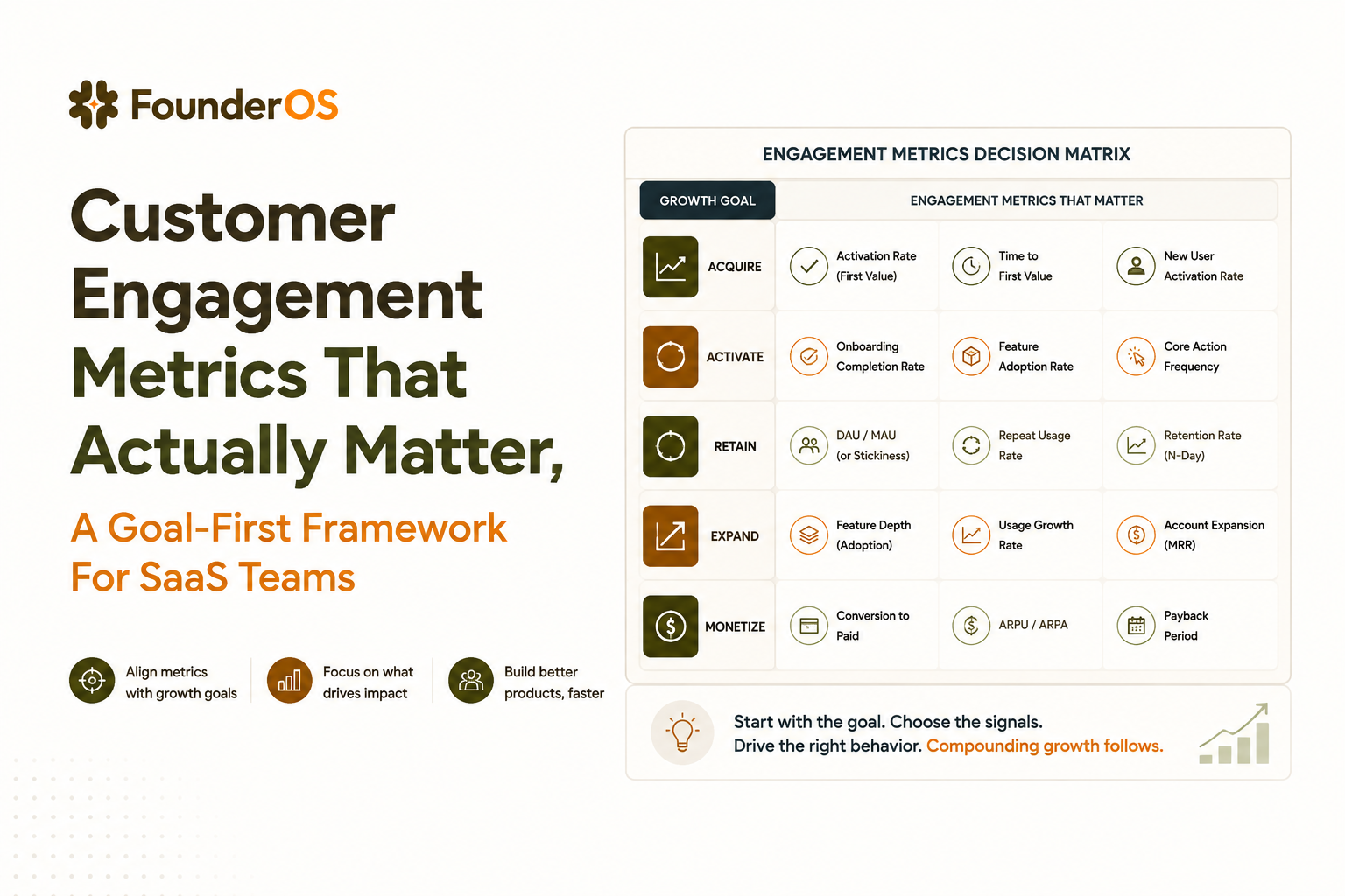
Pick the 3 to 5 metrics that match your growth goal
Customer engagement metrics work best when you choose them with a decision matrix that forces one primary KPI and a small set of supporting indicators for a single growth goal.
The common failure mode is building a “kitchen sink” dashboard where marketing, product, and customer experience are blended, then arguing about why numbers moved. The fix is simple: decide what you are trying to change over the next 4 to 8 weeks, then select metrics that (1) move in that time window, (2) are attributable to a concrete lever, and (3) are measurable without heroic instrumentation.
A decision matrix you can use in one meeting
Use the matrix below to pick one primary KPI plus two supporting KPIs for each goal. Score each candidate metric 1 to 5 across the criteria, then pick the highest total while enforcing “one primary.”
- Time-to-move: Can it change measurably in 2 to 4 weeks?
- Actionability: Does it map to a specific lever (onboarding step, feature discovery, lifecycle email, in-app prompt)?
- Attribution clarity: Can you isolate cohorts (new users vs existing, channel A vs B, plan tier)?
- Data reliability: Do you have clean events/surveys, consistent definitions, and low missingness?
- Business proximity: Does it predict retention, expansion, or conversion better than vanity usage?
Goal-to-metric templates (primary + supports)
Start with one of these templates and adjust only if you have a strong reason.
- Goal: Improve activation
Primary: activation rate (defined as % of new signups reaching a “first value” event within a set window)
Supports: time-to-first-value (median), onboarding completion rate (step-based) - Goal: Drive core feature adoption
Primary: % of active accounts using the core feature weekly (WAU using Feature X)
Supports: repeat usage (accounts with 2+ uses/week), adoption funnel conversion (discover → try → succeed) - Goal: Reduce early churn risk
Primary: 7-day or 14-day retention for new users (cohort retention)
Supports: “at-risk” segment size (no key event in N days), reactivation rate after nudges - Goal: Improve expansion readiness
Primary: % of accounts hitting a usage threshold tied to plan limits (seats, projects, automations run)
Supports: multi-user adoption (% accounts with 2+ active users), admin engagement (settings/config events)
In our experience working with B2B SaaS teams, the fastest way to stop metric sprawl is to require that every dashboard tile answers “what decision changes if this moves?” If the answer is “none,” it is a report, not a KPI.
Separate behavioral, survey, and outcome metrics into clear measurement models
Customer engagement metrics become interpretable when you split them into three models: behavioral (what users do), survey (what users say), and outcome (what the business gets).
Mixing these models creates false narratives, like calling a rise in sessions “customer love,” or treating a dip in NPS as purely a product issue when it was actually caused by support response time. The point is not to track less; it is to keep causality straight so each team can act without stepping on others’ work.
Model 1: Behavioral engagement (product reality)
Behavioral metrics come from instrumented events. Use these when you need to debug experience, adoption, and habit formation.
- Frequency: DAU/WAU/MAU, but only after defining “active” as a value action, not a login.
- Depth: number of meaningful actions per session (for example, tasks created, reports exported).
- Breadth: feature adoption across the suite, especially for multi-module products.
- Progression: step completion through onboarding or setup milestones.
If you need a practical way to design these, align events to a KPI-first schema, then expand. This is also where analytics events tracking frameworks keep you from collecting noise.
Model 2: Survey engagement (user perception)
Survey metrics capture experience quality that behavior cannot explain, like “I got value but it was frustrating.” Keep them close to moments, not quarterly blasts.
- NPS: loyalty sentiment, best used for trend + segmentation, not day-to-day optimization.
- CSAT: satisfaction after a specific interaction (support ticket, onboarding call, feature use).
- CES: perceived effort, most useful for onboarding and support journeys.
Model 3: Outcome metrics (business truth)
Outcome metrics tell you if engagement is paying off. They do not diagnose the why by themselves.
- Retention and churn: logo retention, revenue retention, cohort retention curves.
- Conversion: trial-to-paid, lead-to-opportunity, expansion conversion.
- Revenue quality: gross revenue retention (GRR), net revenue retention (NRR), ARPA.
A clean approach is to keep three dashboard pages: Behavioral (product), Survey (experience), Outcome (business). Then you use drill-down and segmentation to connect them, instead of blending them into one chart soup.
Treat NPS, CSAT, CES, retention, and churn as one CX system
NPS, CSAT, CES, retention, and churn should be managed as one customer experience system because each metric maps to a different point in the customer journey and they explain one another.
Teams often ask “Which one should we track?” The better question is “Which one is the leading signal for the journey stage we are trying to fix?” Use the mapping below so you collect feedback where it predicts outcome, then route the insight to the right owners.
A journey map that makes these metrics actionable
- Awareness and expectations: NPS (baseline) plus “expectations met” micro-question after onboarding kickoff.
- Onboarding and setup: CES (effort) after key setup milestones, plus onboarding completion behavior.
- Support and incidents: CSAT on ticket close, paired with first response time and resolution time (operational metrics).
- Loyalty and advocacy: NPS trend by segment (plan tier, use case, success milestone reached).
- Risk and renewal: churn (logo and revenue) and renewal saves, explained by behavior drop-offs plus negative feedback themes.
How to connect sentiment to the right cohort
Do not analyze NPS as one number. Segment it by behaviors that represent value realization: activated vs not, core feature adopted vs not, multi-user accounts vs single-user. This is where user segmentation turns survey scores into a roadmap.
What surprised our team was how often “neutral” NPS segments (7 to 8) contained the most actionable product feedback once we filtered to users who had tried the core feature but failed to repeat it. That pattern is easy to miss if you only look at promoters vs detractors.
Set benchmarks before you declare engagement good or bad
Customer engagement metrics need benchmarks that separate “strong,” “watch,” and “caveat” ranges, but your first benchmark should be your own baseline, not an industry average.
Public benchmarks are often incomparable because products define “active,” “retained,” and even “user” differently. So the practical workflow is: (1) define precisely, (2) measure consistently for 4 to 6 weeks, (3) set internal thresholds and alerts, then (4) only later sanity-check against external reference points if you can find a definition match.
Thresholds you can use as starting points (with caveats)
- NPS: Above 0 is generally more promoters than detractors, above 30 is often considered strong. Caveat: survey timing and audience mix can swing it heavily.
- CSAT: Target high satisfaction for support interactions, but treat it as interaction-specific. Caveat: customers can be satisfied with support while still churning for product-fit reasons.
- CES: Lower effort is better; use it to compare flows you can change (setup, import, integrations). Caveat: “easy” is not always “valuable.”
- Activation rate: Benchmark internally by channel and ICP segment; “good” depends on trial length, complexity, and sales assist. Caveat: a high activation rate can still hide shallow value if users never repeat the action.
- Retention: Compare cohorts by signup month and segment; focus on curve shape (early drop vs gradual decay). Caveat: seasonality and pricing changes can distort comparisons.
How to set internal baselines that hold up in planning meetings
- Write a metric spec: numerator, denominator, time window, inclusion rules, exclusions, and owner.
- Freeze the definition for a quarter: allow iteration, but version it so trend lines remain interpretable.
- Baseline by segment first: ICP vs non-ICP, self-serve vs sales-assisted, plan tier.
- Define three bands: green (no action), yellow (investigate), red (trigger a response playbook).
After running several metric audits, the pattern was clear: most “bad engagement” alarms were actually definition drift, like a changed onboarding flow that stopped firing one event. A lightweight metric spec prevents weeks of wasted debugging.
Build a cross-channel tracking workflow from events to alerts
Customer engagement metrics become operational when you connect event collection, identity, cohorts, dashboards, and alert thresholds into one workflow that produces weekly actions.
This section is deliberately implementation-heavy because measurement fails more often in plumbing than in theory. The goal is not “perfect data,” it is “reliable enough to act without second-guessing.”
Step 1: Standardize event naming around outcomes
- Use verb-object naming:
project_created,report_exported,integration_connected. - Capture context properties: plan, role, workspace_id/account_id, channel/source, feature variant.
- Define success events: events that indicate value, not navigation (avoid counting
page_viewas engagement).
Step 2: Resolve identity so journeys are real
- Unify anonymous to known users: map pre-signup behavior to the same user on signup.
- Group users into accounts: B2B engagement is often account-level, not user-level.
- Track role differences: admins, champions, and end users behave differently and drive different outcomes.
Step 3: Build cohorts that mirror how you operate
Create cohorts you will actually run plays on, such as:
- New activators: completed first value event in 7 days.
- Stalled onboarders: started onboarding but did not hit value within 3 days.
- At-risk accounts: no core feature usage in 14 days and renewal within 60 days.
Step 4: Dashboard for diagnosis, not reporting
Use a consistent dashboard layout so everyone knows where to look:
- Top row: primary KPI by segment.
- Middle: supporting metrics that explain the primary KPI (time-to-first-value, repeat usage, adoption funnel steps).
- Bottom: drill-down lists (top drop-off steps, sessions for failed users, most common error states).
Step 5: Alerts that trigger a playbook
Alerts should be based on thresholds and volume minimums, otherwise you will train the team to ignore them.
- Threshold rule: alert when primary KPI drops below the yellow band for 3 consecutive days.
- Volume rule: only alert if cohort size is above a minimum (for example, at least 50 new signups in the window).
- Routing rule: product gets behavioral drop-offs, support gets CSAT/CES issues, marketing gets channel cohort anomalies.
If you want this in one place, Founder OS can help by tying product tracking to user profiles and segments, then surfacing funnels and GTM reporting without waiting on a separate data team. The key is using the same cohorts for dashboards and for follow-up actions, so measurement and execution stay linked.
Use a simple formula and worked example to connect engagement to revenue
Customer engagement metrics should be treated as leading indicators only when you can quantify how a realistic change flows into retention or revenue with a simple model.
You do not need a full causal model to make better decisions. You need a back-of-the-envelope translation that (1) uses your own baselines, (2) makes assumptions explicit, and (3) can be updated as you learn.
The simplest chain most SaaS teams can defend
Use this structure:
- Engagement lift → changes retention probability for a cohort
- Retention lift → changes expected revenue over a period
A minimal formula for a single cohort:
- Revenue impact ≈ (# accounts in cohort) × (ARPA) × (change in retention rate over period)
Worked example you can adapt
Assume 400 new trial accounts per month convert into 100 new paying accounts (25% trial-to-paid). ARPA is $200/month. Your 90-day logo retention for these new paying accounts is 80%.
- If an onboarding improvement increases a leading engagement metric (for example, % reaching the first value event within 7 days) and you observe 90-day retention rise from 80% to 84%, that is a +4 percentage point retention lift.
- Expected 90-day revenue impact for that cohort (ignoring expansion and discounting) ≈ 100 accounts × $200/month × 3 months × 0.04 = $2,400.
The number is not the point; the decision is. If the improvement costs more than the expected impact, you either need a bigger lift, a different lever, or a different cohort.
How to validate the assumption without overfitting
- Hold out a control group: keep a portion of users on the old onboarding flow if possible.
- Measure lagging outcomes by cohort: compare retention curves for the cohorts exposed vs not exposed.
- Sanity-check confounds: channel mix changes, seasonality, plan pricing shifts.
Turn metric changes into actions with feedback, experiments, and follow-up checks
Customer engagement metrics only matter when every meaningful change triggers a repeatable loop: diagnose, decide a fix, test it, then re-check the same metric with the same cohort definition.
Most teams do the diagnose part and skip the follow-up check, so dashboards become a history lesson. Use the loop below to keep engagement measurement tethered to execution.
The action loop (one page your team can adopt)
- Detect: alert or weekly review flags a movement in the primary KPI.
- Diagnose: identify the segment and the step where behavior changed (funnel step, feature adoption stage, cohort).
- Explain with feedback: read qualitative comments from NPS/CSAT/CES, review support tickets, watch session replays if you have them, and tag themes.
- Decide the lever: pick one of: onboarding copy, in-app guidance, pricing/packaging guardrails, support macro, lifecycle message.
- Test: run an experiment or staged rollout with a pre-registered success metric and time window.
- Re-check: measure the same KPI definition against the same cohort and confirm the lift is durable for at least one full usage cycle.
A checklist for making qualitative feedback usable
- Tag feedback to a journey step: setup, first value, repeat use, collaboration, renewal.
- Separate bugs from fit: bugs get prioritized by frequency and severity; fit issues drive messaging and segment targeting.
- Quantify themes: count occurrences per 100 responses so it is comparable week to week.
Common failure modes and what to do instead
- Failure: metrics move, team debates meaning for two weeks.
Fix: pre-define your yellow/red bands and who owns the first investigation. - Failure: survey scores drop, product team scrambles, but the issue was support backlog.
Fix: treat survey metrics as a CX system and route by journey stage. - Failure: engagement rises but retention does not.
Fix: redefine “active” around value, then focus on repeat usage, not raw sessions.
We initially assumed adding more in-app prompts would always lift adoption, but user comments showed the real bottleneck was unclear setup prerequisites, so reducing steps improved repeat usage more than adding guidance. That is why tying behavioral changes to CES or ticket themes matters.
| Growth goal | Primary KPI | Two supporting KPIs | First action when it drops |
|---|---|---|---|
| Improve activation | Activation rate (first value in X days) | Median time-to-first-value; onboarding completion | Inspect funnel step drop-off and cohort by channel |
| Increase core feature adoption | % accounts using core feature weekly | Repeat usage; discover → try → succeed conversion | Review failed sessions and add one targeted nudge |
| Reduce churn risk | 14-day retention (new cohort) | At-risk segment size; reactivation rate | Trigger re-engagement play and investigate blockers |
| Improve support experience | CSAT on ticket close | First response time; CES after resolution | Audit queue, macros, and escalation rules |
FAQ
If you want one place to track product events, build user profiles, segment cohorts, and turn customer engagement metrics into a working GTM dashboard with funnels and onboarding actions, Founder OS is designed for exactly that workflow. Start small with one goal, one primary KPI, and two supports, then expand only when your team can act on what you measure.

Stages In Sales Funnel Explained, One Master Map For 3, 5, 6, And 7 Stages
Stages in sales funnel explained with one master map, entry/exit criteria, examples, and minimal KPIs to measure each stage clearly.
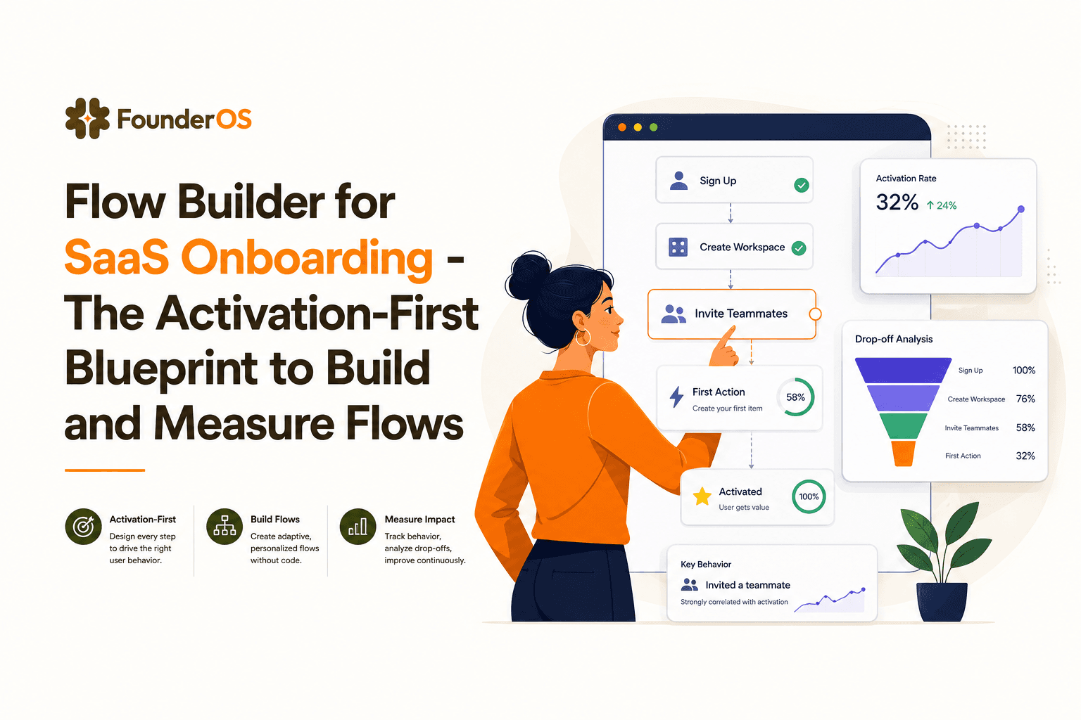
Flow Builder for SaaS Onboarding - The Activation-First Blueprint to Build and Measure Flows
Use a flow builder to design onboarding that drives activation, with triggers, segmentation, guardrails, and measurement that proves lift.
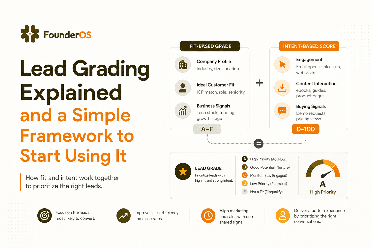
Lead Grading Explained and a Simple Framework to Start Using It
Learn lead grading vs scoring, set grades in an afternoon, and validate they predict pipeline and revenue with simple checks.