
Metrics for User Engagement in B2B SaaS - The 5 KPIs That Actually Matter
Metrics for user engagement in B2B SaaS work only when they reflect product behavior that predicts activation, retention, and expansion, not a long list of “nice to track” activity counts.
- Pick engagement KPIs by decision: activation, retention, expansion, or risk, then measure the minimum set that explains outcomes.
- Use five core metrics (active usage, frequency, depth, adoption, and stickiness) with clear formulas and segment-based interpretation.
- Run a weekly engagement review that ties drop-offs to cohorts, onboarding fixes, and experiments, not just dashboards.
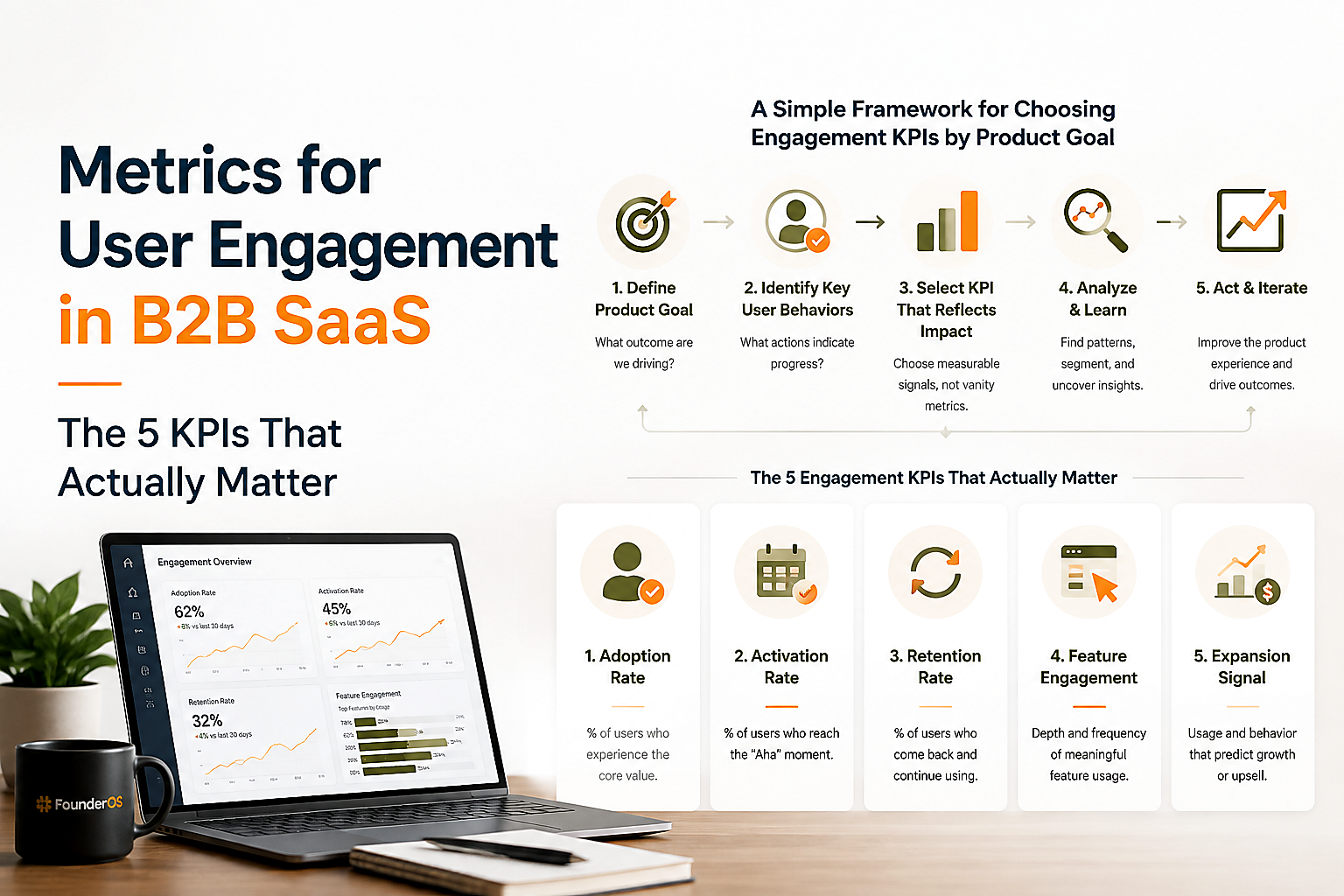
What User Engagement Metrics Actually Mean in B2B SaaS
User engagement metrics in B2B SaaS should be defined as repeatable in-product behaviors that correlate with value realization for a specific user role and account context.
The common failure mode is measuring “activity” instead of “value”: page views, sessions, or clicks that look healthy while activation stalls or churn rises. In practice, engagement needs to be anchored to your product’s value moments (for example, “created a dashboard and invited 2 teammates” rather than “visited settings”).
To narrow the scope, we use a three-part definition that makes engagement measurable and comparable week to week:
- Behavioral: events users generate inside the product (not email opens, social, or generic web analytics).
- Role-aware: engagement differs by persona (admin vs contributor) and should be segmented accordingly. A contributor may be “engaged” with fewer actions but high repeat usage.
- Outcome-linked: each metric has an expected relationship with activation, retention, support load, or expansion. If you cannot state the expected relationship, it is not a KPI.
One useful test: if a metric rises 20% next month, can your team name a specific product decision you would make differently? If not, it is likely a vanity metric.
Engagement is not the same as satisfaction or awareness
Engagement is what users do; satisfaction is how they feel; awareness is how they discovered you. All matter, but they answer different questions and require different instruments. For example, NPS can validate whether high usage is “happy usage” versus “forced usage,” but it should not replace behavioral metrics for user engagement when you are diagnosing drop-offs.
Start with a value path, not a metric list
A value path is the smallest set of steps a user must complete to get ongoing value. Map the path per persona, then choose metrics that measure progress along it. If you are building your tracking plan from scratch, align it with your broader digital product analytics approach so engagement KPIs are based on reliable event definitions.
The 5 Metrics for User Engagement That Matter Most by SaaS Goal
The best metrics for user engagement are the smallest set that explains movement in activation, retention, and expansion for your product’s core use case.
Below is a KPI matrix we use to pick the right metric based on the decision you are trying to make, plus a note on when each metric misleads. The point is not to track all five as equal, but to select 2 to 3 as primary and keep the rest as diagnostics.
KPI selection matrix by goal
- Goal: Improve activation
- Primary: Activation completion rate (value moment), time-to-value (TTV)
- Diagnostic: onboarding step conversion, early feature adoption
- Misleads when: you count “setup steps” as value; activation rises but retention does not
- Goal: Increase ongoing usage (retention)
- Primary: WAU/MAU (stickiness) and retention cohorts
- Diagnostic: usage frequency per engaged user, recency
- Misleads when: seasonality or weekly workflows inflate WAU, while depth drops
- Goal: Drive feature adoption
- Primary: % of active users adopting Feature X, adoption time from signup
- Diagnostic: depth (events per active user) within the feature
- Misleads when: adoption is “clicked once,” not “used successfully”
- Goal: Reduce churn risk
- Primary: engaged-user count trend, disengagement rate (drop in recency/frequency)
- Diagnostic: reactivation rate after nudges, support-driven friction events
- Misleads when: you only monitor account-level activity and miss user-level decay
- Goal: Expand revenue
- Primary: engaged accounts, multi-user adoption, feature usage tied to plan limits
- Diagnostic: invite rate, collaboration actions per account
- Misleads when: expansion depends on procurement timing more than product usage
The five metrics, stated precisely
These five cover most B2B SaaS products without turning into a dashboard zoo:
- Active usage (AUs): count of users (or accounts) completing a defined “active” event set in a time window.
- Usage frequency: how often engaged users return and complete the active event set (sessions per week, active days per week).
- Depth of usage: events per active user, or number of meaningful actions completed per active session.
- Feature adoption rate: % of active users who successfully use Feature X at least N times (not just first click).
- Stickiness: WAU/MAU or DAU/WAU depending on your natural cadence.
If you need a broader catalog for your KPI library, this companion guide on user engagement metrics can help you build a shortlist, but the decision matrix above should still dictate what becomes “executive-level” reporting.
How to Calculate and Interpret Each Metric With a Worked SaaS Dashboard
Metrics for user engagement become actionable when you compute them from consistent event rules and read them together as a system, not as isolated numbers.
The quickest way to avoid “metric whiplash” is to define one Active Event Set per persona (and sometimes per plan) and base most engagement calculations on that set. If your product has multiple workflows, you can define 2 to 3 event sets, but keep them stable for at least a quarter so trends are meaningful.
Step 1: Define the Active Event Set and the value moment
- Active Event Set (example for a B2B analytics tool): Viewed report + Applied filter + Exported or Shared
- Value moment (activation): Created first report AND invited 1 teammate
We initially assumed “login” was a decent proxy for engagement, but cohort review showed login-heavy weeks without any increase in retained users; anchoring to a value-based event set fixed that within two reporting cycles.
Step 2: Calculate the five metrics (with formulas)
- Active Users (weekly) = Count of distinct users who triggered any event in the Active Event Set in the last 7 days
- Usage frequency = Active days per active user per week (or sessions per week)
- Example: Total active days in week / weekly active users
- Depth = Meaningful events / weekly active users
- Use only events that represent progress, not UI noise (scroll, hover).
- Feature adoption rate (Feature X) = Users who completed “successful use” of Feature X at least N times / weekly active users
- Pick N based on learning curve: often N=2 or N=3 is more diagnostic than N=1.
- Stickiness = WAU / MAU (common for weekly cadence) or DAU / WAU (common for daily tools)
Step 3: A worked mini-dashboard with sample data
Use this as a template for your weekly review. The numbers are illustrative so you can see relationships, not benchmarks.
- MAU: 2,000
- WAU: 900
- Weekly active users (value-based): 650
- Total active days in week (across those 650): 1,430
- Meaningful events in week: 5,850
- Feature X successful users (N=2 uses): 260
- New signups this week: 300
- Activated this week (hit value moment within 7 days): 90
- Stickiness (WAU/MAU) = 900/2,000 = 45%
- Usage frequency (active days per weekly active user) = 1,430/650 = 2.2 days/week
- Depth (meaningful events per weekly active user) = 5,850/650 = 9.0 events/user/week
- Feature adoption (X) = 260/650 = 40%
- Activation rate (7-day) = 90/300 = 30%
Step 4: Interpret relationships, not single numbers
Here is how we read this mini-dashboard in a real weekly meeting:
- High stickiness + low depth often means “checking in” behavior. Investigate whether users are blocked from deeper workflows or if your active event set is too loose.
- Rising active users + flat activation typically means acquisition is improving but onboarding is leaking. Link onboarding step conversion to the activation rate definition you use.
- Feature adoption up + retention down can happen when Feature X is not the value driver you assumed, or adoption is measured as “clicked once.” Tighten “successful use.”
Lightweight benchmark guidance you can apply without fake precision
Benchmarking engagement across companies is hard because definitions vary, so treat benchmarks as starting hypotheses. For many B2B SaaS products with weekly workflows, WAU/MAU is commonly used as a stickiness check; the more important benchmark is your own: trend by cohort (new vs tenured users, role, plan, industry). If you do need a standard definition for retention cohort math, the cohort analysis primer from Amplitude retention analysis is a solid reference for terminology.
When Behavioral Metrics Are Not Enough
Behavior-only metrics for user engagement can misclassify “forced usage” and “frustrated usage,” so you need at least one qualitative or attitudinal signal to validate the story.
Three practical add-ons that do not require a research team:
- Micro-surveys at key moments: one-question prompts after a value moment (for example, “Did you accomplish what you came to do?”). Pair results with segments (activated vs not) so you do not average away meaning.
- User Engagement Scale (short-form): if you already run periodic surveys, a structured engagement instrument can separate attention, perceived value, and delight. Keep it consistent rather than frequent.
- Session replays or targeted interviews: use them only after metrics point to a specific step. “Watch 10 sessions at the drop-off step” beats “watch sessions until you find something.”
After running multiple onboarding audits, the pattern was clear: behavioral metrics pinpointed where users stalled, but short qualitative checks explained why they stalled, which made fixes dramatically faster to ship.
If you are already investing in event analytics, this is the missing bridge between “we see a drop-off” and “we know what to change.”
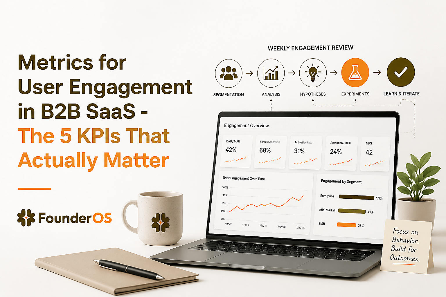
How to Build a Weekly Engagement Review That Drives Action
A weekly engagement review works when it produces a short list of decisions, owners, and experiments tied to metrics for user engagement rather than a status readout.
Use this five-step cadence. It is designed for product-led B2B SaaS teams that ship weekly, but you can adapt it to biweekly if your release cycle is slower.
1) Start with one chart: engaged users and engaged accounts
- Engaged users: users who hit your Active Event Set at least once in the last 7 days
- Engaged accounts: accounts with at least N engaged users (often N=2 for collaboration products)
Account-level engagement prevents the classic false positive where one champion is active but the account is not adopting.
2) Segment before you interpret
Segmenting is not a “nice to have”; it is how engagement becomes diagnosable. Minimum segments that usually pay off:
- New (0 to 14 days) vs tenured
- Role (admin, contributor, viewer)
- Plan tier
- Use case or industry (if your messaging differs)
In our experience working with founder-led B2B SaaS teams, the fastest wins come from one segment where engagement is strong and one where it is weak, then comparing the first 7 days of behavior side-by-side.
If you want a practical framework for this, see user segmentation.
3) Turn one metric movement into one hypothesis
Examples that keep the team focused:
- Depth down + frequency flat in new users: onboarding teaches navigation but not core workflow. Hypothesis: the first-run guide does not reach the value moment.
- Feature adoption up in admins only: contributors lack permissions or discovery. Hypothesis: permission defaults block role-based engagement.
- Stickiness down only in a specific acquisition channel: expectations mismatch. Hypothesis: landing promise differs from in-product first success.
4) Choose the action type and assign an owner
- Onboarding change: add a guided task, checklist, or tooltip at the highest-leverage drop-off step.
- Product change: remove friction or shorten the path to the value moment.
- Lifecycle message: target disengaged users with a prompt tied to the next best action.
- Data fix: if event definitions drifted, fix tracking before changing the product.
5) Close the loop with a simple experiment scorecard
Track just enough to learn:
- What changed (ship note)
- Target segment
- Primary metric (one of your metrics for user engagement)
- Guardrail metric (support tickets, errors, or time-to-value)
- Decision after 2 weeks: keep, iterate, revert
| Goal | Primary engagement KPI | Diagnostic view | Typical action |
|---|---|---|---|
| Activation lift | 7-day activation completion rate | Onboarding step funnel, time-to-value | Shorten path to first value, improve guides |
| Retention improvement | WAU/MAU stickiness | Cohort retention by segment | Improve recurring workflow, reminders |
| Feature adoption | % active users with successful use of Feature X (N uses) | Adoption time distribution | Improve discovery, templates, permission defaults |
| Churn risk reduction | Disengagement rate (recency and frequency decay) | At-risk cohort behaviors | Reactivation flow, fix friction step |
| Expansion readiness | Engaged accounts (2+ engaged users) | Collaboration actions per account | Drive invites, team workflows, in-app prompts |
FAQ on B2B SaaS engagement measurement
If you want to operationalize this without building a brittle tracking stack, Founder OS can help you instrument product tracking, tie events to user profiles, segment engaged and at-risk users, and turn your weekly engagement review into repeatable reporting and onboarding improvements with less manual work.
Interactive Product Tour Explained, A Practical Framework for SaaS Teams
Learn what an interactive product tour is, when to use it vs demos, and how to plan, build, and measure tours that drive activation.
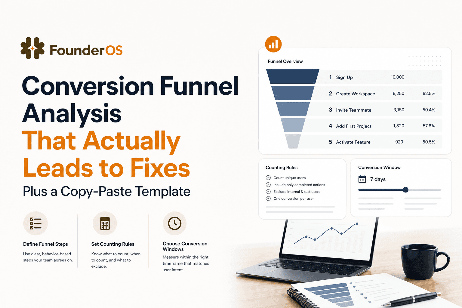
Conversion Funnel Analysis That Actually Leads to Fixes Plus a Copy-Paste Template
Learn conversion funnel analysis with a simple framework, counting rules, windowing, and a copy-paste template to turn drop-offs into prioritized actions.
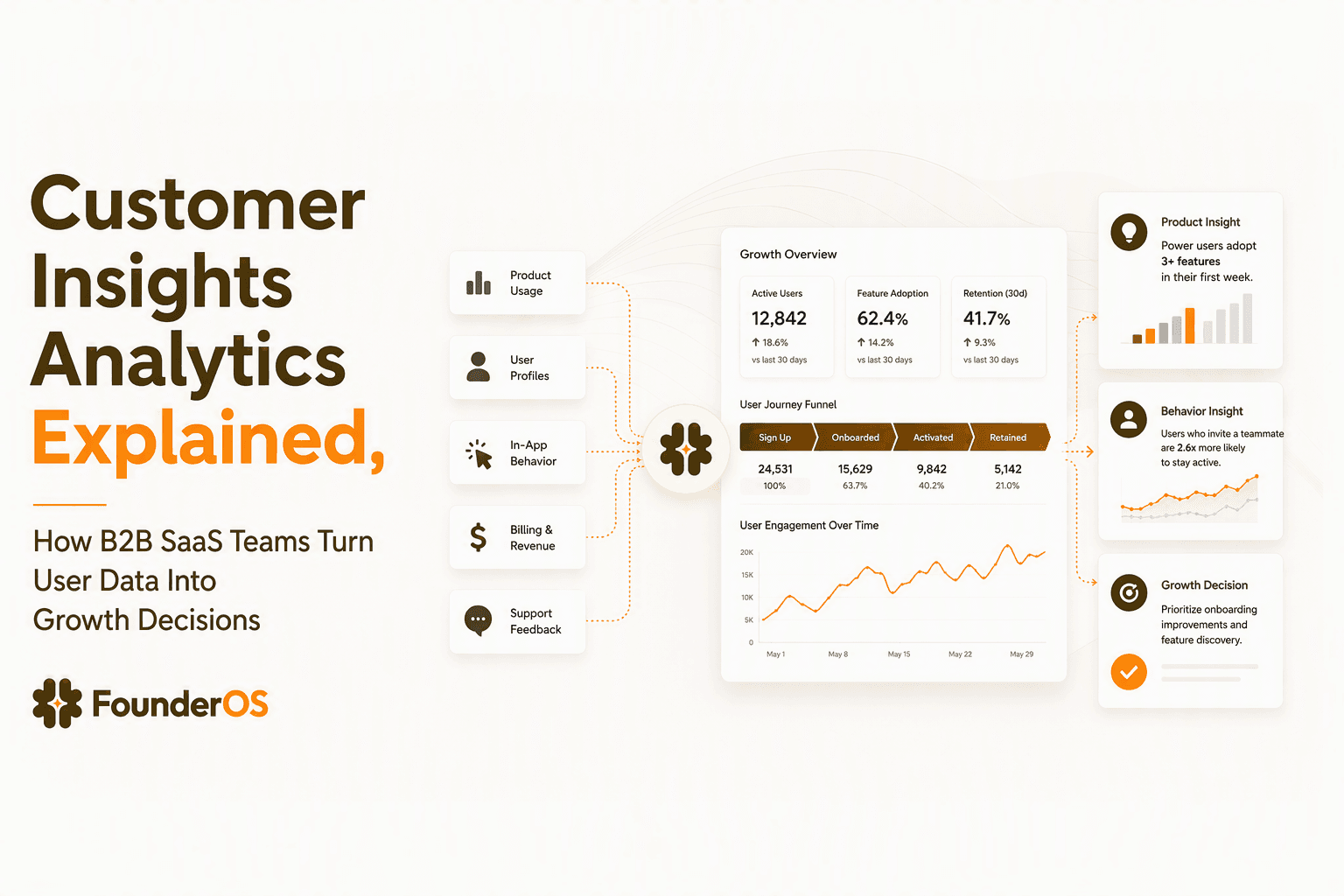
Customer Insights Analytics Explained, How B2B SaaS Teams Turn User Data Into Growth Decisions
Learn how customer insights analytics helps B2B SaaS teams connect user behavior, product data, and revenue signals to make growth decisions.