
Onboarding Tooltips Explained, Types, Examples, and How To Avoid Tooltip Fatigue
Learn onboarding tooltips: what they are, types, copy templates, fatigue guardrails, and a simple measurement plan tied to activation.
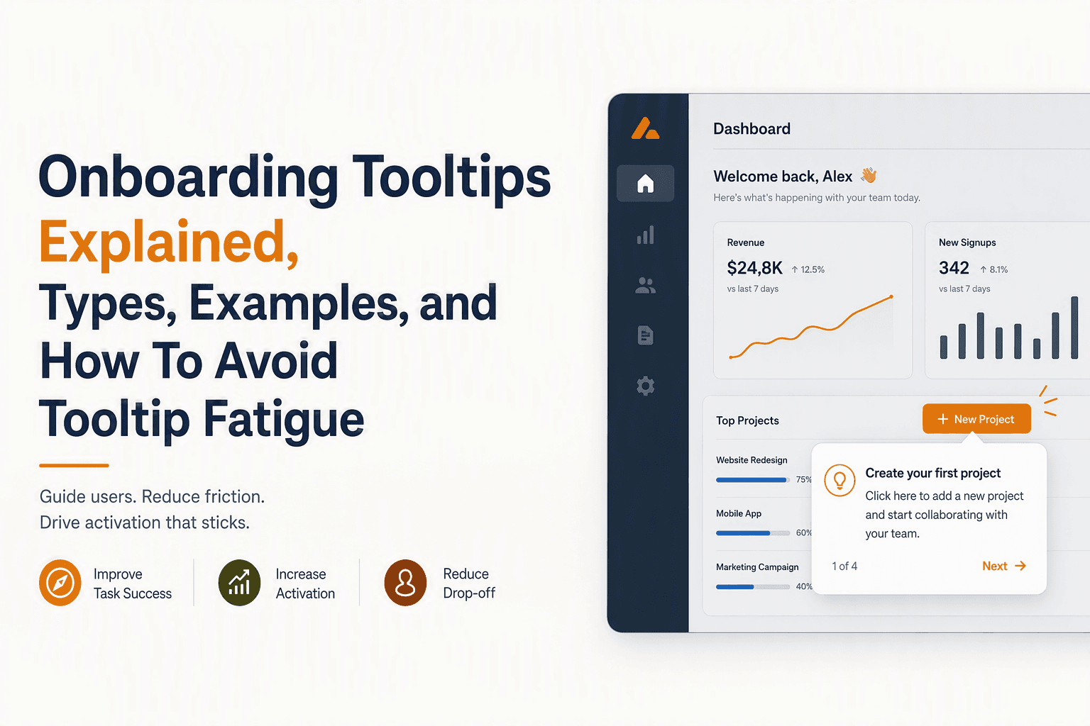
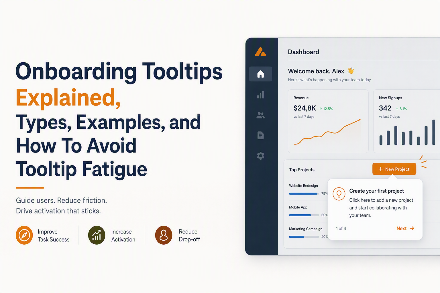
Onboarding tooltips are small, UI-anchored prompts that explain a specific element in your product at the moment it matters, helping new users take the next step without forcing them through a full tour.
- Use tooltips for just-in-time guidance on one UI element, not to narrate your whole product.
- Choose a tooltip type based on trigger and risk: first-seen, behavior-based, error-based, or segment-based.
- Measure impact with a minimal event schema (shown, clicked, dismissed, completed) tied to an activation action, not just completion rate.
What onboarding tooltips are and when they actually help
Onboarding tooltips work best when a user is already in the right place, but is unsure what a control does or what to do next.
A tooltip is a short message visually attached to a UI element (button, field, icon, menu item) that provides context, a recommendation, or a call-to-action. The value is timing and specificity: a tooltip should answer one question about one element, right when that question is likely to come up.
Tooltip vs. product tour vs. modal announcement
To avoid overusing tooltips, it helps to separate formats by purpose:
- Tooltip: one element, one idea, fast decision. Best for feature discovery, form guidance, and nudging a next step.
- Guided tour: multiple steps across screens. Best when the user must complete a sequence to succeed (setup flows, integrations, initial configuration). If you need 6 to 10 steps, you are usually in tour territory, not tooltip territory.
- Modal announcement: interruption with broad message. Best for release notes, plan limits, or major changes. Worst for “click here” micro-instructions.
Best-fit moments in SaaS
Use onboarding tooltips when the user intent is clear and your job is to reduce hesitation:
- First encounter with a key control: user lands on dashboard, sees an empty state, hovers, pauses, or scrolls without acting.
- After a prerequisite is met: user imported data, now needs to create the first report or invite a teammate.
- At decision points: “Choose tracking method”, “Select default pipeline”, “Pick permission level”.
- During error recovery: user submits invalid input, misses a required field, or fails an integration check.
In our experience auditing onboarding, the most annoying tooltips are the ones that fire on page load with no evidence of confusion or intent, especially when they stack on top of each other and cover the UI.
A simple taxonomy of onboarding tooltip types and onboarding types
A taxonomy keeps tooltips useful by tying each tooltip to a trigger, a job-to-be-done, and an explicit risk you mitigate.
Tooltip types mapped to triggers, use cases, and risks
| Tooltip type | Trigger (when it fires) | Best use case | Main risk | Guardrail |
|---|---|---|---|---|
| First-seen | User views a page/element for the first time | Introduce a single high-value control | Noise if user already knows it | Segment by role or referrer; show once |
| Behavior-based | User performs (or fails to perform) an action | Nudge the next step after a milestone | Feels creepy or pushy | Use clear “why now” copy; add snooze |
| Hover / focus help | User hovers or focuses a field | Explain a setting, input format, or constraint | Hidden on mobile; missed guidance | Also validate inline; consider “info” icon |
| Error-based | Error state appears or validation fails | Fix issues fast and reduce tickets | Blame-y tone; repeated loops | Use neutral copy and a direct fix path |
| Contextual upgrade | User hits a limit or locked feature | Explain limit and next option | Too salesy; interrupts workflow | Offer alternative action; allow dismiss |
| Segment-based | User attribute or role matches | Different paths for admins vs. members | Wrong targeting breaks trust | Default to “show less”; QA segments |
Onboarding types and where tooltips fit
| Onboarding type | User goal | Where tooltips fit | Where they do not |
|---|---|---|---|
| Empty-state onboarding | Create first meaningful object | Point to primary CTA and clarify what happens next | Explaining every sidebar item |
| Setup and configuration | Connect data, set defaults | Explain unfamiliar settings and prerequisites | Replacing a multi-step wizard |
| Feature discovery | Find and try valuable features | Reveal one feature at the moment it becomes relevant | “Tour of everything” on day one |
| Expansion onboarding | Invite team, add integrations | Nudge collaboration after individual success | Hard-sell upgrades before value |
Copy-and-paste onboarding tooltip examples and microcopy templates by scenario
Good tooltip microcopy is short, specific, and action-oriented, with an explicit outcome the user gets in return for clicking.
Below are ready-to-use onboarding tooltips you can paste into your builder, grouped by scenario. Keep titles optional: if the tooltip body is under roughly 90 to 120 characters, a title often adds clutter. If you include a CTA, use a verb that matches the next screen.
Scenario A: First value moment (empty state)
- Title: Start here
Body: Create your first project so you can track progress in one place.
CTA: Create project
Guidance: Body 70 to 110 chars; CTA 12 to 18. - Title: Import instead of starting blank
Body: Have data already? Import a CSV to skip manual setup.
CTA: Import CSV
Guidance: Mention the shortcut (“skip manual setup”). - Title: Choose a template
Body: Pick a template to get a working setup you can edit later.
CTA: Browse templates
Guidance: Reduce risk with “edit later”.
Scenario B: Explaining a setting without a long doc
- Title: Default timezone
Body: Reports and alerts use this timezone for dates and schedules.
CTA: Got it
Guidance: No CTA needed if it is informational. - Title: Permission level
Body: Admins can manage billing and access. Members can only use assigned projects.
CTA: View roles
Guidance: Two clauses max, avoid policy tone. - Title: Auto-archive
Body: Turn on to archive items after 90 days of inactivity. You can restore anytime.
CTA: Enable auto-archive
Guidance: Include reversibility (“restore anytime”).
Scenario C: Guiding a next step after a milestone
- Title: Nice, you are set up
Body: Next: invite a teammate so approvals and handoffs happen inside the app.
CTA: Invite teammate
Guidance: State “Next:” to justify timing. - Title: One more step to automate
Body: Add an integration to keep this updated automatically.
CTA: Connect integration
Guidance: Promise a concrete outcome (“updated automatically”). - Title: Save time later
Body: Set a default workflow now so new items follow your process automatically.
CTA: Set default
Guidance: “Now vs later” framing works well here.
Scenario D: Feature discovery without feeling spammy
- Title: Filter faster
Body: Use filters to find accounts by status, owner, or last activity.
CTA: Try filters
Guidance: Name 2 to 3 examples, not 10. - Title: Keyboard shortcuts
Body: Press ? anytime to see shortcuts for search and navigation.
CTA: Show shortcuts
Guidance: Include the exact key if applicable. - Title: Pin this view
Body: Pin to keep this report on your dashboard for quick access.
CTA: Pin report
Guidance: Use the object name (“report”, “view”).
Scenario E: Form completion and error recovery
- Title: Required format
Body: Use company email format (name@company.com) so invites do not bounce.
CTA: OK
Guidance: Provide an example pattern. - Title: Missing field
Body: Add a workspace name to continue. You can change it later in settings.
CTA: Add name
Guidance: Keep it neutral; avoid “You did not”. - Title: Connection failed
Body: We could not reach the service. Reconnect, or try again in a few minutes.
CTA: Reconnect
Guidance: Offer two paths, not one.
Scenario F: Upgrades and limits (without breaking trust)
- Title: Limit reached
Body: You have reached the monthly quota. Upgrade for more, or wait until the reset date.
CTA: See plans
Guidance: Always give a non-upgrade option. - Title: Available on higher plan
Body: This feature is on the Pro plan. If you want to test it, start a trial first.
CTA: Start trial
Guidance: Offer evaluation, not pressure.
Scenario G: Respectful dismissal patterns (so users do not hate tooltips)
- Title: Hide tips
Body: Prefer fewer hints? Turn off onboarding tips anytime in settings.
CTA: Open settings
Guidance: Make opt-out real, not fake. - Title: Not now
Body: Want to do this later? Snooze tips for 7 days.
CTA: Snooze
Guidance: Choose a fixed duration and stick to it. - Title: Skip this step
Body: You can skip and come back when you are ready. We will keep this in your checklist.
CTA: Skip for now
Guidance: Avoid guilt language.
Avoid tooltip fatigue with timing rules, frequency caps, and opt-outs
Tooltip fatigue happens when prompts appear too early, too often, or without clear relevance to what the user is trying to do.
Guardrails that prevent “Reddit rage” reactions
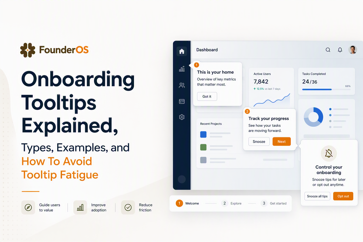
- Rule 1: One screen, one tooltip at a time. If multiple are eligible, queue them and show the next only after the user clicks, completes, or dismisses the first.
- Rule 2: Use a frequency cap per user. A simple starting cap: 1 to 2 tooltips per session and no more than 3 per week per user. Adjust only after you measure impact.
- Rule 3: Require a signal before showing a nudge. Good signals: user has been idle for 8 to 15 seconds, has scrolled the panel, has attempted an action and stopped, or has completed a prerequisite event.
- Rule 4: Make dismissal meaningful. “X” should stop that tooltip from appearing again for a meaningful period, not reappear on refresh.
- Rule 5: Keep the tooltip off critical UI. Do not cover Save/Submit buttons, error banners, or navigation needed to escape.
Segmentation patterns that reduce noise
Segmentation is the fastest way to make onboarding tooltips feel helpful instead of spammy. Split by role (admin vs member), lifecycle stage (new vs returning), and intent (came from invite link vs marketing site). We initially assumed “show it to all new users” was safer, but behavior audits usually show new users take very different paths depending on role and data readiness, so broad targeting increases dismissals.
Respectful opt-out copy and placement
Add an explicit “Turn off tips” path in your tooltip footer or in a settings area that is easy to find. A good pattern is to include secondary actions like “Snooze” or “Hide tips” after the second dismissal, not immediately on the first tooltip.
How to measure tooltip performance with a minimal event schema and KPI checks
Measuring onboarding tooltips properly means tying them to an activation action, not celebrating clicks or completion rates in isolation.
Minimal event schema (what to track)
Start with four events and a small set of properties so you can debug targeting and compare variants:
- tooltip_shown (properties: tooltip_id, page_url, step_index, trigger_type, user_segment)
- tooltip_clicked (properties: tooltip_id, cta_label)
- tooltip_dismissed (properties: tooltip_id, dismiss_type: close|snooze|disable)
- activation_event (your product-specific milestone, properties as needed)
Three KPI checks that catch “noise” fast
- Dismissal rate by tooltip_id: If one tooltip has unusually high dismissals compared to others, the problem is usually relevance or timing, not copy.
- Assisted activation: Compare activation rate for users who were shown the tooltip vs not shown, ideally within the same segment and time window.
- Time-to-next-action: Measure median time from tooltip_shown to the next meaningful click or completion. A tooltip that helps should reduce hesitation, not add steps.
A lightweight dashboard layout
Create a simple dashboard with: (1) tooltip_shown volume over time, (2) top tooltips by dismissals, (3) top tooltips by assisted activation, and (4) a breakdown by segment. If you already track product events, align tooltip IDs to the same naming scheme you use for analytics events tracking so you can trace a path from prompt to behavior without guessing.
How to ship your first tooltip flow this week with a starter checklist
Shipping onboarding tooltips quickly requires a narrow scope, clear triggers, and a checklist that forces you to decide what success looks like before you publish.
No-code vs code: selection criteria
- Choose no-code if you need to iterate weekly, target by segment, add frequency caps, and preview changes without deployments.
- Choose code if your UI is highly custom, you need extreme performance control, or you already have a robust in-house experimentation and targeting framework.
After running several tooltip cleanups, the pattern was clear: teams move faster when product and growth can change targeting and microcopy without waiting for an engineer, but they still need disciplined measurement to avoid shipping noise.
Starter checklist (copy and adapt)
- Pick one activation action: define it as an event (example: created_project, invited_teammate, connected_integration).
- Pick 3 tooltip candidates max: one empty-state, one setting explainer, one next-step nudge.
- Define trigger + cap for each: first-seen or behavior-based, plus a session cap and a weekly cap.
- Write microcopy: include outcome, keep body under 120 characters where possible, and make CTA explicit.
- Add an opt-out: snooze for 7 days or disable tips in settings.
- Instrument events: tooltip_shown, clicked, dismissed, plus your activation event.
- QA targeting: verify segment logic and edge cases, including mobile layouts.
- Ship and review in 72 hours: scan dismissal outliers and time-to-next-action before adding more.
If you need a structured path beyond tooltips, pairing them with an onboarding checklist and a lightweight product walkthrough plan helps you decide what deserves a tour versus a single tooltip.
| Common problem | Symptom | Fix (fastest) |
|---|---|---|
| Too many tooltips | High dismissals, complaints, UI feels cluttered | Queue one-at-a-time, add frequency caps, remove low-value prompts |
| Wrong timing | Users ignore or close immediately | Switch from page-load to behavior-based triggers and prerequisite checks |
| Copy is vague | Clicks do not lead to activation | Rewrite to name outcome and next step; tighten CTA verbs |
| No measurement | Team debates opinions | Track shown, clicked, dismissed, plus activation event; review in 72 hours |
FAQ
How many onboarding tooltips should I show to a new user?
Start with 1 to 3 total tooltips tied to a single activation goal, then expand only after you see low dismissals and a positive lift in the activation action for the shown segment.
What is the difference between tooltip onboarding and a guided tour?
Tooltip onboarding focuses on one UI element at a time with just-in-time guidance, while a guided tour is a multi-step sequence that walks users through a workflow across screens. If you need more than a couple of steps, a tour is usually a better fit.
Should onboarding tooltips have a CTA button?
Use a CTA when the tooltip is meant to drive a next action (Create, Connect, Invite). Skip the CTA for purely explanatory tooltips and keep them dismissible so they do not block the UI.
How do I stop tooltips from annoying experienced users?
Segment by role and lifecycle, cap frequency per session and per week, and honor dismissals with a real cooldown. Adding a visible “turn off tips” option is often the biggest trust builder.
If you want to apply the taxonomy and templates quickly, Founder OS can help you build tooltip onboarding flows with a no-code builder and then measure tooltip_shown through to activation using built-in tracking and segmentation, so you can keep what works and delete what adds noise.
Read Next
View all
Time to Value in B2B SaaS Explained Plus a Framework to Shorten It
Learn what time to value means in B2B SaaS and use a measurable framework to shorten time to value with behavior-based in-app onboarding.
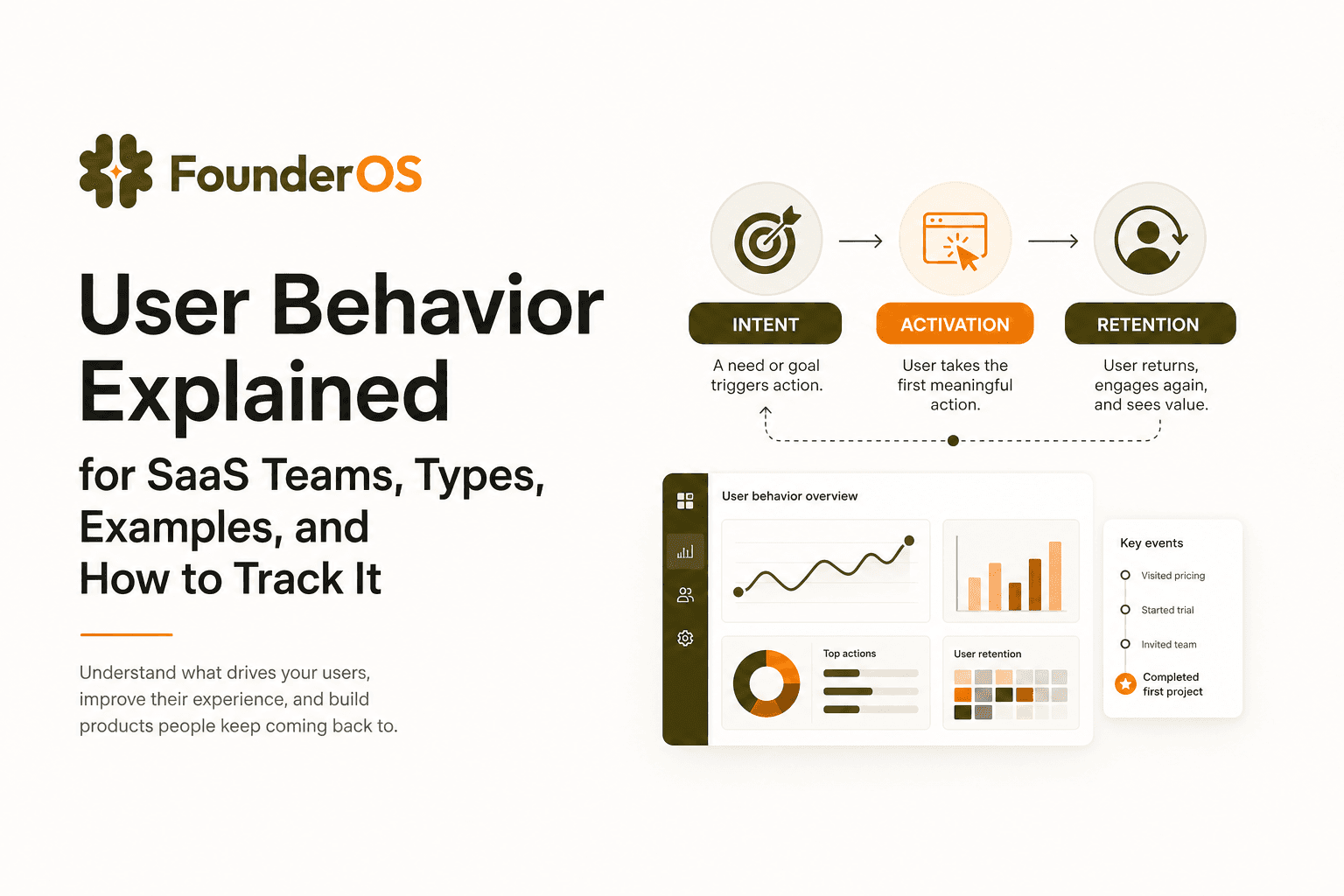
User Behavior Explained for SaaS Teams, Types, Examples, and How to Track It
Learn what user behavior means in SaaS, the key types, and a practical event tracking playbook to turn user behavior into product decisions.
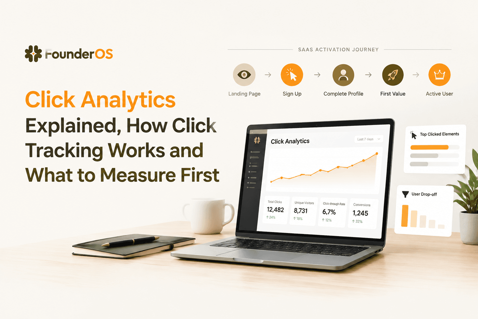
Click Analytics Explained, How Click Tracking Works and What to Measure First
Learn click analytics for B2B SaaS: how click tracking works end-to-end, what to measure first, and how to interpret results without traps.