
In App Guidance Explained, Patterns, A Selection Matrix, and a Measurement Playbook
Learn in app guidance patterns, a selection matrix, and a measurement playbook to prove activation impact without false wins.

In app guidance is the set of in-product UI prompts and step-by-step flows that steer users toward the next meaningful action, and it works best when it is targeted, triggered, and measurable rather than “more onboarding UI.”
- Choose in app guidance patterns by job-to-be-done, user state, and intrusiveness, not by what looks nicest in a tour builder.
- Instrument guidance like a product experiment: exposure, step, completion, and downstream activation events, with holdouts to avoid inflated wins.
- Use a decision matrix to separate “announce”, “teach”, “nudge”, and “recover” moments, then match each to the right pattern and trigger.
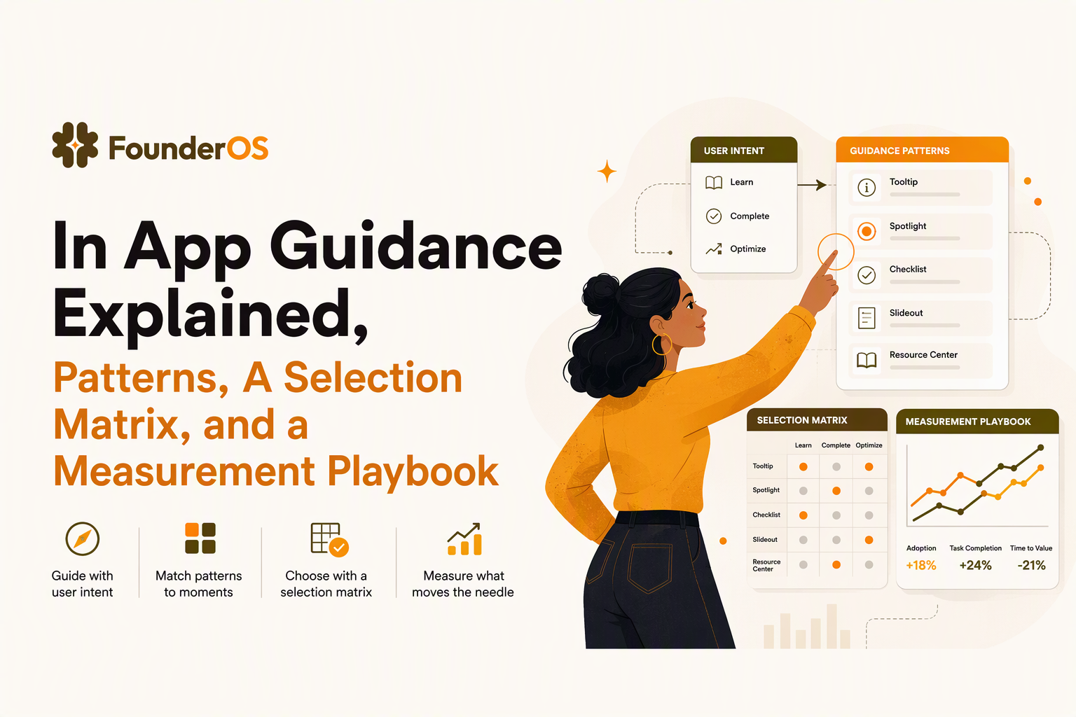
In App Guidance basics, prompts vs guidance, and where it fits in onboarding
In app guidance should be treated as a control system for user intent: it detects a condition (who/where/when) and delivers the minimum UI needed to move the user to a verified next step.
Plain-language definitions you can align on
- Prompt: a single UI element that asks for an action (example: a tooltip pointing to “Invite teammates”).
- Guidance: a sequence that reduces uncertainty across multiple steps (example: 4-step checklist that ends with “Create first project”).
- Onboarding: the full set of actions that get a new user to value, including emails, docs, sales enablement, and in-product flows.
Where in-product guidance actually belongs
In practice, in app guidance is most effective at three moments that other channels handle poorly:
- Right after intent signals (user clicks “New”, lands on a blank state, or opens a settings page).
- Right before irreversible actions (billing, permissions, data import).
- Right after friction (validation error, repeated back-and-forth, abandonment).
A quick “prompt vs guidance” rule you can apply
Use a prompt when the user already understands the task but needs a nudge; use guidance when the user is missing a mental model or must complete a sequence in the correct order. A simple check: if success requires two or more UI locations or one new concept, treat it as guidance.
In app guidance patterns and when to use each one
In app guidance patterns are best chosen by the user’s job-to-be-done and their current confidence level, because the same UI can either accelerate activation or create banner blindness.
The core patterns (and what they are for)
- Modal / announcement overlay: best for “everyone must know this now” messages (new permissions, breaking changes). Use sparingly.
- Tooltip / hotspot: best for “notice this control exists” feature discovery; keep copy action-oriented.
- Anchored speech bubble step: best for “do this next” guidance that must follow the UI in context.
- Checklist: best for multi-step activation paths where order matters; the checklist is the map.
- Inline empty-state guidance: best for first-time use, where the UI is otherwise blank; reduces bounce.
- Micro-survey (NPS, 1 question, or rating): best for qualifying intent and routing users (example: “What are you trying to do today?”).
Map patterns to lifecycle stages without guessing
Use the stage as a targeting constraint, not as a design brief:
- First session: empty-state guidance, checklist, 1-2 anchored steps.
- First value repeat: tooltips on secondary features; triggered reminders when a user returns but does not progress.
- Expansion: role-based checklists (admin setup, integrations), modals for permission changes.
- Recovery: error-triggered guidance, inline explanations, and short “here’s how to fix it” steps.
What surprised our team was how often a “bigger” pattern performed worse: swapping a 6-step tour for a 3-item checklist plus 2 contextual tooltips reduced step drop-off simply because users could pause and resume without losing their place.
Use triggers as the real design surface
The same tooltip can be helpful or spam depending on when it appears. At minimum, define (1) entry trigger (URL, click, event), (2) audience (segment, role, plan), and (3) cooldowns (do not show again for X days or once goal is achieved). If you are designing complex flows, plan your triggers explicitly, and consider implementing behavior triggers so guidance appears only when the user is stuck or ready.
A pattern selection matrix you can use to design flows that drive activation
A selection matrix turns in app guidance from “add a tour” into a repeatable decision: match the user scenario to the least intrusive pattern that can reliably move a measurable activation event.
The matrix (scenarios, triggers, tradeoffs, success metrics)
| Scenario | User signal (trigger) | Recommended pattern | Intrusiveness risk | Primary success metric |
|---|---|---|---|---|
| User lands on empty dashboard | First visit to /dashboard AND no objects created | Inline empty-state + 3-step checklist | Low | Create-first-object rate within 1 session |
| User visits key feature page but does nothing | Page view + 30-60s no click OR back navigation | Anchored speech bubble to next action | Medium | Click-through to primary CTA |
| User starts setup but abandons | Setup_started event AND no Setup_completed within 24h | Resume checklist + contextual tooltip on return | Low | Setup completion within 7 days |
| New feature launch to broad audience | First session after release (or first login post-announcement) | Modal announcement + optional “show me” | High | Opt-in rate to walkthrough; feature adoption within 14 days |
| User hits repeated validation errors | Same error code 2+ times in 10 min | Error-inline guidance + 1-step fix bubble | Low | Error resolution rate; support ticket deflection |
| Admin must grant permissions | Role=admin AND blocked_action event | Modal with clear consequence + link to settings | Medium | Permission granted rate; time-to-unblock |
How to use the matrix in 20 minutes
- Pick one activation milestone (example: “Invite 1 teammate” or “Import 1 dataset”).
- List 3 failure modes (user never starts, user starts but stalls, user finishes but does not repeat).
- Assign a pattern per failure mode using the least intrusive option that can still remove uncertainty.
- Write the trigger in event terms, not UI terms (example: “no project_created event after project_page_view”).
- Define the success metric and time window before you ship.
We initially assumed the best flows were linear, but audits across several SaaS onboarding paths showed branching by role and data maturity mattered more: “admin with existing data” needed import guidance, while “solo evaluator” needed a fast demo dataset path.
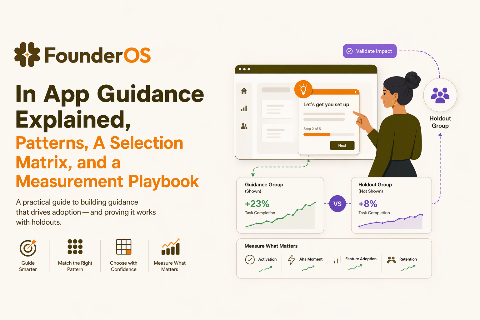
How to measure and prove in app guidance impact
Measuring in app guidance impact requires separating “engagement with the UI” from “movement in the product”, then validating uplift with holdouts or controlled experiments.
An event taxonomy for guidance that avoids vanity wins
Instrument guidance like any other feature with four layers of events:
- Exposure: guidance_shown (include flow_id, step_id, variant, trigger_type).
- Interaction: guidance_clicked, guidance_dismissed, guidance_snoozed.
- Progress: guidance_step_completed, guidance_flow_completed (time per step helps diagnose friction).
- Outcome: activation_event (the product event you actually care about, e.g., project_created, integration_connected).
If you already have product analytics, align naming to your broader event plan; if not, set a minimum standard using a KPI-first approach like analytics events tracking so “completion” never becomes the goal by accident.
A/B test template for guidance (what to randomize)
- Unit of randomization: usually user_id (not session) to prevent repeated cross-over exposure.
- Control: no guidance, or a less intrusive baseline pattern.
- Primary metric: activation event conversion within a fixed window (commonly 1-7 days depending on cycle).
- Guardrails: error rates, time-on-task, support contacts, and dismiss rate.
- Stopping rule: predefine test duration; do not stop the first time you see a lift.
Attribution checklist (common false positives)
- Selection bias: guidance triggers only on “high intent” pages; add a holdout in the same context.
- Simultaneous changes: sales email, pricing prompt, or UI redesign launched alongside the flow; log releases and exclude overlap windows.
- Learning effect: users see guidance once and succeed later; measure both immediate and delayed impact.
- Over-counted completion: a multi-step tour can inflate completions without raising activation; tie success to product outcomes.
For accessibility and interaction measurement standards, WCAG guidance on focus order and keyboard navigation is a useful baseline: WCAG.
Salesforce In-App Guidance setup overview, limitations, and when to use a DAP
Salesforce In-App Guidance is a solid option when your guidance needs are confined to Salesforce pages and you mainly need lightweight prompts rather than deeply segmented, behavior-based flows.
Setup overview (what teams typically configure)
- Type: pick a prompt style (often walkthrough or prompt) based on whether you need a sequence.
- Target: choose the Salesforce app, page, and element context.
- Audience: select profiles or permission sets to avoid showing admin steps to standard users.
- Scheduling: define start/end dates so old announcements expire automatically.
Common constraints to plan around
- Cross-product journeys: if your activation path starts in Salesforce but finishes in your own app, native guidance may not cover the full flow.
- Advanced triggering: teams often want triggers tied to events (records created, fields missing, repeated errors) rather than page-only context.
- Experimentation: if you need consistent holdouts, variants, and downstream attribution, you may outgrow native reporting.
- Governance: large orgs need versioning, approvals, and localization workflows beyond “publish a prompt”.
Evaluation checklist for “native vs DAP” decisions
- Do we need behavior-based triggers, not just page context?
- Do we need segmentation beyond roles, such as lifecycle stage, plan, or past feature usage?
- Do we need to measure downstream product outcomes in a single analytics view?
- Do we need guidance across multiple web apps or embedded surfaces?
- Do we need localization at scale with consistent translation memory?
If you decide to implement deeper walkthroughs, keep your content modular so it can be reused in a guided product tour or a shorter interactive walkthrough depending on user intent.
Enterprise readiness checklist, accessibility, localization, and privacy
Enterprise-grade in app guidance requires predictable focus behavior, a translation workflow that does not break layouts, and data minimization so targeting does not create privacy risk.
Accessibility checklist (practical, testable items)
- Keyboard: every step must be reachable and dismissible by keyboard alone; test Tab order across modals and tooltips.
- Focus management: on open, move focus into the guidance; on close, return focus to the triggering control.
- ARIA: dialogs use appropriate roles; tooltips are announced correctly; avoid trapping screen readers in overlays.
- Motion and timing: avoid auto-advancing steps; provide “pause” if using timed elements.
Localization workflow that avoids “string chaos”
- Externalize copy: store step text by key, not hardcoded per flow, so translations update safely.
- Allow text expansion: design for 30% to 50% longer strings to handle German, Portuguese, and similar expansion.
- Locale targeting: segment by user locale and ensure fallback language is explicit.
Privacy and data minimization for targeting
- Collect only what you use: if targeting uses role and feature usage, do not ingest unrelated PII “just in case”.
- Log responsibly: avoid sending sensitive form field values in guidance interaction events; record only IDs and timestamps.
- Retention: set retention windows for interaction logs aligned to your security posture.
Tooling and implementation options, from native UI to no-code flow builders
Tooling for in app guidance should be selected by how quickly you can iterate triggers, targeting, and measurement, because guidance is rarely correct on the first publish.
Three implementation paths (and when they fit)
- Native UI code (build): best when guidance must be deeply custom, performance-sensitive, or integrated with proprietary UI states; higher engineering cost per iteration.
- Native platform guidance (configure): best when the surface is contained (for example, inside a single platform) and you need straightforward prompts and announcements.
- No-code flow builder (buy/configure): best when product teams need to ship and iterate without deployment cycles, and you need segmentation plus analytics tied to outcomes.
A “must support” checklist for no-code builders
- Triggering: URL and event-based triggers, plus cooldown rules and stop conditions.
- Targeting: segments by attributes and behavior; AND/OR logic; exclusion lists.
- Preview and QA: environment support, draft vs live, and per-step validation.
- Analytics: step drop-off, completion, and downstream outcome attribution, not just views.
- Governance: roles, approvals, and change history for regulated teams.
A practical “one-flow” implementation sequence
- Define your activation event and the earliest preceding “intent” event.
- Ship a minimal product walkthrough that covers only the steps that remove uncertainty.
- Launch with a holdout and measure 1-2 weeks to capture delayed conversions.
- Iterate by changing triggers and audience first, then copy, then UI pattern last.
After running several onboarding audits, the pattern was clear: teams moved faster when targeting and analytics lived next to the flow builder, because each iteration was “change trigger, publish, measure” rather than “file a ticket, wait, and guess.”
| Choice | Best for | Main tradeoff | What to validate first |
|---|---|---|---|
| Build in code | Highly custom UX and logic | Slower iterations, higher dev cost | Do you have stable requirements and design capacity? |
| Native platform guidance | Contained surfaces, simple prompts | Limited experimentation and cross-app journeys | Can you target by the signals you actually need? |
| No-code builder | Fast iteration with product-led teams | Vendor dependency, governance review needed | Can it measure downstream outcomes reliably? |
FAQ
How many steps should in app guidance tours have?
Keep tours to the minimum steps required to reach a measurable outcome. In practice, start with 3 to 5 steps aimed at one activation event, then add only if drop-off analysis shows users need more context.
What is the difference between a tooltip and a walkthrough?
A tooltip is a single contextual hint, while a walkthrough is a guided sequence that teaches a process across multiple UI locations. Use a tooltip for discovery and a walkthrough when order or concepts matter.
How do you prevent banner blindness with in app guidance?
Use behavior-based triggers, strict frequency caps, and stop conditions so guidance disappears once the user achieves the goal. Also rotate patterns so not every message is a modal or a tour.
What should you measure besides completion rate?
Measure the downstream activation event (conversion within a time window), time-to-value, error resolution, and support contacts. Completion is useful for diagnosing step friction, but it is not proof of product impact.
If you want a practical next step, build one activation-focused in app guidance flow, instrument exposure and outcome events, and run a holdout test; Founder OS is an optional way to ship the flow with a no-code builder while tracking product events and targeting segments so you can measure uplift faster.
Read Next
View all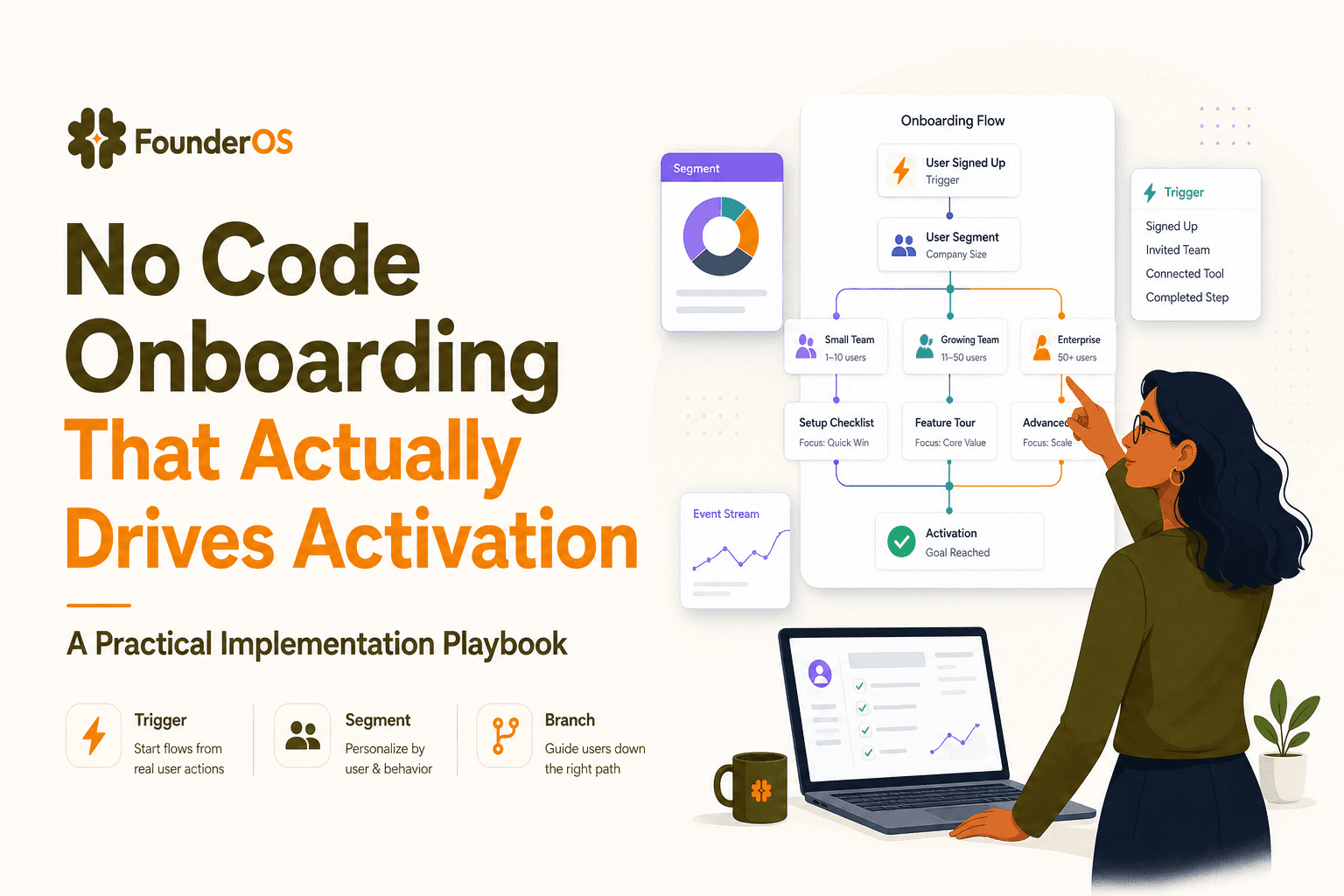
No Code Onboarding That Actually Drives Activation - A Practical Implementation Playbook
A practical playbook for no code onboarding that proves activation lift with targeting, triggers, instrumentation, and safe rollout in B2B SaaS.
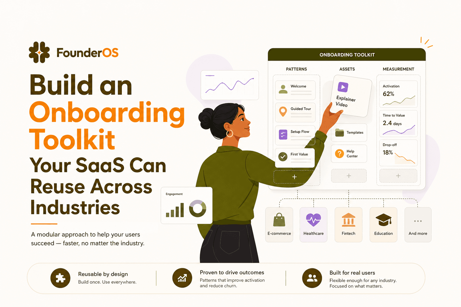
Build an Onboarding Toolkit Your SaaS Can Reuse Across Industries
Build an onboarding toolkit that standardizes flows, assets, and measurement across industries to reduce time-to-first-value and boost activation.
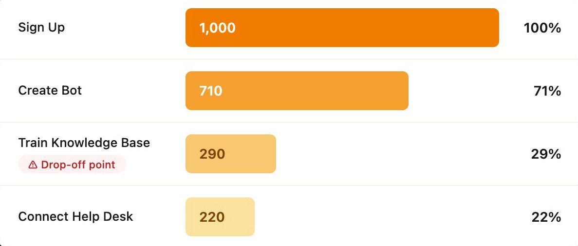
How CX Genie Increased Setup Completion by 61% in 60 Days
Learn how CX Genie improved SaaS user activation by increasing setup completion by 61% in just 60 days with onboarding optimization and activation strategies.