
Onboarding Tours Explained, When to Use Them, and How to Design Tours That Drive Activation
Learn what onboarding tours are, when to use them, and how to design and measure onboarding tours that improve activation in B2B SaaS.
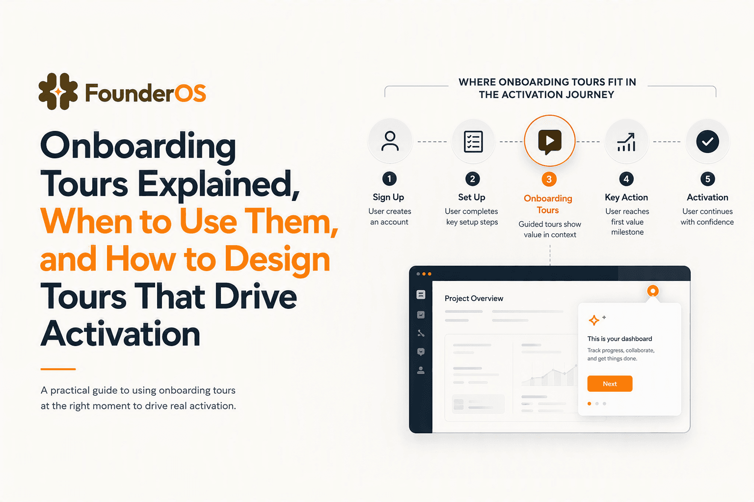
Onboarding tours are in-app, step-by-step guidance flows that help new users reach a specific “first value” action inside your product with minimal confusion and fewer support handoffs. Used well, onboarding tours reduce time-to-value by showing the next best action in the UI; used poorly, they become long, skippable slide decks that inflate “completion” while leaving activation flat.
- Use onboarding tours for multi-step, high-friction actions that users cannot infer from UI alone (not for “feature marketing”).
- Pick the pattern based on interruption tolerance: checklist for self-paced setup, contextual nudges for just-in-time hints, tours for sequential tasks.
- Measure impact with exposure cohorts and activation events, not tour completion rate alone.
What onboarding tours are and when they work best
Onboarding tours work best when a user must complete a short sequence of steps to experience value and the UI does not make the sequence obvious without guidance. In B2B SaaS, that “value” is usually an activation milestone such as “invited a teammate,” “connected a data source,” or “created and shared the first artifact,” and tours are simply one delivery mechanism to guide users through that milestone.
Definition, scope, and the practical boundary
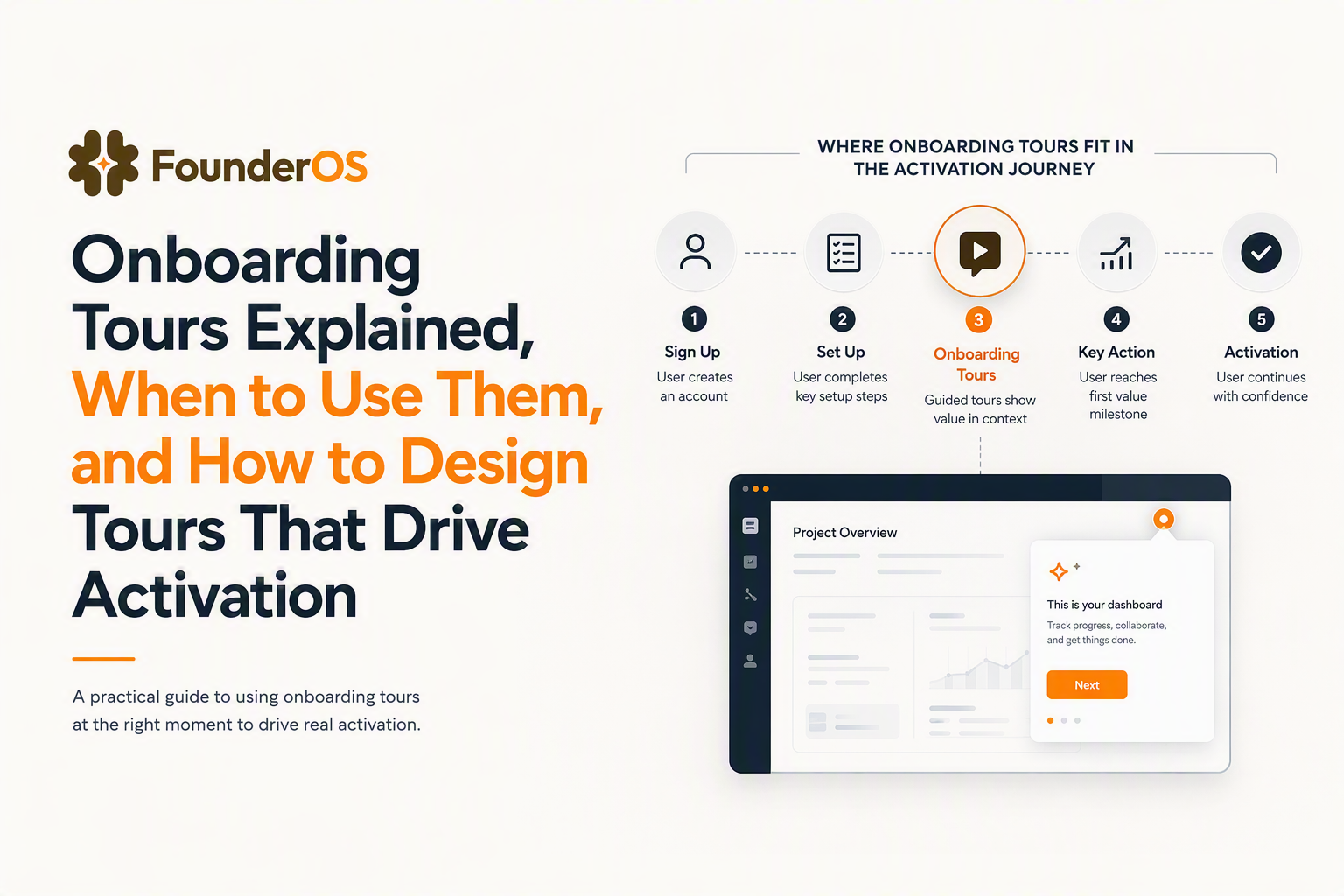
For this article, an onboarding tour is a guided, ordered flow of in-app prompts (tooltips, bubbles, modals, highlights) that leads a user from a starting state to a measurable outcome inside the product. That’s narrower than “onboarding,” which also includes emails, docs, live training, and sales handoffs.
A useful boundary our team uses in audits is: if the experience can be consumed passively (read, watch, acknowledge), it’s education; if it must be completed actively (click, enter, connect, invite), it’s onboarding. Tours are for active onboarding.
Activation and time-to-value linkage (and the anti-goals)
Onboarding tours should target one of two things: (1) reduce the number of decisions a user must make to reach the first value moment, or (2) reduce the number of “unknown UI moves” required to finish a setup workflow. The anti-goals are just as important:
- Do not use a tour to “announce everything.” That creates banner blindness and teaches users to skip.
- Do not use a tour to compensate for unclear IA or broken empty states. Fix the product copy and navigation first.
- Do not force a tour before a user has intent (for example, on sign-up before they’ve chosen a workspace name or role).
When tours tend to outperform other onboarding patterns
In practice, tours outperform checklists and one-off tooltips when the path to value has: a strict order (Step A must happen before Step B), UI hiding (actions buried in menus), or irreversible consequences (users fear doing it wrong, so they stall). Examples: connecting OAuth integrations, importing data, configuring permissions, creating the first automation.
A simple decision tree to choose tours vs checklists vs contextual nudges
A decision tree prevents teams from defaulting to onboarding tours for every problem by routing each onboarding goal to the least interruptive pattern that still produces activation. The fastest way to choose is to start from the user’s job-to-be-done and the product’s “interruption budget.”
Step 1: Start with the activation job, not the feature
Write the goal as a user outcome with a concrete verb, then add the measurable activation event you will track. Examples:
- “Invite 1 teammate” → activation event:
teammate_invited - “Import 100 rows” → activation event:
import_completedwith propertyrows_imported - “Create first project and add 1 task” → activation event:
first_project_created
If you can’t define an activation event, you’re not ready to build an in-app flow yet. A tour without a measurable outcome becomes UI theater.
Step 2: Score the workflow with three criteria
Use a quick 0 to 2 score for each criterion. Total score guides the pattern selection.
- Sequencing requirement: 0 = any order, 1 = recommended order, 2 = strict order
- UI discoverability: 0 = obvious, 1 = somewhat hidden, 2 = buried or jargon-heavy
- User confidence risk: 0 = safe to explore, 1 = mild fear, 2 = high fear or irreversible change
Interpretation: 0 to 2 use contextual nudges, 3 to 4 use a checklist plus a couple nudges, 5 to 6 use onboarding tours with driven actions.
Step 3: Pick the delivery pattern by interruption tolerance
Match the pattern to how much interruption the user will accept at that moment:
- Contextual nudges (tooltips, inline hints) work when the user is already looking at the right screen and needs one small nudge.
- Checklists work when setup is longer than 2 to 3 minutes and users want control over pacing. Pair with deep links to screens.
- Onboarding tours work when you can predict the next step and the user benefits from “do this now” guidance.
In our experience working with early-stage B2B SaaS teams, the most common mistake is launching a tour when the product actually needs a checklist: the setup takes 15 minutes, so users either abandon mid-tour or speed-skip to regain control.
Step 4: Decide build vs buy based on iteration speed
A practical rule: if you expect to change onboarding copy, targeting, or steps weekly for the next 4 to 8 weeks, you want a no-code builder and analytics baked in. Engineering-built tours can be fine for stable flows, but they often slow iteration because every copy tweak becomes a deployment.
Also consider whether you need segmentation and behavior triggers early. If yes, choose a system that can target by URL, attributes, and events without custom code.
Onboarding tour UI playbook, patterns, rules, and accessibility
Onboarding tour design that drives activation is mostly about pattern discipline: pick the smallest UI component that can move the user to the next step without hiding the product. The playbook below is meant to be shippable: it includes pattern rules, copy constraints, and accessibility checks you can run before publishing.
Pattern selection rules (modal vs bubble vs tooltip vs survey)
- Modal: use for a single decision or commitment (choose role, confirm import). Limit to 1 key message and 1 primary CTA.
- Speech bubble: use for sequential steps anchored to UI. Best default for tours.
- Tooltip: use for “one action, one hint” moments (naming conventions, where to click).
- Survey: use after value, not before. Collect intent (“what are you trying to do?”) to route the next flow.
Step rules that prevent “tour theater”
Apply these constraints to every tour before you ship:
- Hard cap steps at 5 to 7 for a first release. If you need more, convert to a checklist with deep links.
- Each step must require an action (click, type, select). If a step is only informational, rewrite it as an inline hint or move it to docs.
- One concept per step. If your step copy includes “and,” it is usually two steps.
- Give an escape hatch: visible Skip, and a way to replay later from a help menu.
Driven actions, validation, and error-proofing
Activation-first onboarding tours should confirm that the user actually did the action, not just saw the step. Use “driven actions” when possible: advance only after the user clicks the intended control, lands on the correct URL, or triggers the expected event. For forms, validate completion and handle errors with friendly copy (“Looks like the API key is invalid, try regenerating it”).
What surprised our team was how often completion rate stayed high even when users failed silently at a key step (for example, connecting an integration but lacking permissions). Adding validation and a clear failure state reduced downstream support tickets, even when the tour got one extra step longer.
Accessibility and theming checklist (keyboard, screen readers, dark mode)
- Keyboard: all tour controls reachable via Tab, Enter activates CTAs, Esc closes modals.
- Focus management: when a step opens, focus moves to the bubble or modal; when dismissed, focus returns to the triggering element.
- Contrast: highlight rings and tooltip text meet WCAG contrast guidelines; avoid low-contrast overlays in dark mode.
- Screen readers: step content announced as dialog/alert where appropriate; avoid purely visual “hotspots” with no text.
- Motion: keep animations subtle; respect reduced-motion settings when possible.
Tour blueprint templates mapped to common SaaS activation goals
Tour templates work when they map to a single activation milestone and include copy blocks that reduce ambiguity at each decision point. Below are three common B2B SaaS goals with step libraries you can adapt without rewriting from scratch.
Template A: Invite a teammate (collaboration activation)
Use when: value increases with multiple users and permissions matter. Success event: teammate_invited.
- Bubble on “Invite” button: “Add one teammate so you can share updates and avoid working in a silo.” CTA: “Invite now”.
- Tooltip on email field: “Use a work email so they join your workspace automatically.”
- Bubble on role selector: “Start them as Member. You can change roles later.”
- Driven action: advance only after “Send invite” click.
- Confirmation bubble: “Invite sent. Next, assign them to a project.” CTA: “Go to Projects”.
Common failure mode: user lacks permission. Add an alternate branch: “You need Admin access to invite. Ask an Admin or request access.”
Template B: Import data (time-to-value via existing content)
Use when: users already have data elsewhere and blank states feel empty. Success event: import_completed.
- Modal: “Bring your data in to see results immediately.” Options: CSV, integration, manual.
- Bubble on import option: “CSV is fastest if you already exported a report.”
- Tooltip on mapping UI: “Match these 3 required fields to avoid failed imports.”
- Driven action: only advance after mapping required fields.
- Completion bubble: “Import complete. Create your first view using these filters.” CTA deep link.
Copy block for errors: “Rows with missing required fields were skipped. Download the error file to fix and re-upload.”
Template C: Create first project (core object activation)
Use when: your product’s value centers on a single object (project, workspace, dashboard). Success event: core_object_created.
- Bubble: “Create your first project to organize work.” CTA: “Create project”.
- Tooltip on name field: “Name it after a real initiative, not ‘Test’.”
- Bubble on template selector: “Pick a template to start faster, you can customize later.”
- Driven action: advance after “Create”.
- Next-step bubble: “Add one item so your project isn’t empty.” CTA: “Add item”.
If you need a more detailed step map with copy blocks and KPIs, use this product walkthrough template as a companion.
How to measure onboarding tours, instrumentation and dashboards
Measurement for onboarding tours should prove causal impact on activation by comparing exposed vs unexposed cohorts, not just reporting step completion. A tour that “completes” but does not change an activation event is a UI interaction, not onboarding progress.
Define three layers of events (exposure, progress, outcome)
- Exposure events:
tour_shown,step_shownwith propertiestour_id,step_id,variant,segment. - Progress events:
step_completed,tour_skipped,tour_completed. - Outcome events: your activation milestones, for example
integration_connected,teammate_invited.
Keep naming consistent so reports are easy to maintain. If you later add A/B tests, include a variant property from day one.
Use an exposure cohort to estimate lift
A lightweight method that works without heavy experimentation infrastructure:
- Create an “Exposed” cohort: users who fired
tour_shownfor a given tour. - Create a “Not exposed” cohort: eligible users in the same segment who did not see it (for example, joined before publish, or did not hit the trigger URL).
- Compare activation event conversion within a fixed window (for example, 24 hours, 7 days) after eligibility.
After running onboarding reviews across multiple products, the pattern was clear: completion rate often correlates with good UX, but activation lift correlates with correct timing and correct goal selection. So treat completion as a diagnostic, not the KPI.
Dashboards that answer the only questions that matter
- Activation funnel: eligible → exposed → activated, with drop-offs by segment.
- Step friction: step_shown vs step_completed, plus time between steps to spot “stall” points.
- Replay and skip: % skipped, % replayed, and which step triggers exits.
To go deeper on defining and calculating the metric itself, see this guide to activation rate.
Common mistakes and an iteration plan for your first two tour releases
The fastest way to make onboarding tours effective is to ship small, learn from real behavior, and iterate on targeting and step friction rather than endlessly rewriting copy. Below is a mistake checklist plus a simple two-release cadence you can follow.
Mistake checklist (timing, segmentation, and control)
- Launching too early: triggering a tour on first login before users have context. Fix by triggering on intent signals (visited /settings, clicked “Integrations”).
- No segmentation: showing the same flow to admins and end-users. Fix by segmenting by role, plan, or lifecycle stage.
- No skip and no replay: users feel trapped, then learn to close overlays. Fix with visible skip and a “Replay tour” entry in help.
- Too long: 12-step tours degrade attention and inflate drop-off. Fix by splitting into two tours or converting to an onboarding checklist.
- Measuring the wrong thing: celebrating completion. Fix by tying the tour to an activation event and comparing cohorts.
Iteration plan for release 1 and release 2
Release 1 (week 1): ship one tour for one activation milestone. Keep it 5 steps max. Instrument exposure and outcome events. Add a single segment filter (for example, new admins only).
Release 2 (week 2 to 3): change only one dimension at a time, based on data:
- If exposure is low: fix triggers, entry points, and eligibility.
- If step drop-off is high: simplify UI instructions, add driven validation, or split the tour.
- If completion is high but activation is flat: wrong goal, wrong audience, or users need a checklist instead of a tour.
A practical addition: add one in-product micro-survey after the activation event (“What almost stopped you from finishing?”). That qualitative signal pairs well with step analytics.
| Onboarding pattern | Best for | Typical length | Main KPI | Common failure mode |
|---|---|---|---|---|
| Onboarding tours | Strict sequences to reach first value | 3 to 7 steps | Activation event conversion (exposed vs not) | Too long, too early, no validation |
| Checklists | Longer setups users want to pace | 5 to 12 tasks | % tasks completed + activation milestones | Tasks are vague or not deep-linked |
| Contextual nudges | Single-step friction and UI clarity | 1 tooltip | Click-through or micro-conversion | Overuse creates blindness |
| Empty-state education | Guiding first content creation | Inline module | First object created | Generic copy, no next action |
FAQ about onboarding tours
How long should onboarding tours be?
Keep a first tour to 5 to 7 steps and require an action on each step. If the setup truly takes longer than a few minutes, use a checklist and reserve a tour for the highest-friction subtask.
Should onboarding tours autoplay for every new user?
No, onboarding tours perform best when triggered by intent, such as landing on a relevant page or clicking a key button. Autoplay on first login often gets skipped because users do not yet have context.
What should I measure besides tour completion rate?
Measure activation outcomes (for example, invite sent, integration connected, first project created) and compare exposed vs unexposed eligible cohorts over a fixed time window. Use completion and step drop-off as diagnostics, not the end goal.
Can onboarding tours replace documentation or customer success onboarding?
Onboarding tours complement docs and human onboarding, but they rarely replace them. Tours excel at guiding users through in-app actions; documentation covers edge cases, concepts, and deeper workflows.
If you want a low-friction way to build onboarding tours and tie them to measurable activation, Founder OS combines a no-code onboarding flow builder with product tracking, user segmentation, and GTM reporting so you can ship tours quickly and see whether they actually move your activation milestones.
Read Next
View all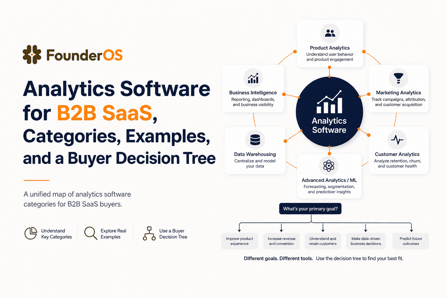
Analytics Software for B2B SaaS, Categories, Examples, and a Buyer Decision Tree
Choose analytics software for B2B SaaS with a clear category map, 10-minute decision tree, real workflows, and a practical buyer checklist.
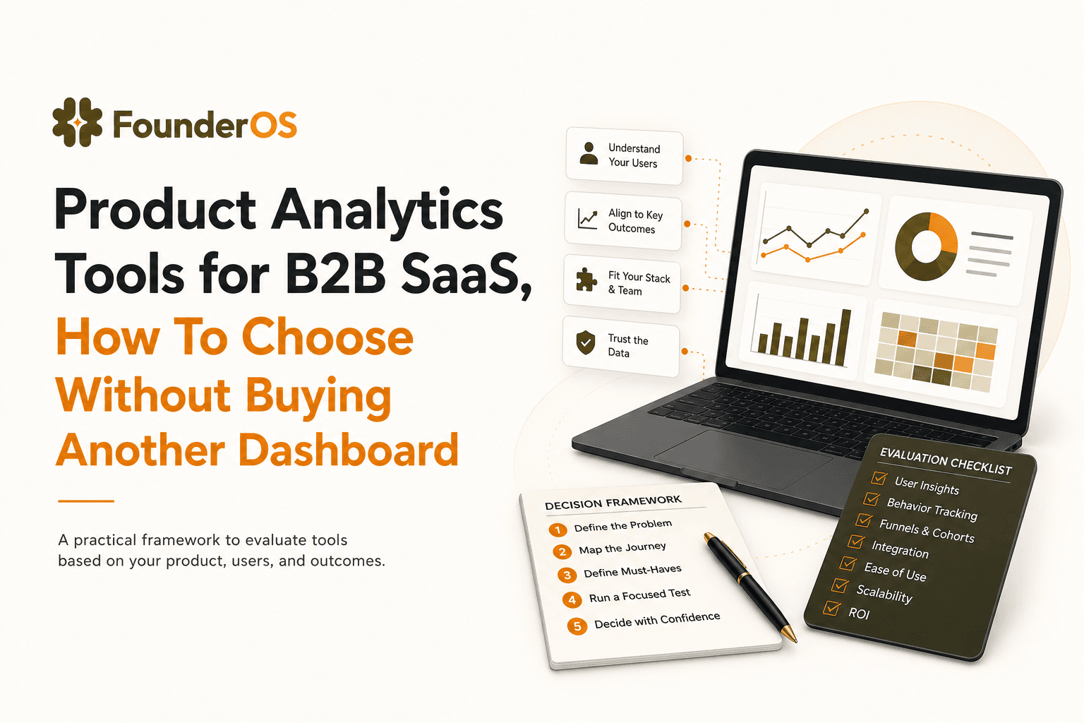
Product Analytics Tools for B2B SaaS, How To Choose Without Buying Another Dashboard
A practical guide to choosing product analytics tools for B2B SaaS: data model, funnels, identity, and revenue insights without dashboard bloat.
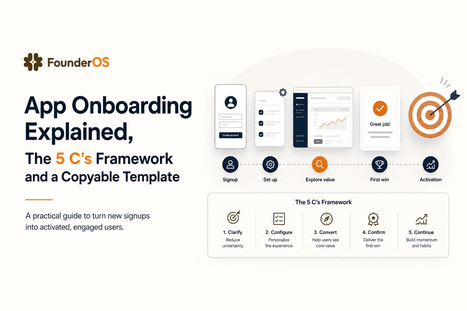
App Onboarding Explained, The 5 C’s Framework and a Copyable Template
Learn app onboarding with the 5 C’s framework, a copyable flow template, and a measurement plan to improve activation and time-to-value.