
Product Tours Explained for SaaS Teams That Want Better User Activation
Product tours are in-app guidance sequences that help users complete meaningful actions and reach value inside a SaaS product. Unlike a generic walkthrough that points out every button, effective product tours focus on one activation milestone, appear at the right moment, and let users learn by doing. For early-stage B2B SaaS teams, that distinction determines whether onboarding reduces confusion or becomes another obstacle.
- A useful product tour guides users toward one measurable outcome, not every available feature.
- Linear walkthroughs often fail because they interrupt intent, overload new users, and measure completion instead of activation.
- The best first tour is short, contextual, skippable, and connected to a milestone your team can track.
What Product Tours Are and What They Are Not
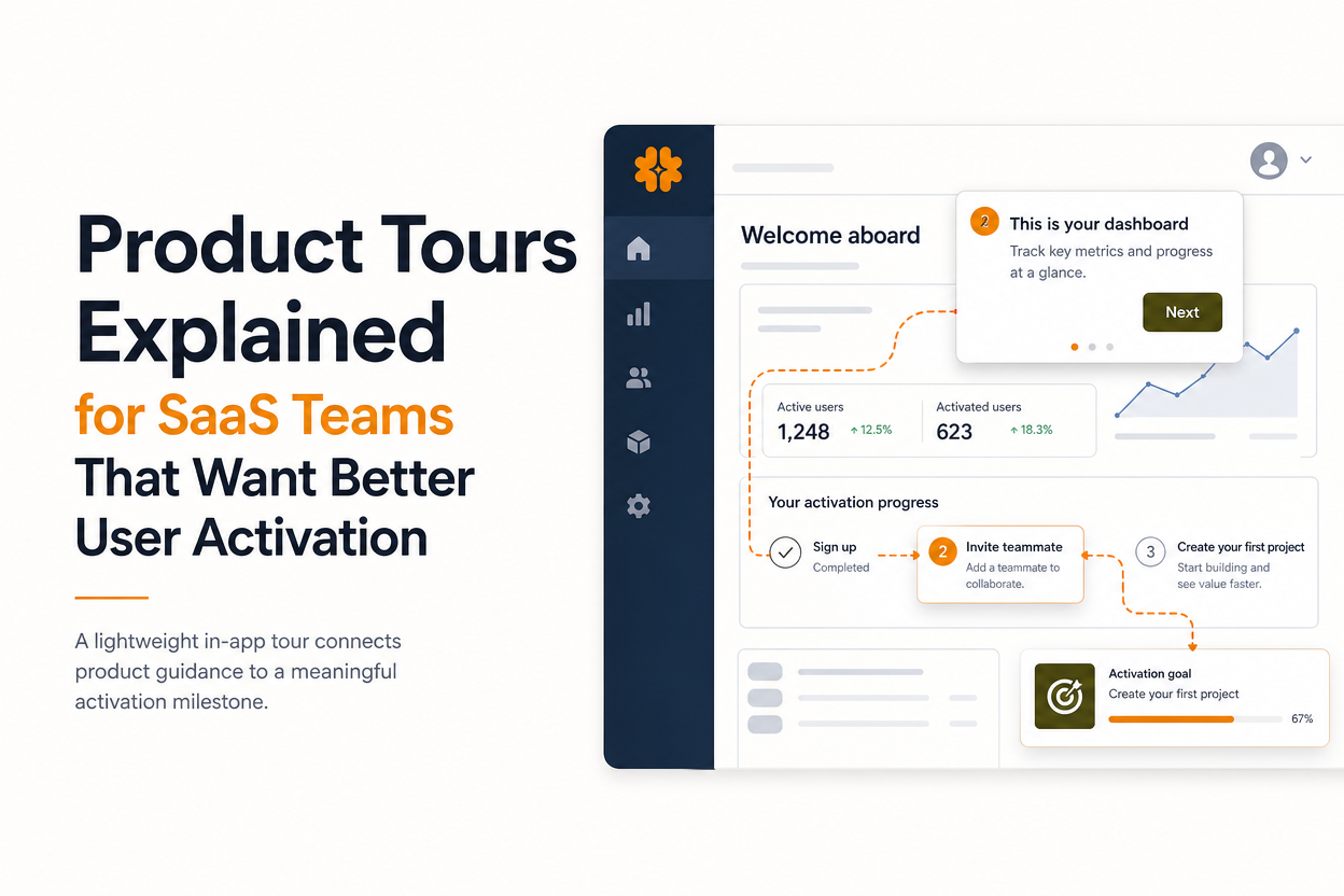
Product tours are contextual in-app prompts that guide users through a small set of actions connected to a specific outcome. A tour might show a new workspace how to invite a teammate, import data, create a report, or complete the first workflow that demonstrates the product's value.
A practical definition
A product tour usually combines several elements: a trigger, a sequence of prompts, a target interface element, and a completion event. The trigger determines when the experience appears. The prompts explain what to do next. The target connects guidance to the real interface. The completion event records whether the user finished the intended action.
For example, a project-management app could trigger a three-step tour after a user creates a project. Step one highlights the task area, step two asks the user to assign a task, and step three points to the due-date control. The tour is complete when the user assigns and schedules a task, not merely when every message has been viewed.
How tours differ from other onboarding patterns
A checklist presents several milestones and allows users to choose their order. A tooltip explains one interface element when the user needs help. A modal announces a change or asks for a decision, but it does not necessarily teach a workflow. A full onboarding flow may include signup, setup, education, email, and in-app guidance across several sessions.
Use a tour when users need brief guidance through a connected interaction. Use a checklist when the product has multiple valid paths. Use a tooltip when the question is local and specific. This distinction prevents a common design error: forcing one pattern to handle every onboarding job.
A guided product tour should therefore be judged by the action it enables, the context in which it appears, and the user segment receiving it.
Why SaaS Teams Use Product Tours
SaaS teams use product tours to shorten the distance between account creation and the first moment when a user understands the product's value.
Three measurable jobs
First, tours can support activation by guiding users toward a behavior that correlates with early success. The behavior may be creating a first dashboard, connecting an integration, inviting a collaborator, or completing a data import. The right action depends on the product, so teams should define it before writing any prompt.
Second, tours improve feature discovery when important capabilities are not obvious from the interface. A targeted prompt can introduce a feature at the moment it becomes relevant, such as showing an automation control after a user creates a recurring task. Discovery works best when the user already has a reason to care.
Third, tours can reduce avoidable support requests by answering predictable questions inside the workflow. The benefit is not simply fewer questions. Users also avoid leaving the product, searching documentation, and losing the context needed to complete a task.
A simple benefit test
Before building a tour, write down four measures:
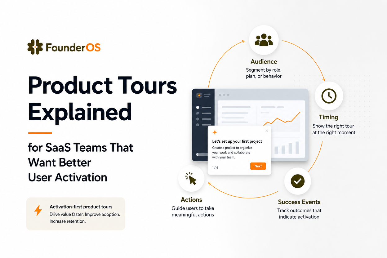
- Audience: Which users have the problem, such as new workspaces or accounts that have not connected an integration?
- Entry event: What action tells you that the user is ready for guidance?
- Success event: What product behavior shows progress?
- Guardrail: What would indicate that the tour is annoying or irrelevant, such as immediate dismissal or repeated exits?
Our team has found that this test changes the conversation from “How many steps should the tour have?” to “Which user behavior should improve?” That shift makes the experience easier to design and easier to evaluate.
Teams comparing options such as free product tour software should apply the same test. A low-cost tool is only useful if it supports the triggers, audience rules, and measurement needed for the activation job.
Why Many Product Tours Fail to Improve Activation
Many product tours fail because they optimize for exposure and completion instead of helping users complete a valuable task.
The forced walkthrough problem
A linear tour that blocks the interface asks users to read several messages before they can act. That approach assumes every new user has the same goal, the same level of knowledge, and the same available time. In a B2B product, those assumptions are usually wrong. An administrator may need setup guidance, while an invited teammate may only need to complete one assigned task.
The fix is to make the tour optional where possible, keep it tied to a relevant trigger, and allow users to exit without losing access to the product. A short sequence of two to four meaningful steps is generally easier to scan than a tour that attempts to explain an entire navigation system.
Poor timing and weak targeting
A prompt shown before the user has reached the relevant screen creates interruption rather than assistance. A prompt shown after the user has already completed the action feels unnecessary. Targeting should account for URL, role, account state, prior behavior, and whether the user has already seen or completed the guidance.
Teams can make this concrete with a timing checklist:
- Show setup guidance after the user signals readiness, not immediately after every login.
- Do not display a prompt for a feature the user has already used.
- Separate new users from returning users and invited users from account owners.
- Set an exit path and a re-entry rule so dismissed guidance does not become a permanent interruption.
Too much information
A tour is not a product manual. Explanations should answer one question: what should the user do next, and why does it matter? Replace feature descriptions with action-oriented copy. “Connect your data source to populate this report” is more useful than “This area contains your reporting integrations.”
We initially assumed that adding more context would reduce confusion, but session reviews showed the opposite: users skipped dense prompts and missed the action beneath them. The practical lesson was to put detail in documentation or contextual help, while keeping the tour focused on the next decision.
Measuring the wrong outcome
Completion rate is useful for diagnosing friction within the tour, but it is not proof of activation. Track the downstream event as well. If a tour teaches users to create a dashboard, compare dashboard creation and subsequent return behavior for exposed and unexposed eligible users, while recognizing that this comparison is directional unless the groups are carefully controlled.
The behavior triggers behind the experience should be documented alongside the success event so the team can distinguish a targeting problem from a copy or usability problem.
How to Design a Product Tour That Drives Early Value
An activation-first product tour starts with a user milestone and works backward to the smallest amount of guidance needed to reach it.
Step 1: Define the milestone
Choose one behavior that represents meaningful progress for a specific audience. A useful milestone has three properties: the user can complete it in the product, the team can identify it in event data, and completing it gives the user a reason to return. Avoid vague goals such as “understand the dashboard.” Prefer “create and save the first report using connected data.”
Step 2: Map the user's intent
List what the user already knows, what they are trying to accomplish, and where they are likely to hesitate. This map determines whether a tour is appropriate. If the user has not expressed intent, a checklist or welcome screen may be better. If the user is already on the relevant page, a tooltip or two-step guide may be enough.
Step 3: Reduce the path
Write the shortest path from the current state to the milestone. For each step, record the target element, the user action, the reason for that action, and the fallback if the element is unavailable. Remove any step that does not change the user's ability to complete the task.
Step 4: Add audience and timing rules
Use rules that reflect actual product states. A first tour might target users who have created a workspace but have not completed the activation event. A feature tour might target accounts that have used one workflow but not the related capability. Conditions should also prevent conflicts, such as showing two tours at once or displaying a new-user tour to a long-standing account.
Step 5: Measure the full path
Record impressions, dismissals, step exits, completion, activation, and a later retention signal. Review the sequence by audience and entry condition. A high dismissal rate on step one suggests poor timing or targeting. A high completion rate with no downstream behavior suggests that the tour is easy to click through but does not create value.
In our experience, the first useful experiment is not a large redesign. It is a narrow comparison between a targeted tour and the existing onboarding path, using the same audience definition and milestone. That structure gives a small team enough evidence to decide whether to improve, remove, or expand the experience.
For a deeper planning model, the saas onboarding flow should connect the tour to setup, product use, and follow-up guidance rather than treating the tour as the entire onboarding experience.
When to Use Product Tours and When to Choose Other Patterns
The right onboarding pattern depends on user intent, task complexity, and whether the next action is local or cross-functional.
| Use case | Best pattern | Reason | Success signal |
|---|---|---|---|
| One connected workflow | Product tour | Guides the user through a small number of actions | Workflow completed |
| Several valid setup paths | Checklist | Lets users choose the order of milestones | Key milestones completed |
| One unfamiliar control | Tooltip | Explains the interface at the point of need | Control used successfully |
| Important release or decision | Modal | Creates focused attention for a time-sensitive message | Decision or acknowledgement |
| Complex learning or policy detail | Documentation or guided help | Provides space for depth without blocking work | Task completed with fewer repeated questions |
Three decision criteria
Choose a tour when the user is ready, the workflow is linear enough to explain briefly, and the team can define a downstream success event. Choose a checklist when users have different roles or when setup includes independent tasks. Choose contextual guidance when the user needs help only at a particular screen.
Teams evaluating the best product tour software should check whether the tool supports this decision-making model. Core criteria include no-code editing, audience segmentation, URL and behavior triggers, previewing, dismissal controls, and reporting that connects tour exposure to product behavior.
A first-tour planning checklist
Before publishing, confirm that one audience, one entry condition, and one activation milestone are documented. Confirm that the copy names the next action, the target element is visible, the user can exit, and the tour does not repeat after completion. Finally, define the review date and the minimum evidence needed to keep the tour live.
After running several onboarding audits, the pattern was clear: teams get more useful learning from one well-instrumented tour than from a library of disconnected walkthroughs. Start with the highest-friction milestone, make the guidance small, and expand only when the data shows a real gap.
Product Tours FAQ
Map one activation milestone, test a simple in-app tour, and measure both completion and downstream activation with Founder OS. Its no-code product onboarding tool, product tracking, user profile tracking and segmentation, and GTM reporting help teams move from an onboarding idea to a measurable experiment without a long implementation cycle.
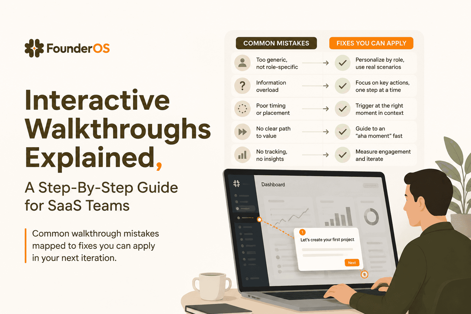
Interactive Walkthroughs Explained, A Step-By-Step Guide for SaaS Teams
Learn what an interactive walkthrough is, where it works best, and how to build one step by step without engineering help.

In App Guidance Explained, Patterns, A Selection Matrix, and a Measurement Playbook
Learn in app guidance patterns, a selection matrix, and a measurement playbook to prove activation impact without false wins.

High Churn Explained, What Counts as High and What to Check First
High churn explained by type, thresholds, and a fast triage checklist to diagnose churn drivers before fixing anything.